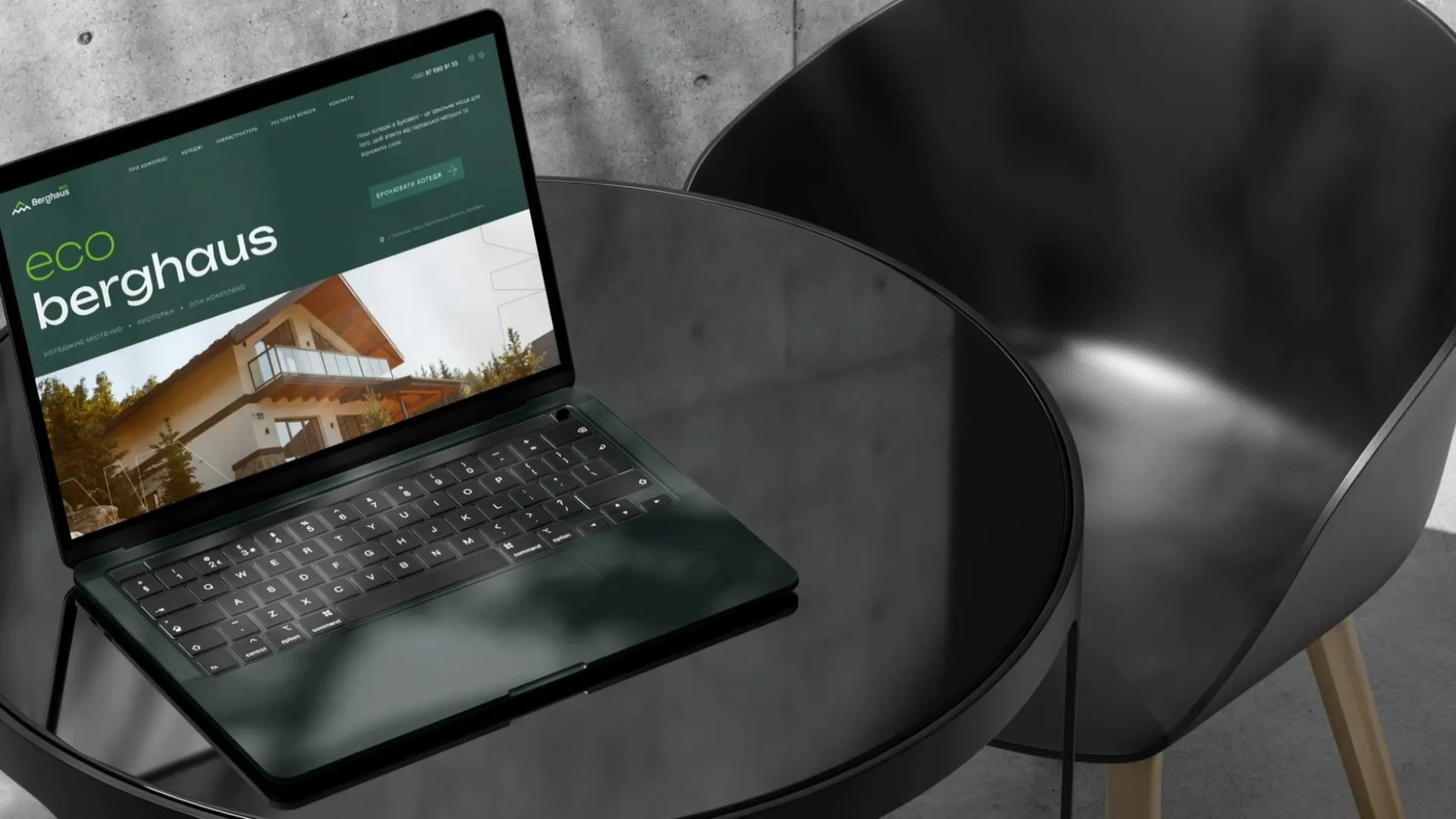
Branding · Restaurant · Polyanytsia, Bukovel
BERGEN Restaurant.
Norwegian runes and Hutsul ornament drawn into one alphabet
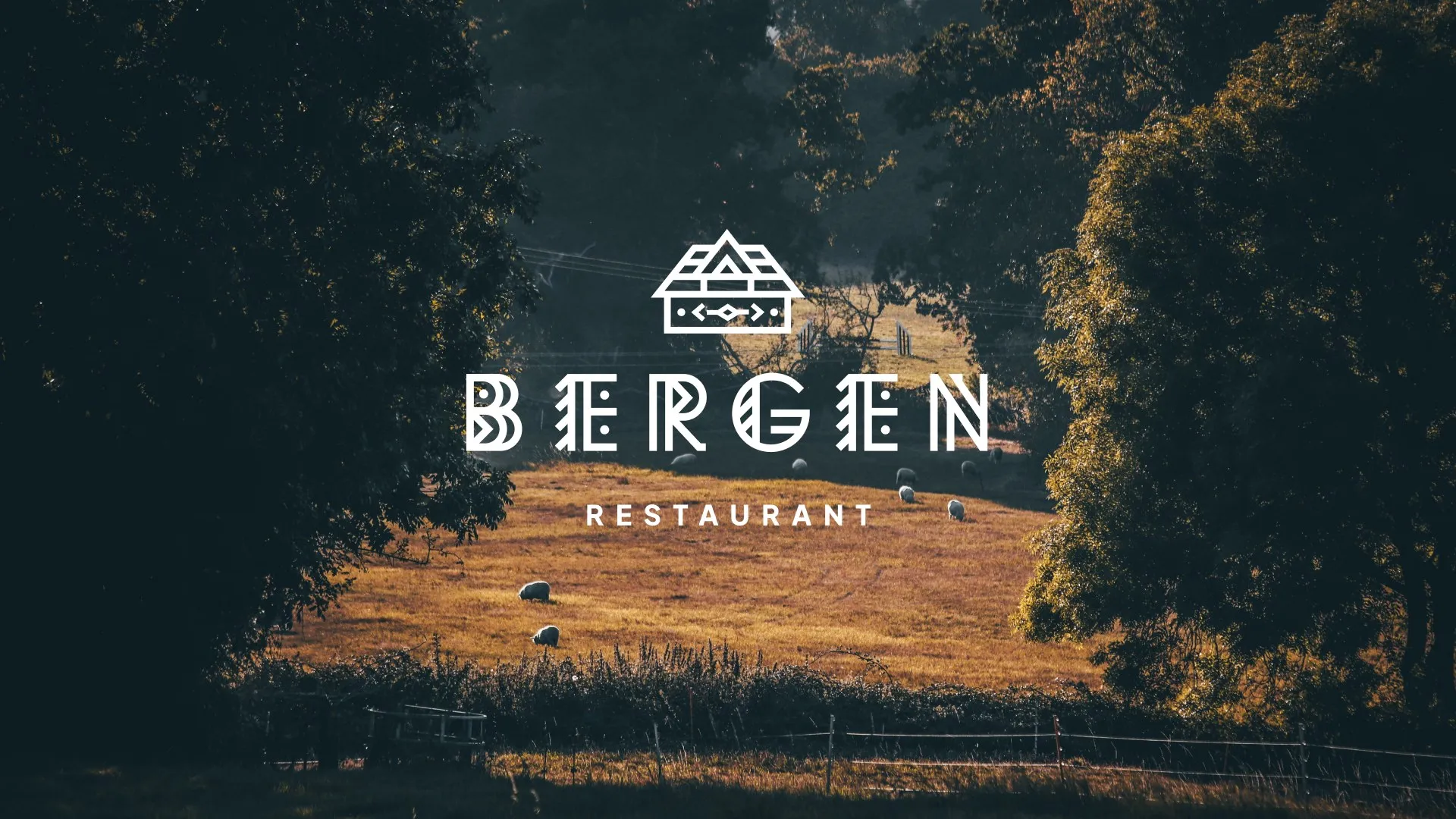

BERGEN is a restaurant in Polyanytsia, next to Bukovel in the Ukrainian Carpathians. The name comes from the Norwegian city of Bergen, while the kitchen and the place are Ukrainian. The owners wanted an identity that carries both without turning into a theme park. It had to feel at home in the mountains and still look modern on a city billboard.
- Logo, extended and short versions
- Colour palette
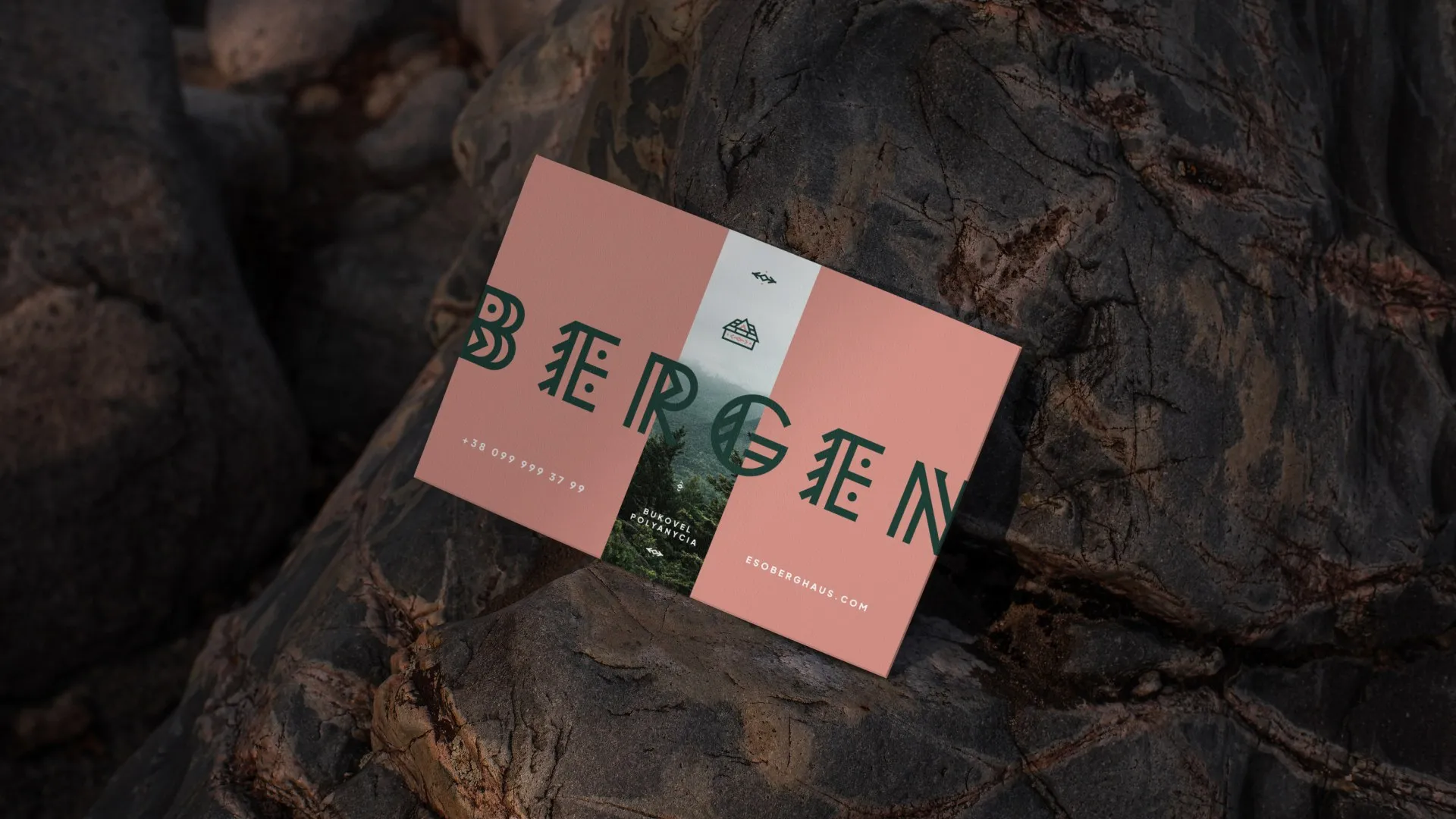
- Menu and business cards
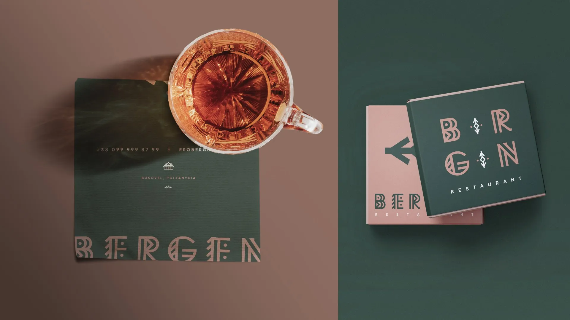
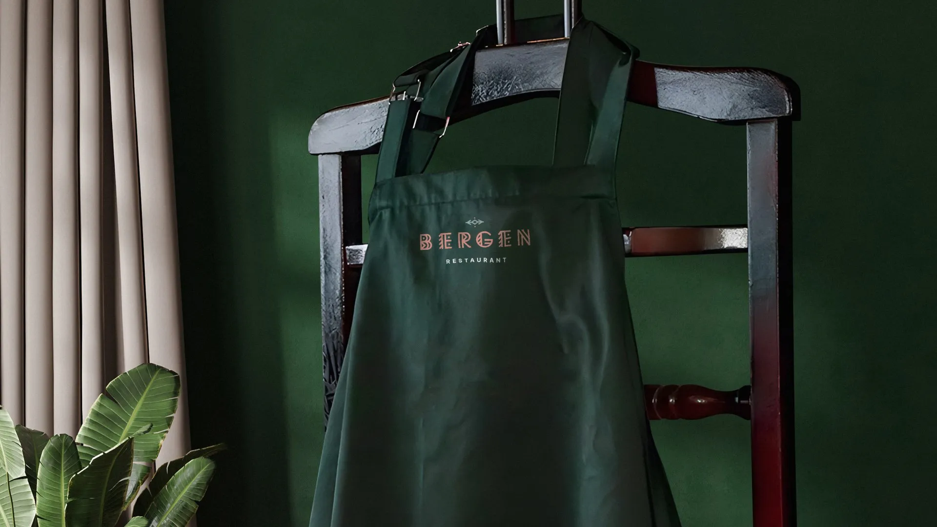
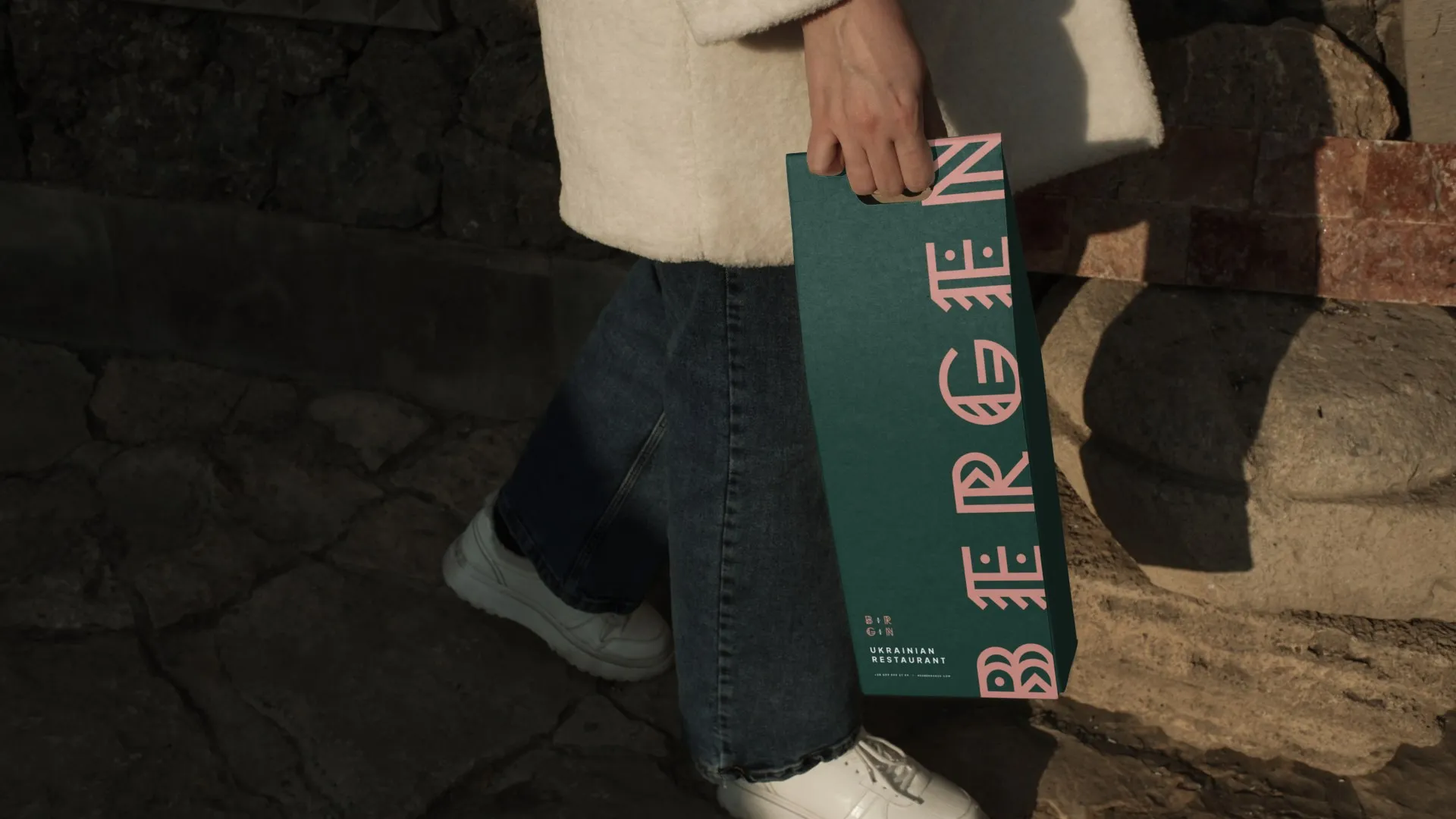
- Staff aprons and packaging
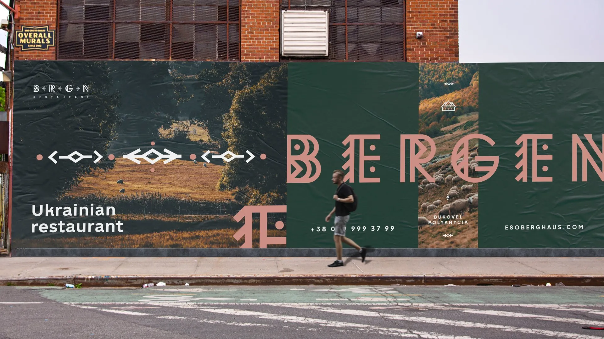
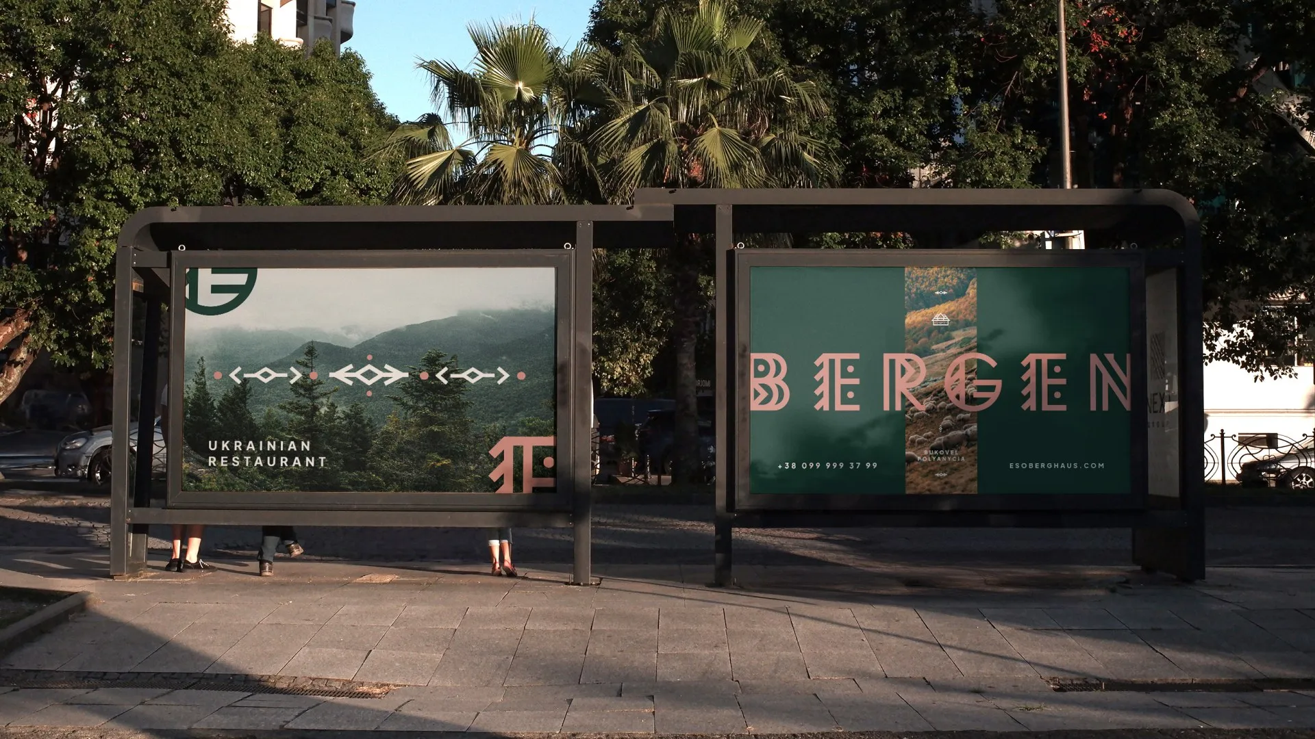
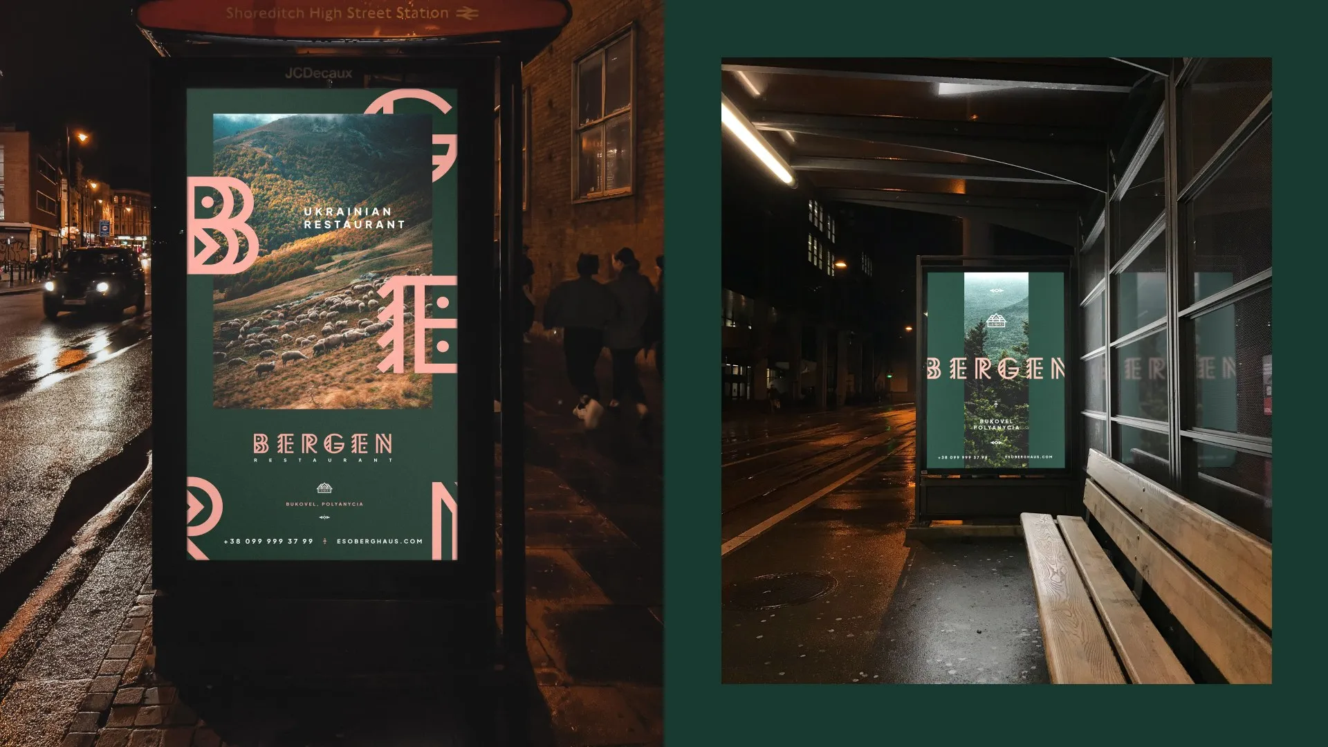
- City lights, billboards and wall posters
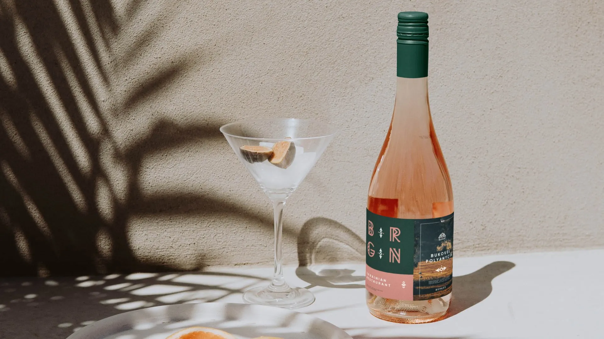
- Wine label and Instagram layouts
A Scandinavian name over a Ukrainian kitchen can easily look like a contradiction. The identity had to explain the name quickly and tie it to the Carpathians. It also had to work wherever the restaurant appears, from the menu and the aprons to roadside signs and phone screens.
- 01 — Two cultures
Norwegian roots in the name and Ukrainian tradition on the plate.
- 02 — Resort location
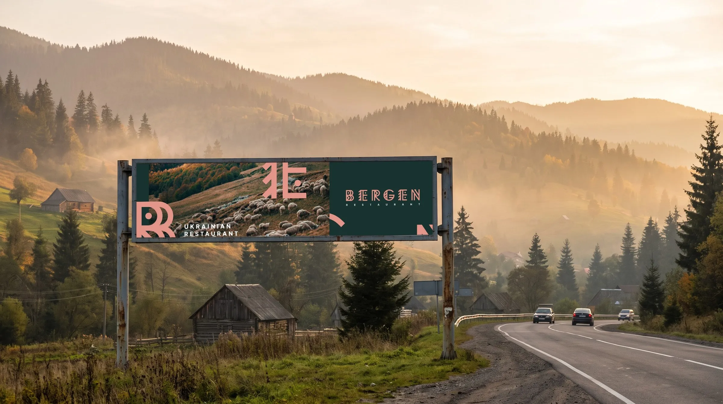
Many guests first see the brand from the road, so the sign has to read from a passing car.
- 03 — Many surfaces
Menu, cards, aprons, bags, labels, outdoor and social media.
Runes beside Hutsul ornament
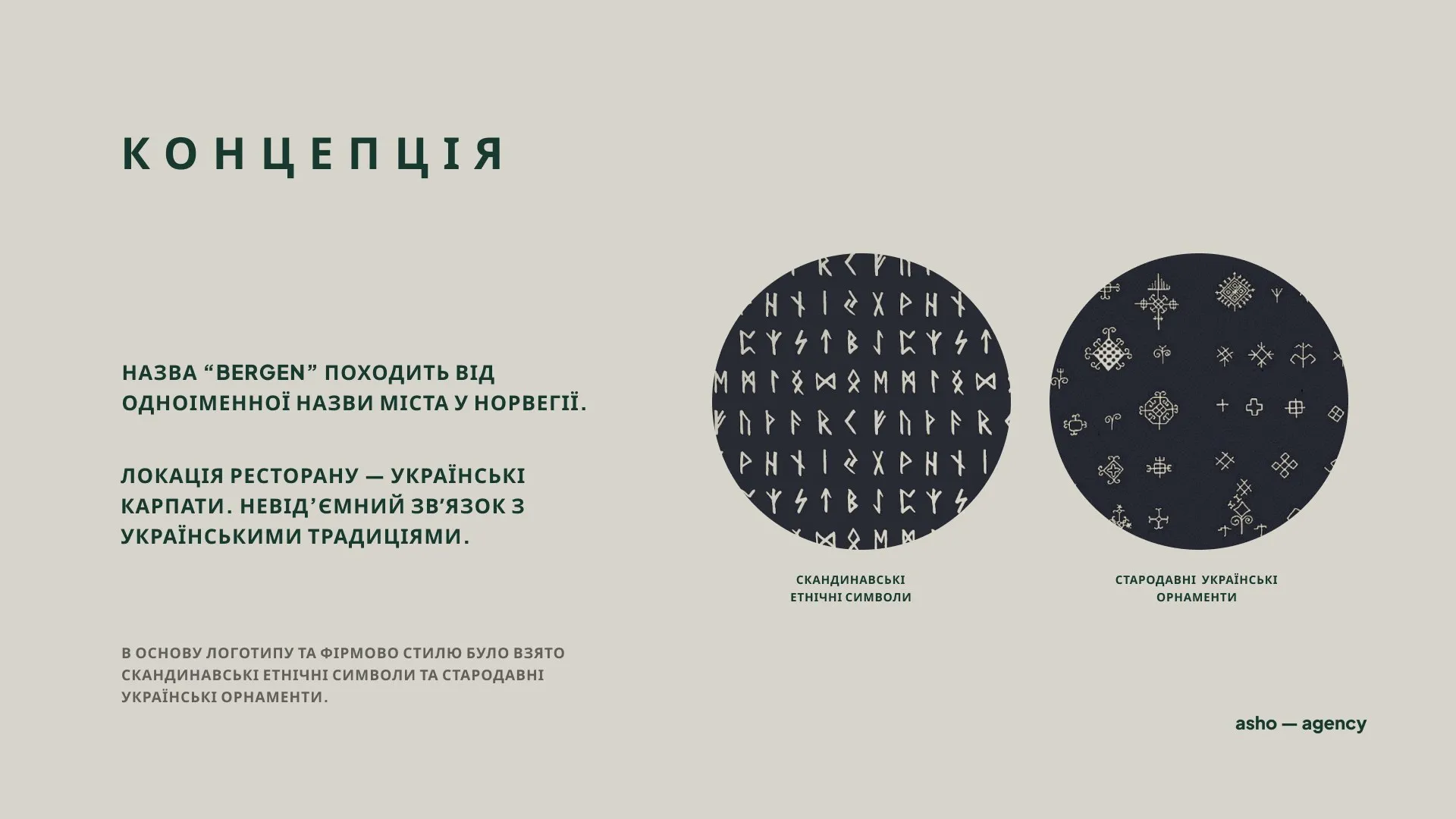
We laid Scandinavian ethnic symbols next to old Ukrainian ornaments and looked for what they have in common. Both are built from straight cuts, diamonds and repeated strokes, and those shared shapes became the raw material for the brand. The concept gives equal weight to ethnic roots and a modern line, so the brand feels local in the Carpathians and is clean enough for a new building.
Letters that work as pattern
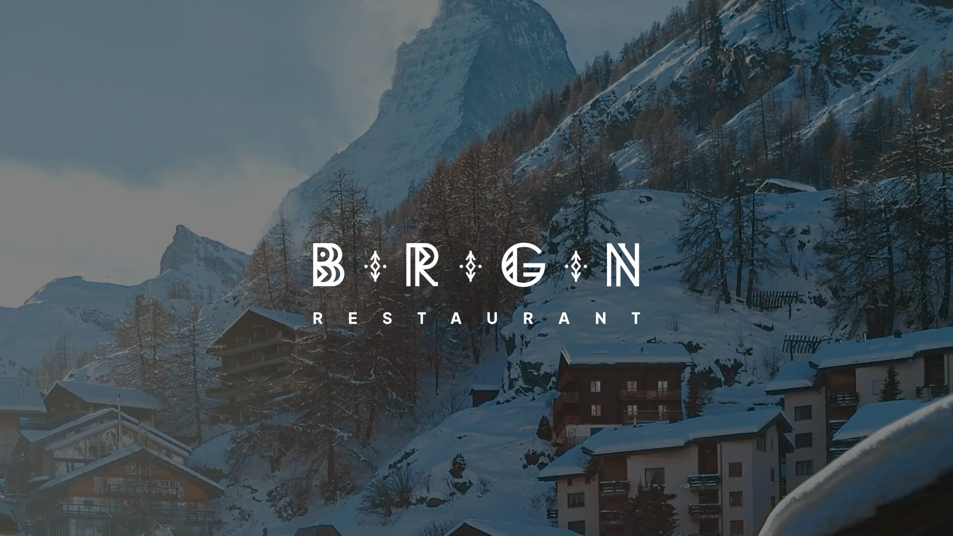
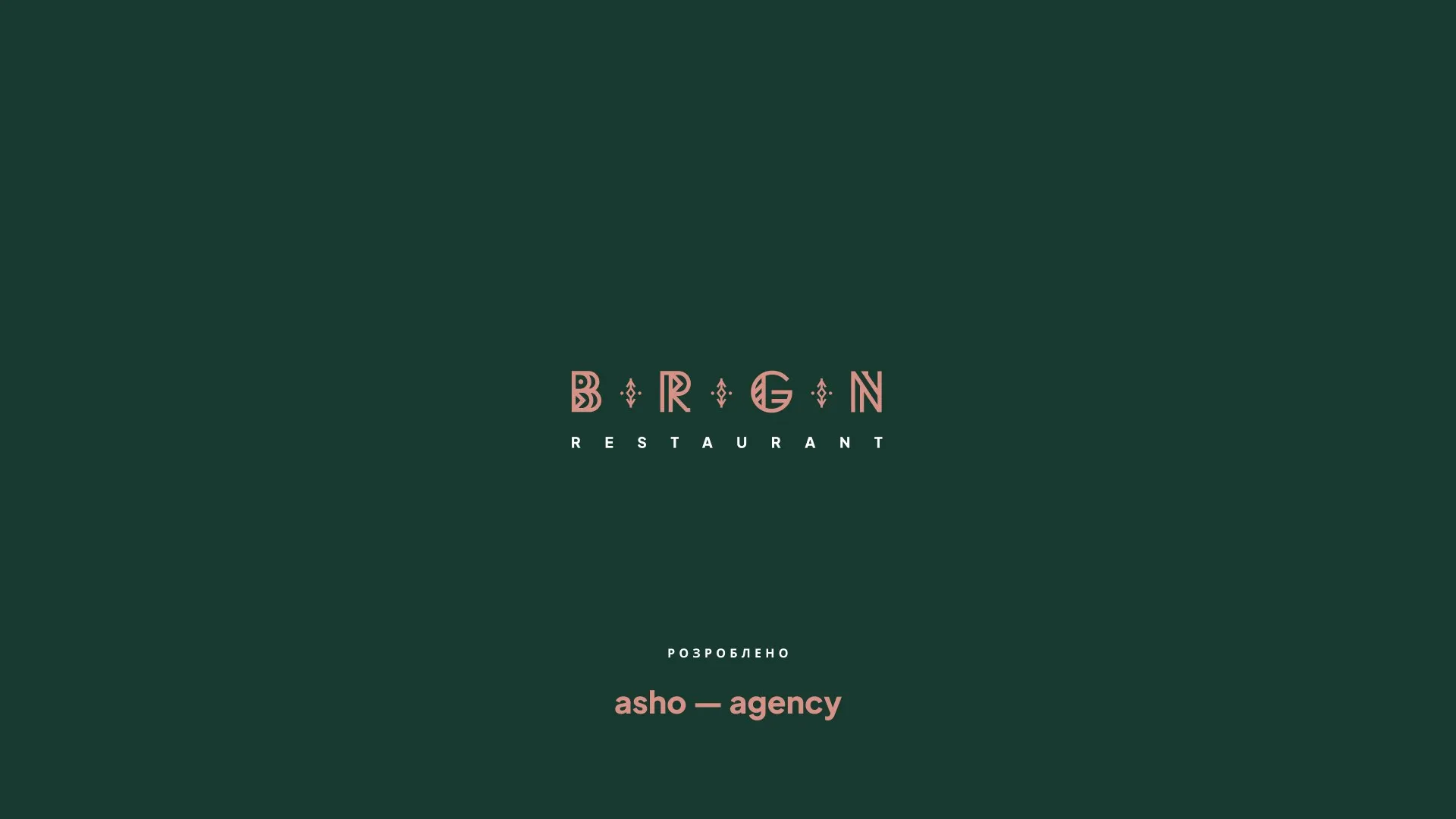
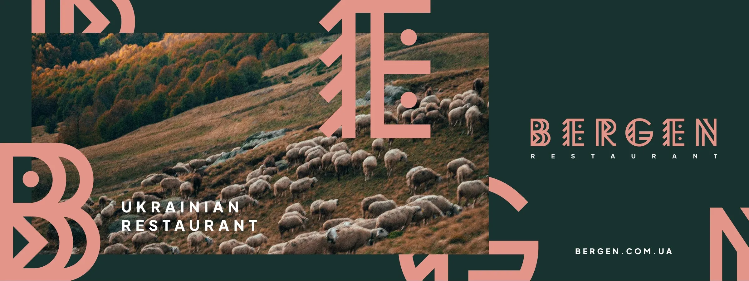
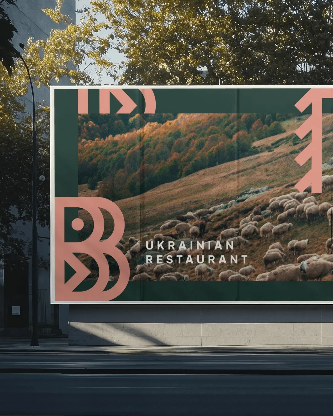
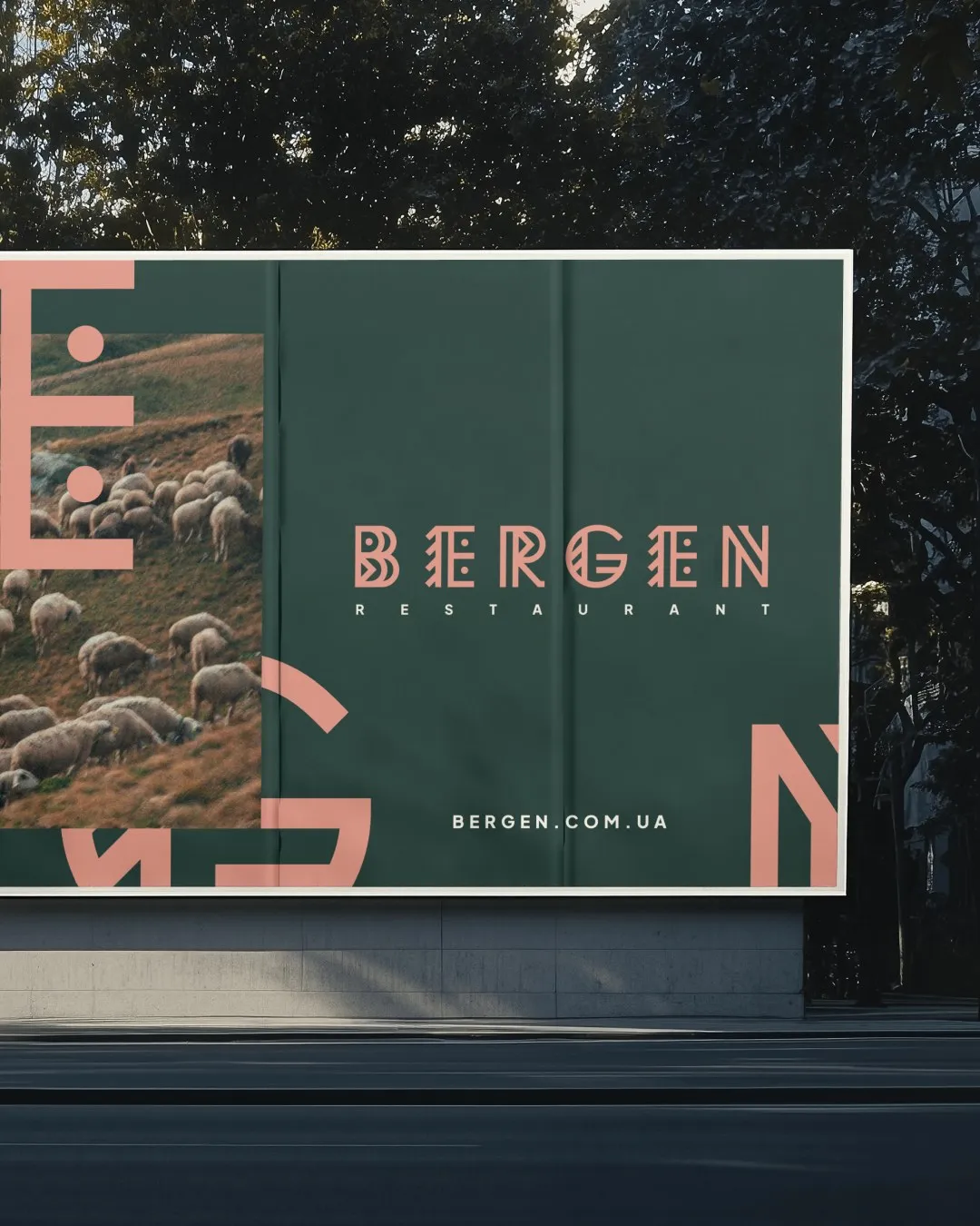
Every letter of BERGEN is drawn from those strokes and diamonds, and a roof-shaped mark sits above the wordmark. The extended version is for signage, and in the short version the E's turn into ornament. Because the letters double as the pattern, a single letter can be cropped very large on a poster, card or bag and still read as BERGEN.
Forest green and Bergen terracotta
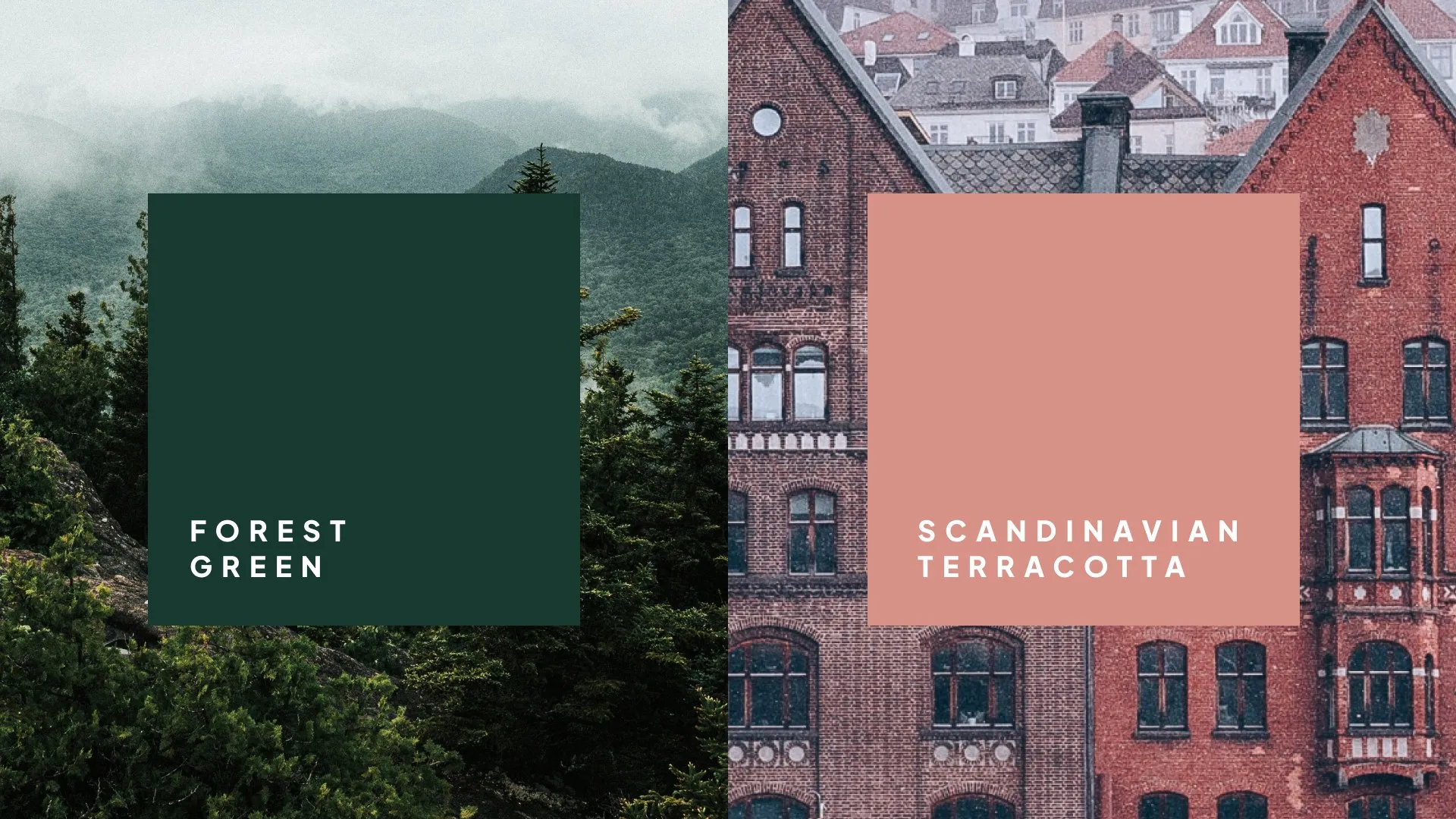
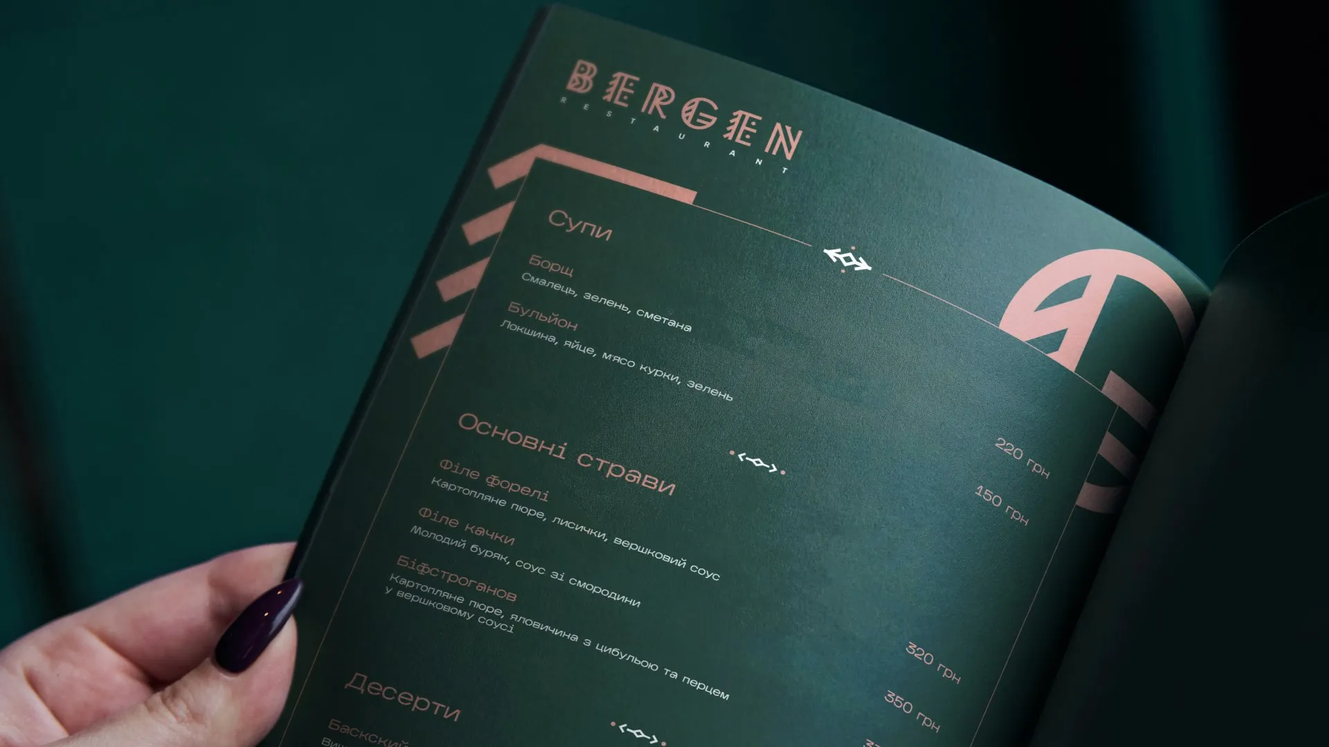
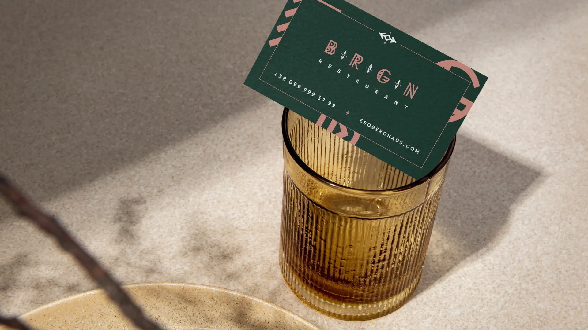
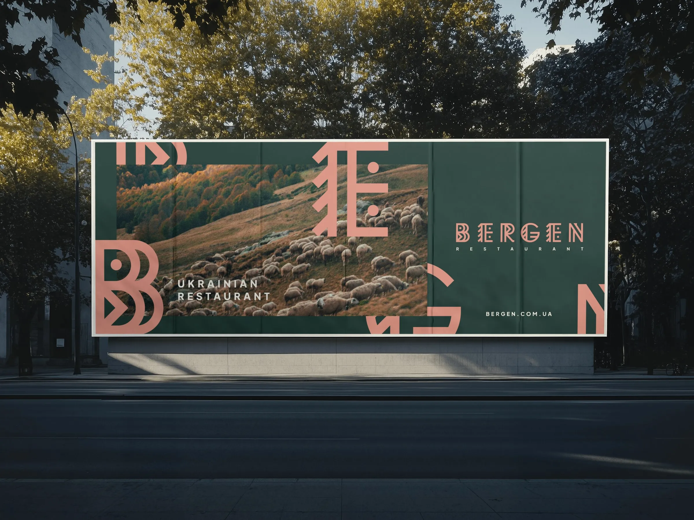
The system runs on two colours. A deep forest green comes from the Carpathian slopes, and the terracotta comes from the brick facades of Bergen. Green holds the background and terracotta draws the letters. Photography of the mountains fills the space between them. The same pairing appears on a business card and on a billboard by the road.
From the menu to the road
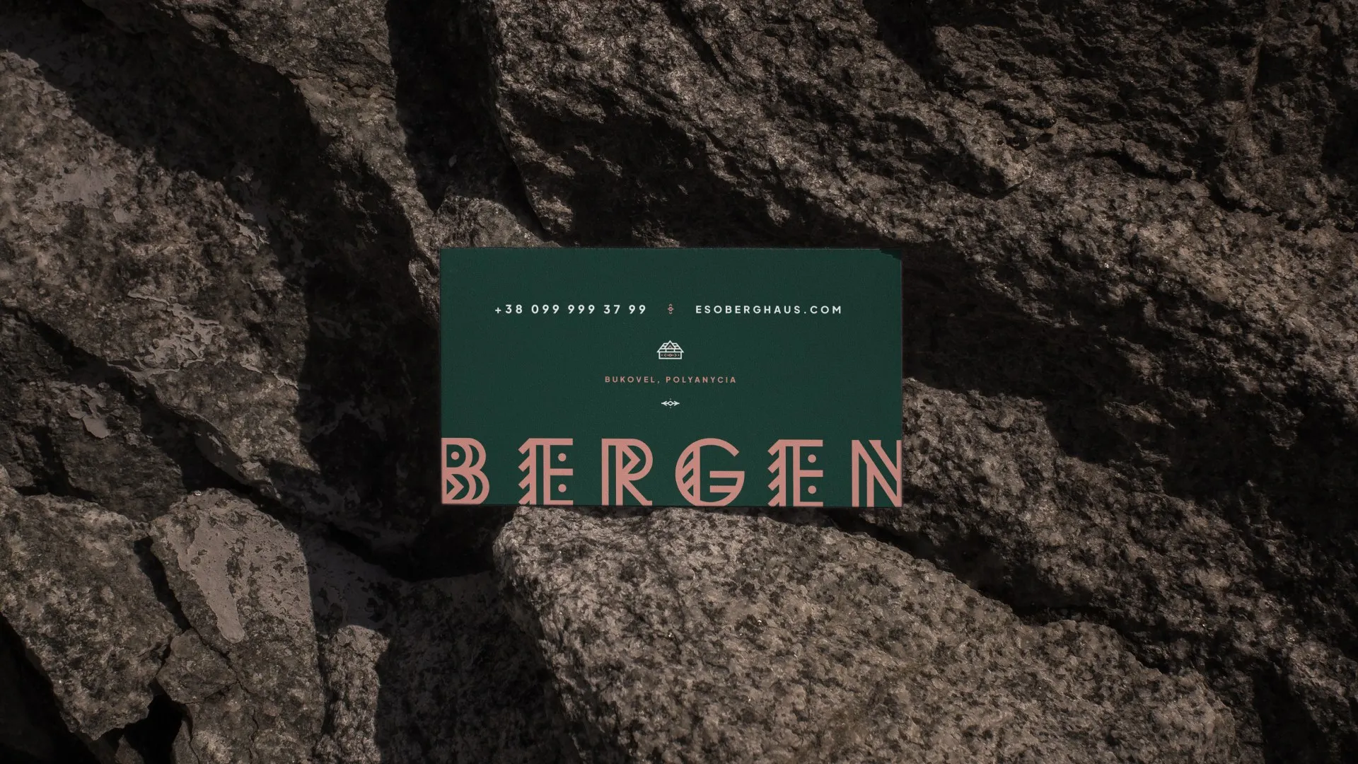
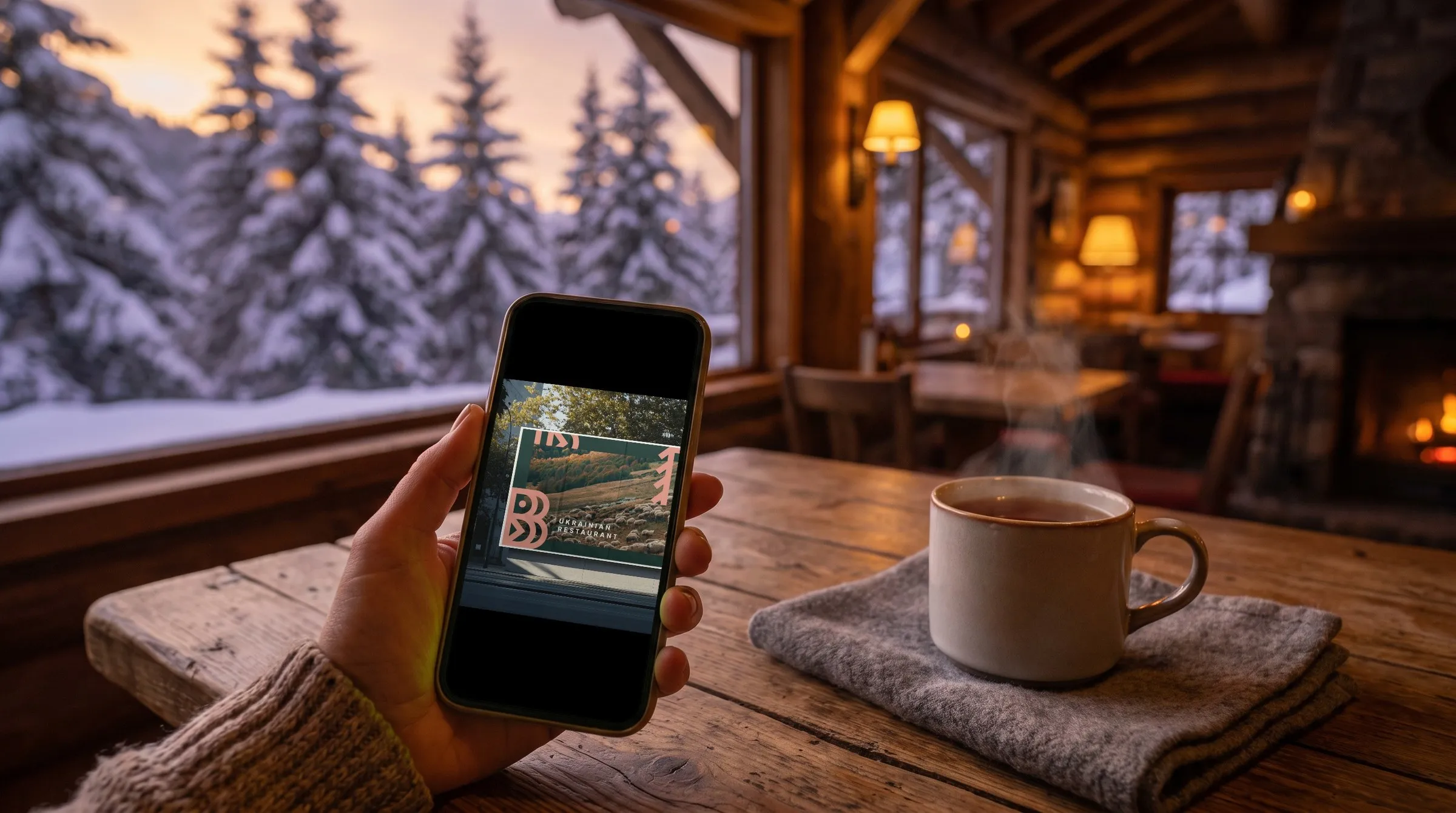
We applied the identity to everything a guest handles, including the menu, business cards, aprons, take-away bags and a house wine label. Outside, the same letters run across city lights, bus stops and wall posters. A new billboard places the restaurant on a hillside with grazing sheep, next to the line "Ukrainian restaurant".
BERGEN has a complete identity built on one idea, a Norwegian name written in Carpathian ornament. The letters, two colours and mountain photography cover everything from the menu to the billboard. The system is simple enough for the team to extend to new formats on their own.
- Logo in extended and short versions
- Two-colour palette
- Menu and business cards
- Aprons, bags and wine label
- Outdoor: city lights, bus stops, posters, billboard
- Instagram layouts