Website · Car dealership · Germany
Autohaus.
A dealership website that starts with the car you're looking for


Autohaus is an official Audi, Škoda and Volkswagen dealer and service centre in Germany. It sells new and used cars, rents vehicles, buys cars from private owners and runs a full workshop. Its old website did not keep up with any of that. It looked dated, and booking a test drive or a service slot was complicated. We redesigned and built the site around two jobs: finding the right car and booking time with the dealer.
- Vehicle catalogue with detailed search
- Test-drive booking flow
- Service appointment form
- Service, tyre and parts pages
- Rental and business-customer pages
- Locations, contact persons, history and careers
The dealer was struggling to attract and keep customers, and the website was part of the problem. Stock, services, rentals and contacts were all there, but spread across pages that looked alike. A visitor who knew which car they wanted still had to dig. Someone who needed new tyres had no quick way to book. We needed one clear path from interest to appointment.
- 01 — Dated look
The site did not match the standard of the brands the dealer represents.
- 02 — Buried stock
Visitors could not easily narrow the stock down to the car they wanted.
- 03 — Slow booking
Reserving a test drive or a service slot took too many steps.
Search comes first
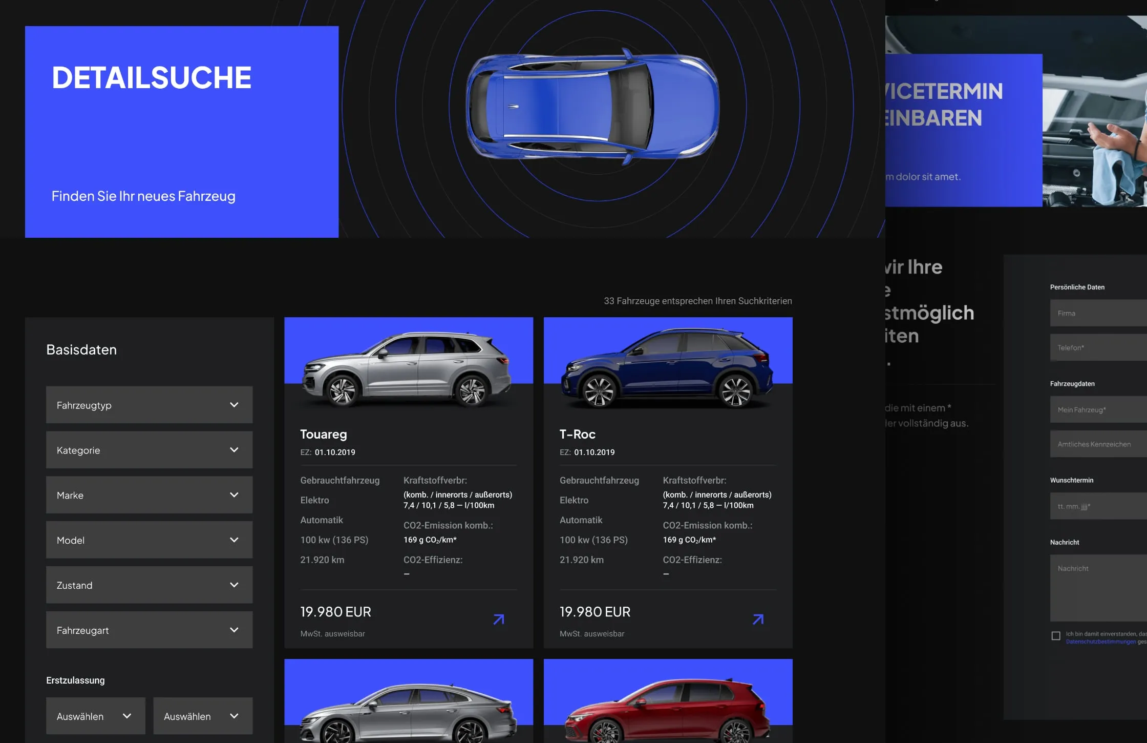
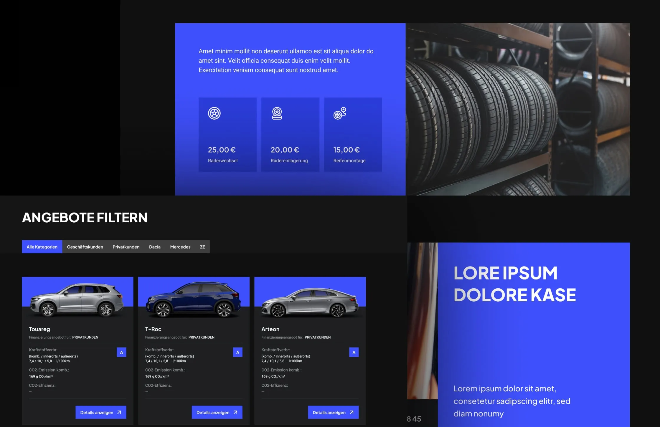
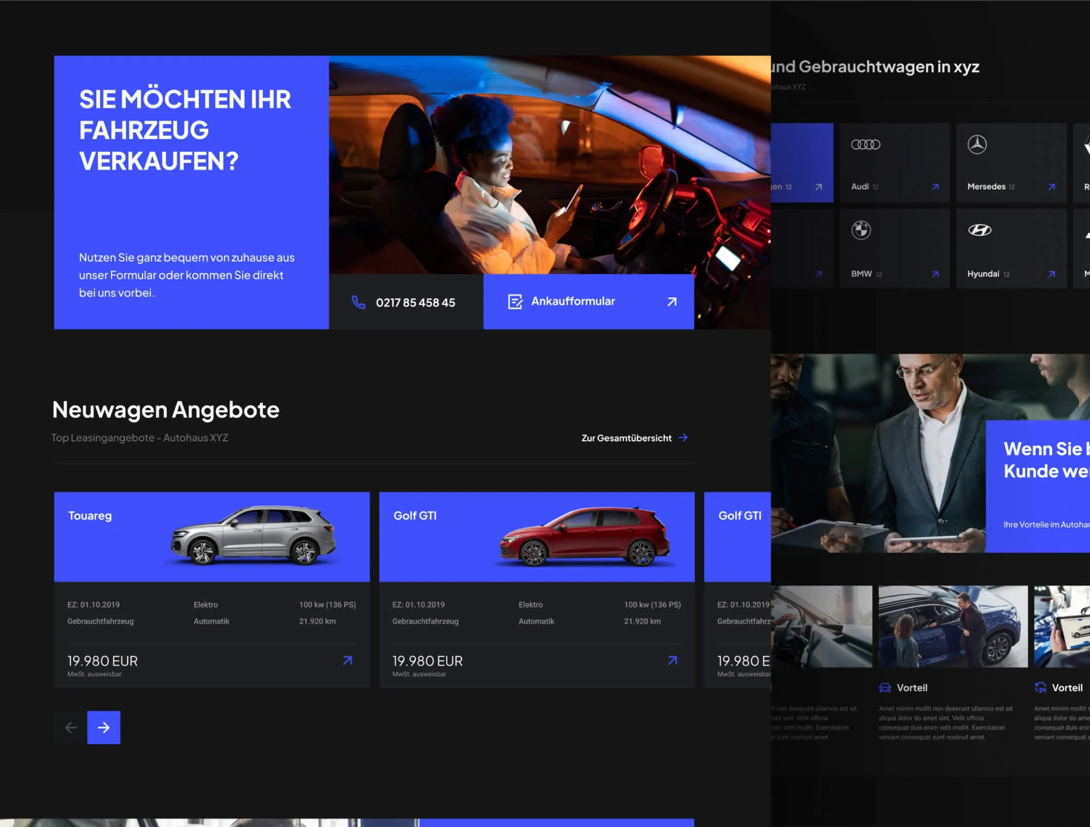
We put the stock search at the centre of the site. Detailed search filters by vehicle type, category, make, model, condition, fuel and first registration. Offers can also be filtered by audience, private or business. Every car card shows the same facts in the same place: registration date, fuel, gearbox, power, mileage, consumption, CO2 and price. Visitors compare cars without opening each one.
Booking in one window
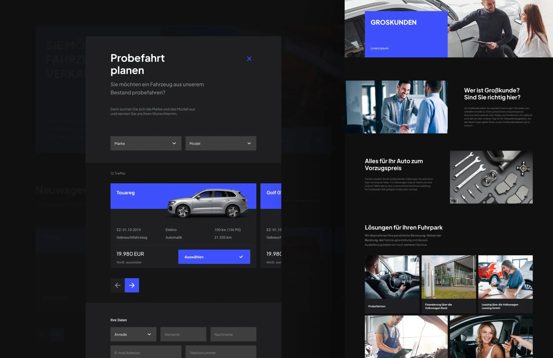
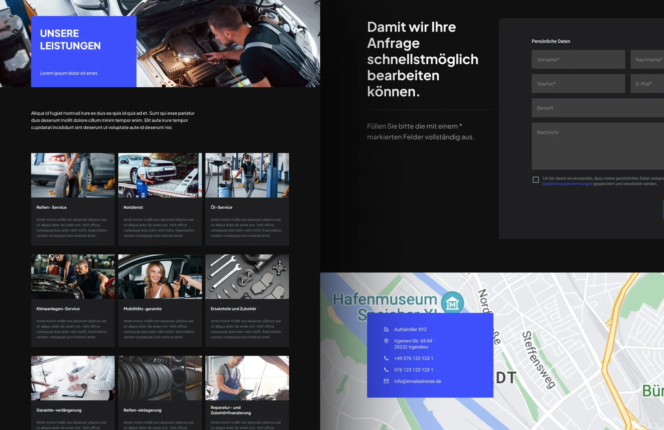
Booking a test drive used to be the hard part, so we made it short. The planner opens over the page. The visitor picks a make and model, sees the matching cars, selects one and adds their details below. Nothing else to fill in. Service appointments follow the same logic: one form with personal details, vehicle data and a preferred date, next to a map of the location.
One blue, used as a signpost
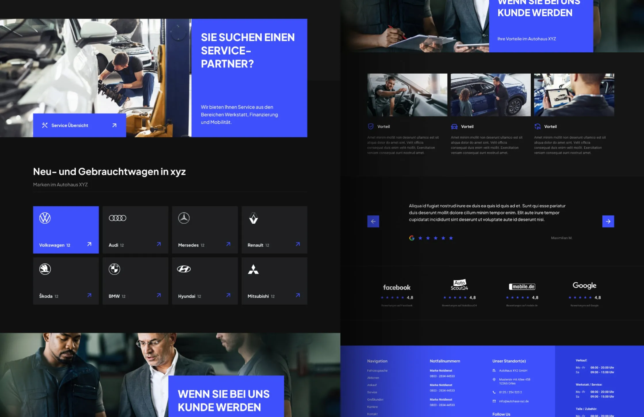
The dealer does many things: sales, purchase of used cars, rental, workshop, fleet deals. We gave the site a dark, calm base and a single electric blue. Each service gets its own blue block with a direct question, such as "Want to sell your car?" or "Looking for a service partner?", plus a phone number and a button. The colour tells visitors where to act.
Real people behind the counter
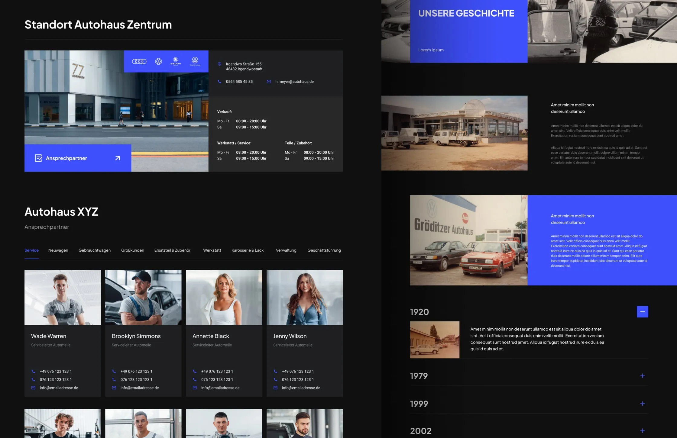
Buying a car is still personal. So every location page shows its address, opening hours for sales, service and parts, and the people who work there, sorted by department, with direct phone numbers and email. A history timeline tells the dealer's story. A careers section lists what employees get. The site sells the cars and the team behind them.
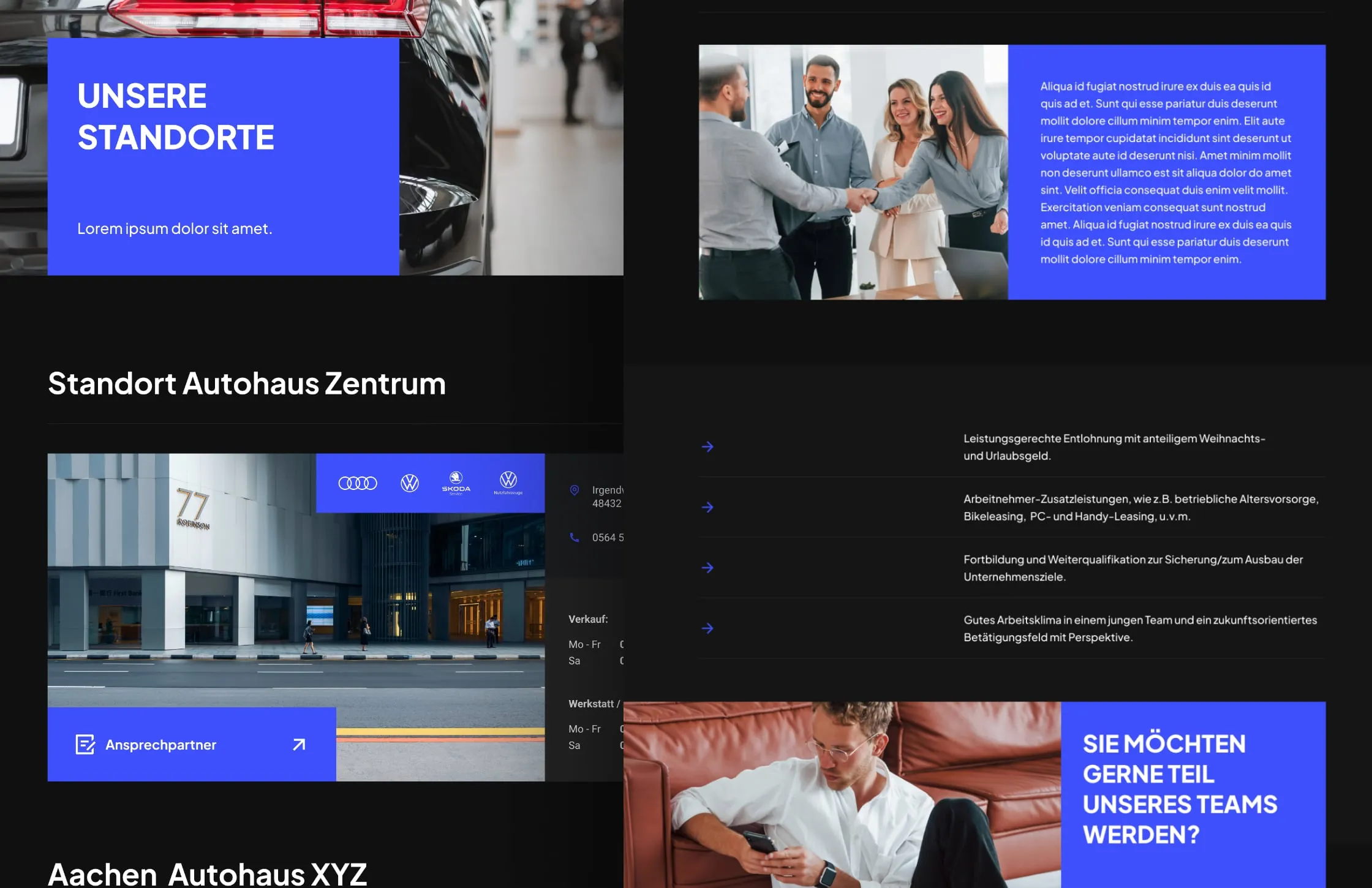
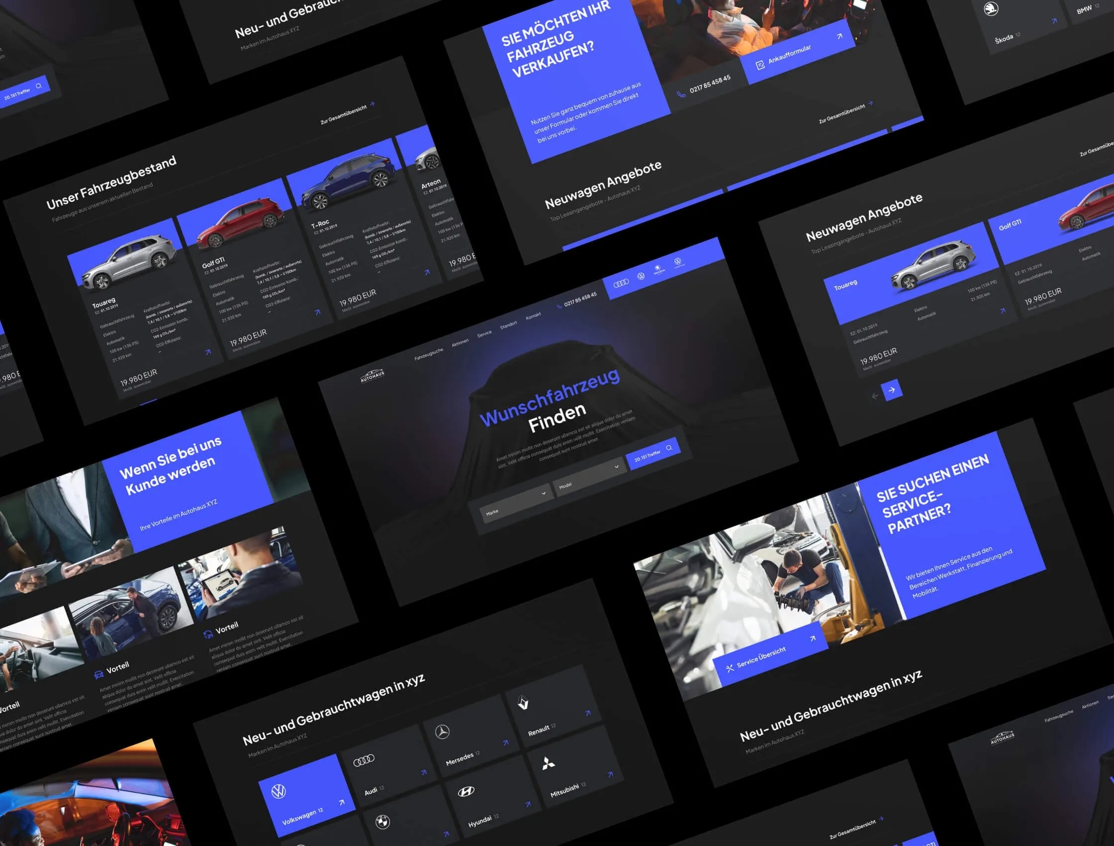
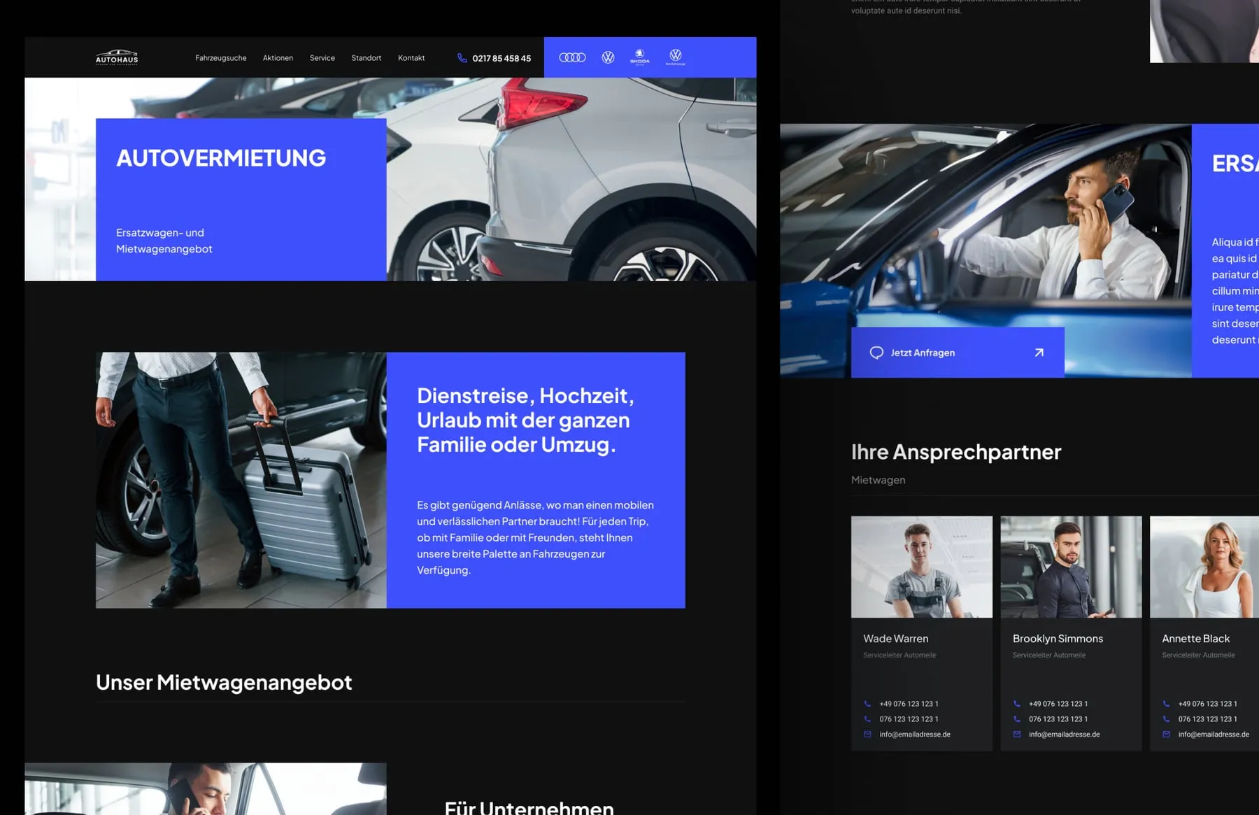
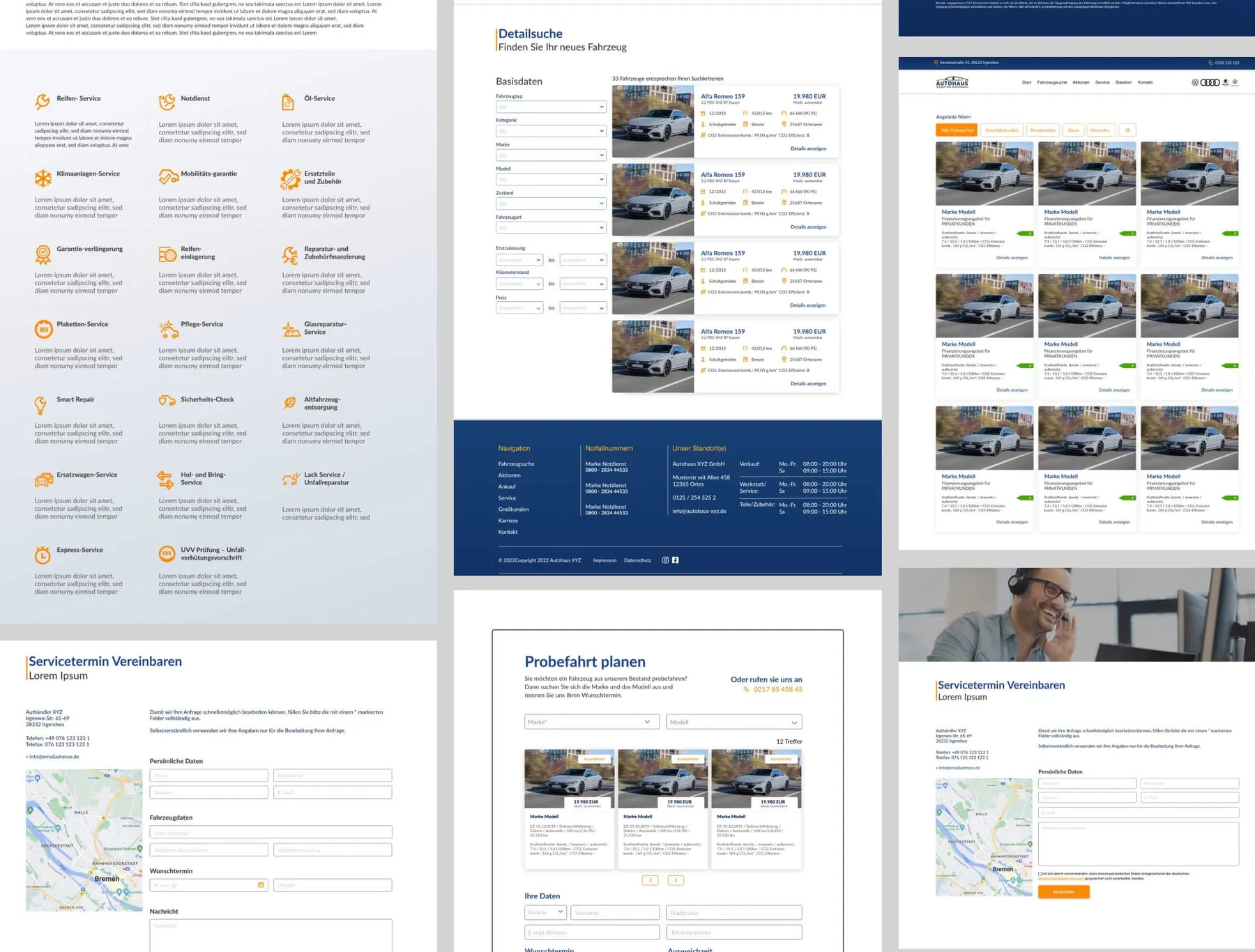
We designed and built the new website. The dealer now has one consistent site for sales, service, rental and recruitment. Visitors filter the stock, see the key data of every car at a glance, and book a test drive or a service slot without leaving the page. Each location lists its people, hours and phone numbers.
- Vehicle catalogue with detailed search
- Test-drive planner
- Service appointment form
- Service, tyre and parts pages
- Locations with contact persons
- History and careers pages
“ASHO Agency helped us not only update our website but completely rethink how we communicate with clients online. The effect of the new design and SEO is wow!”