E-commerce · Art gallery · Israel
The Olive Press Gallery.
A gallery store where only the art gets to be in colour

The Olive Press Gallery is an Israeli art gallery that sells sculpture, painting and works on paper online. It represents a group of artists and keeps a record of their exhibitions. The online store needed a refresh. The client wanted a site that looks right next to the work, makes the collection easy to explore and helps turn interest into sales. We redesigned the store end to end, from the home page to the cart.
- Home page and shop
- Artwork pages
- Artists and exhibitions sections
- Cart with coupon field
- Contact page with hours and map
- Mobile layouts
An art store has two jobs that pull against each other. It has to feel like a gallery: calm, and respectful of the work. It also has to work like a shop, with prices, filters and a cart. The client wanted both in one place. Visitors needed to find a piece, understand it and buy it, without the interface competing with the art.
- 01 — Navigation
Visitors had to move through the collection easily, by artist or by medium.
- 02 — Presentation
Every piece needed room, with no interface colour fighting it.
- 03 — Purchase
The path from an artwork to the cart had to be short and clear.
Let the work bring the colour
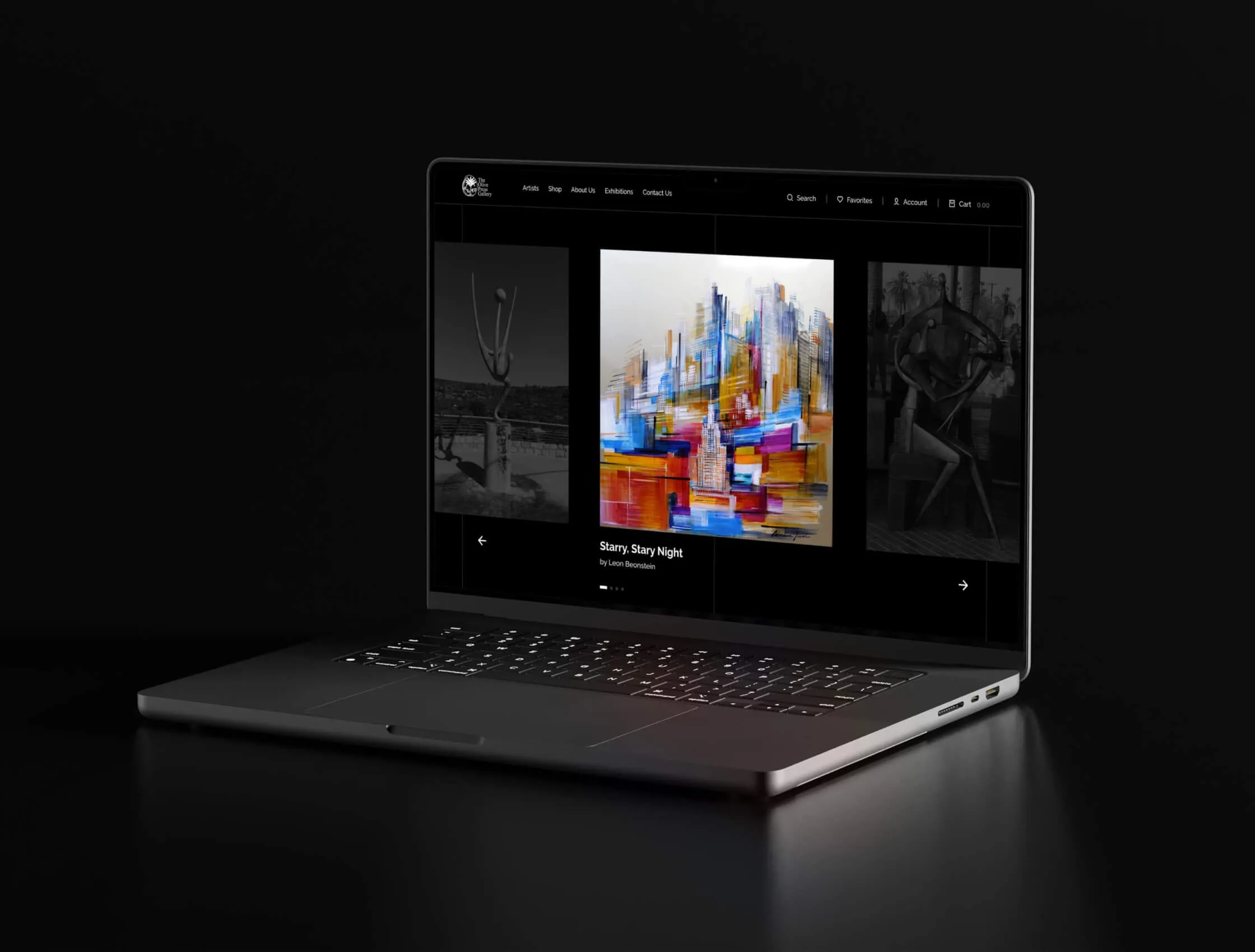
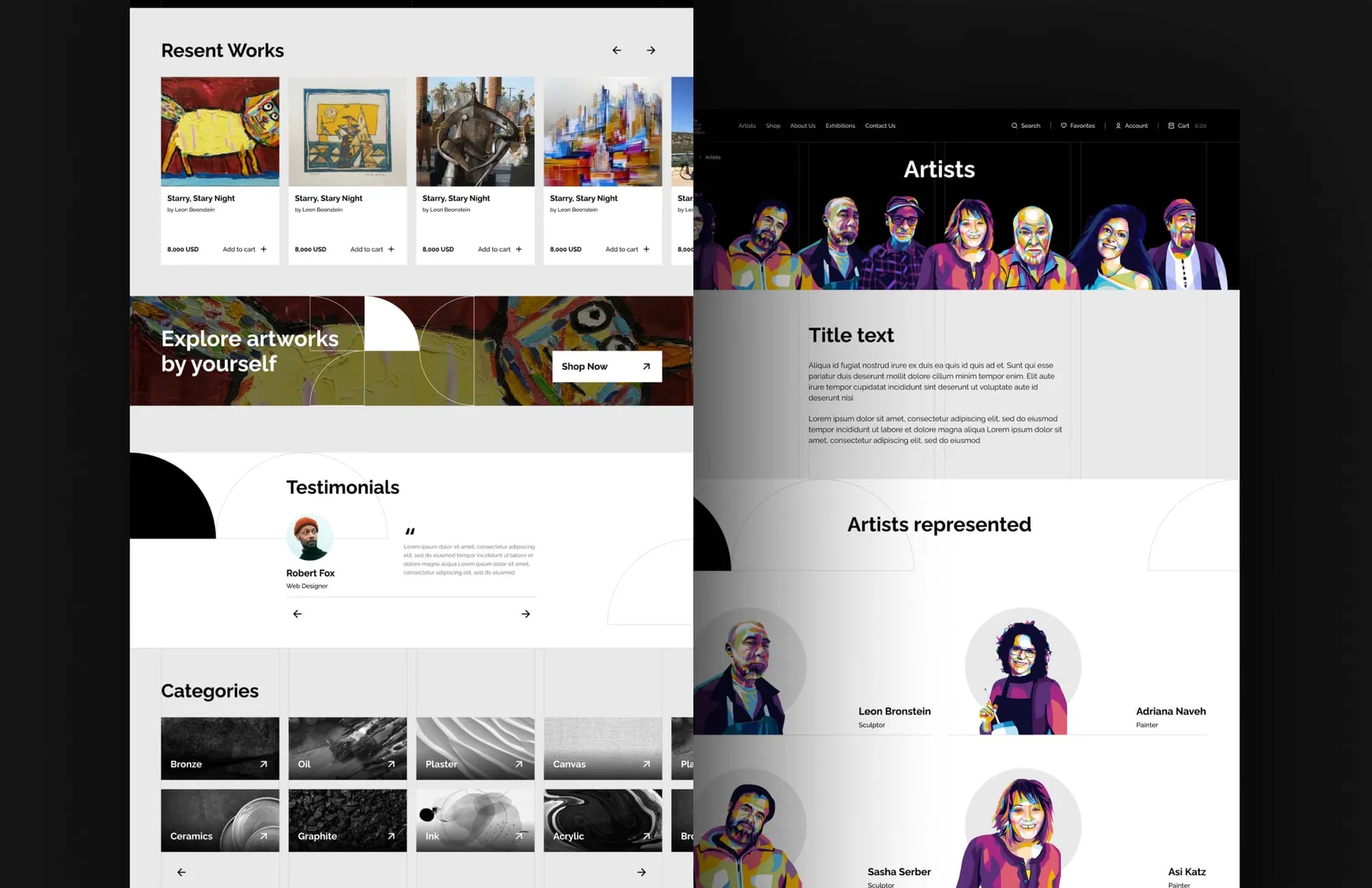
We kept the interface strictly black, white and grey. The only accent is a sage-green semicircle taken from the gallery's logo, repeated as a quiet graphic motif along with thin grid lines. Everything else stays neutral. That way a bronze, a bright canvas and a pop-art portrait all sit on the same page without clashing, and the art is always the loudest thing on screen.
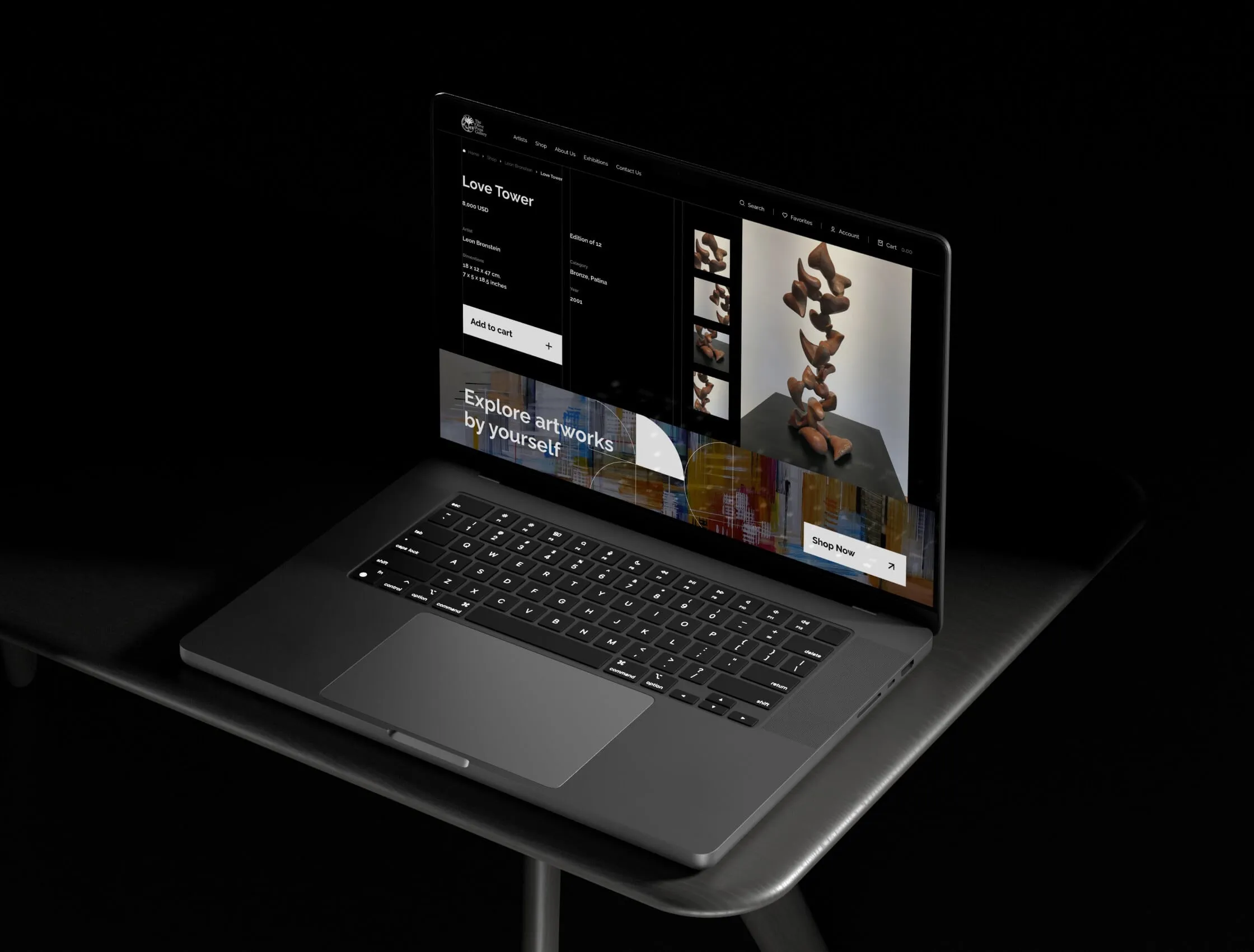
Artwork pages that read like wall labels
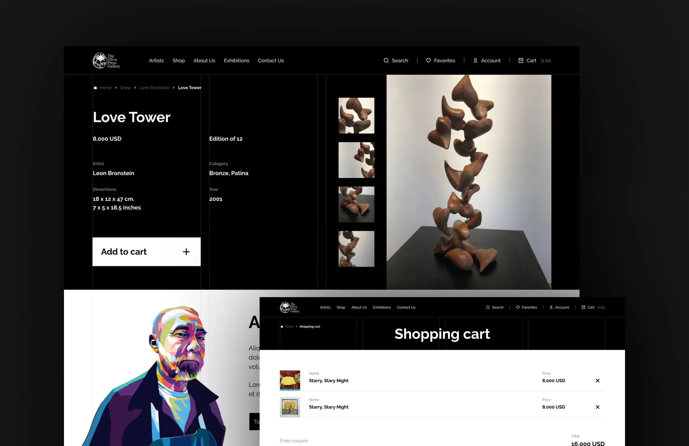
A collector wants the same facts they would find next to a piece in the gallery. So every artwork page leads with them: title, artist, medium, edition, dimensions in centimetres and inches, year and price. Large images and a column of detail shots sit beside the text. "Add to cart" is the only strong button on the page. The cart keeps the same calm layout and adds a coupon field.
A gallery, not just a catalogue
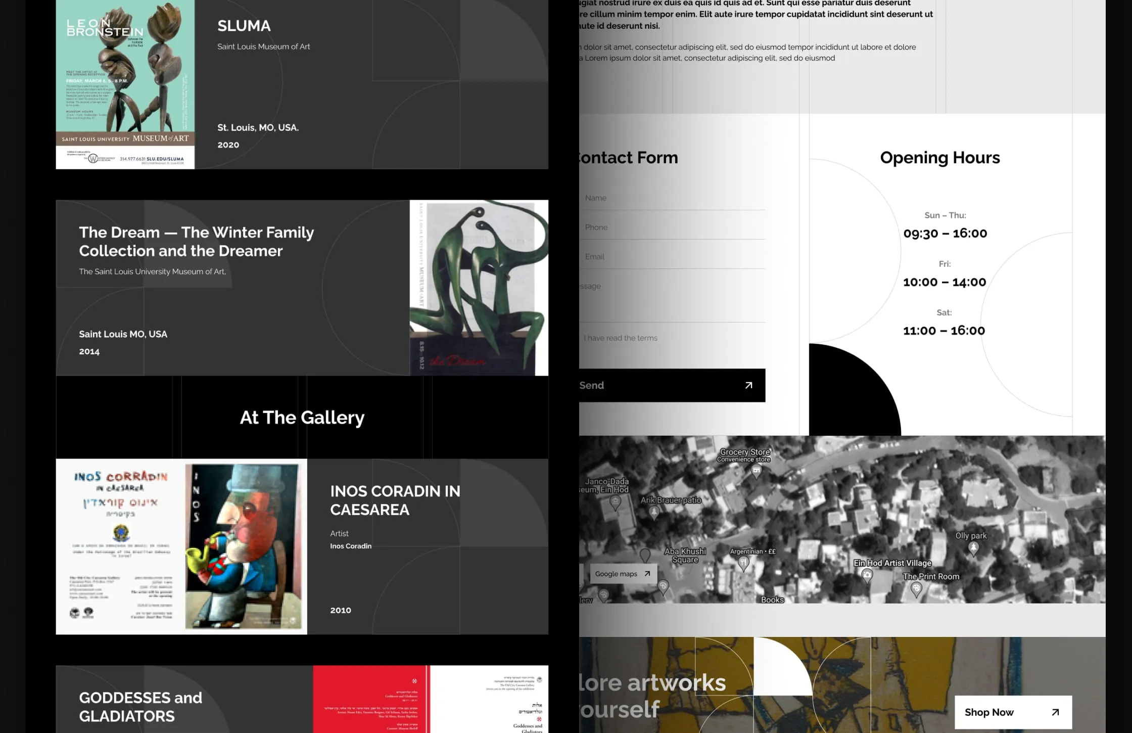
People buy art because of the artist and the story. We gave both their own space. Represented artists get a dedicated section with bold portraits. Past exhibitions appear as an archive with posters, venues and years. The contact page works like a visit planner: a form, opening hours, a map and links to Waze and Google Maps. A newsletter sign-up keeps collectors close.
The same gallery on a phone
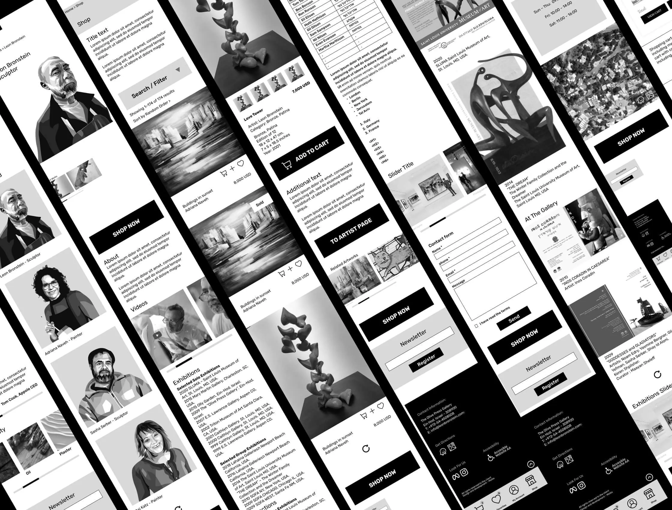
We designed every key page for mobile as well: artist profiles, the shop with search and filters, artwork pages, exhibitions and the contact form. The layout stacks into one column and keeps the black-and-white rhythm, with a full-width "Shop now" button where it matters. The store keeps its character on a small screen.
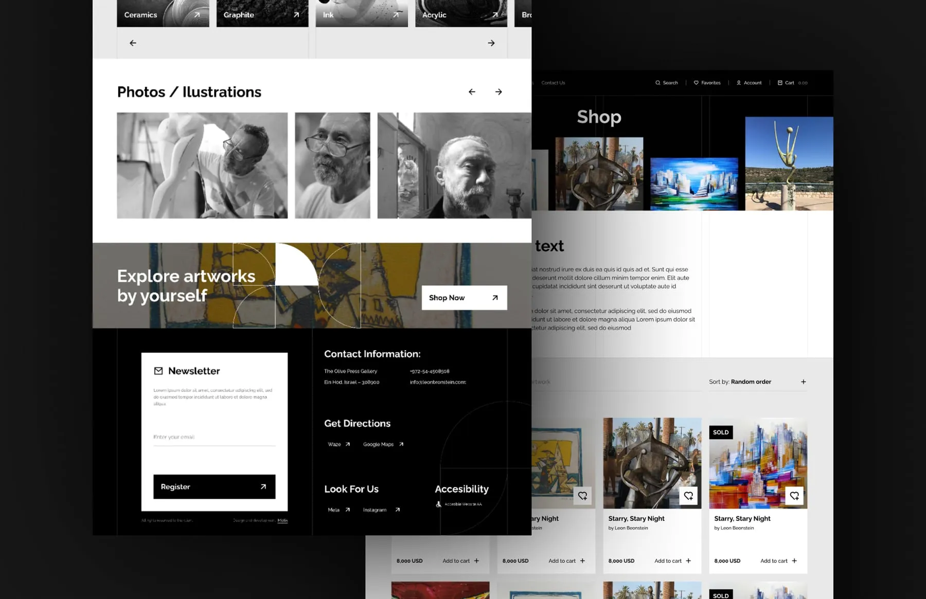
We delivered a redesigned online store with desktop and mobile layouts. The gallery can now present its artists, exhibitions and works in one consistent frame. Visitors browse by medium or by artist, read the full details of a piece and add it to the cart. Contact details, directions and a newsletter sign-up sit in the footer of every page.
- Home page and shop with categories
- Artwork pages
- Artists section
- Exhibitions archive
- Cart with coupon field
- Mobile layouts
“They were proactive in addressing any issues and kept our site secure and up to date at all times. Their expertise and professionalism have been invaluable to our business.”