Branding · Construction & resort development · Ukraine
Ecobud Berghaus.
A developer's logo that is a house, a mountain and a fir tree at once
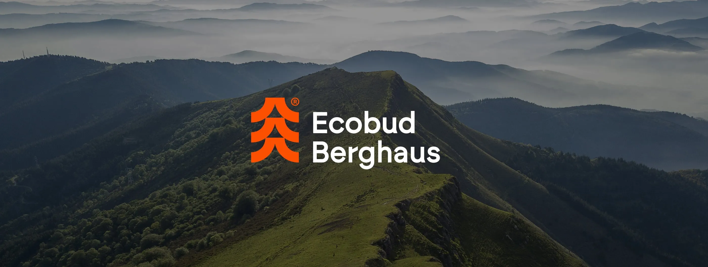

Ecobud Berghaus builds homes and resort property in the Carpathian mountains. The company works in two worlds at once: construction, where buyers want proof of solidity, and leisure, where they want to picture a quiet life among trees. It needed a brand that could sell both on one billboard. Our job was to build that brand from the concept up: the mark, the colours, the voice on the street and the rules that hold it all together.
- Logo and brand mark
- Colour system
- Brandbook
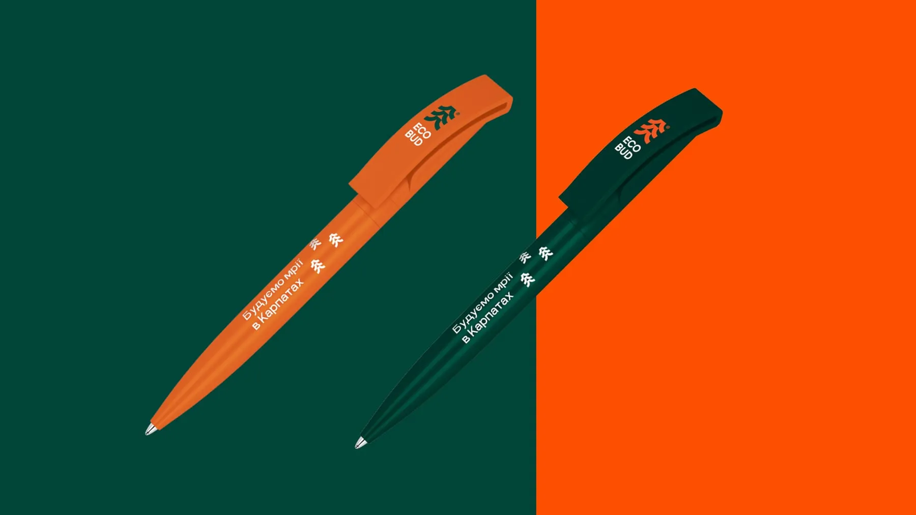
- Stationery and merchandise
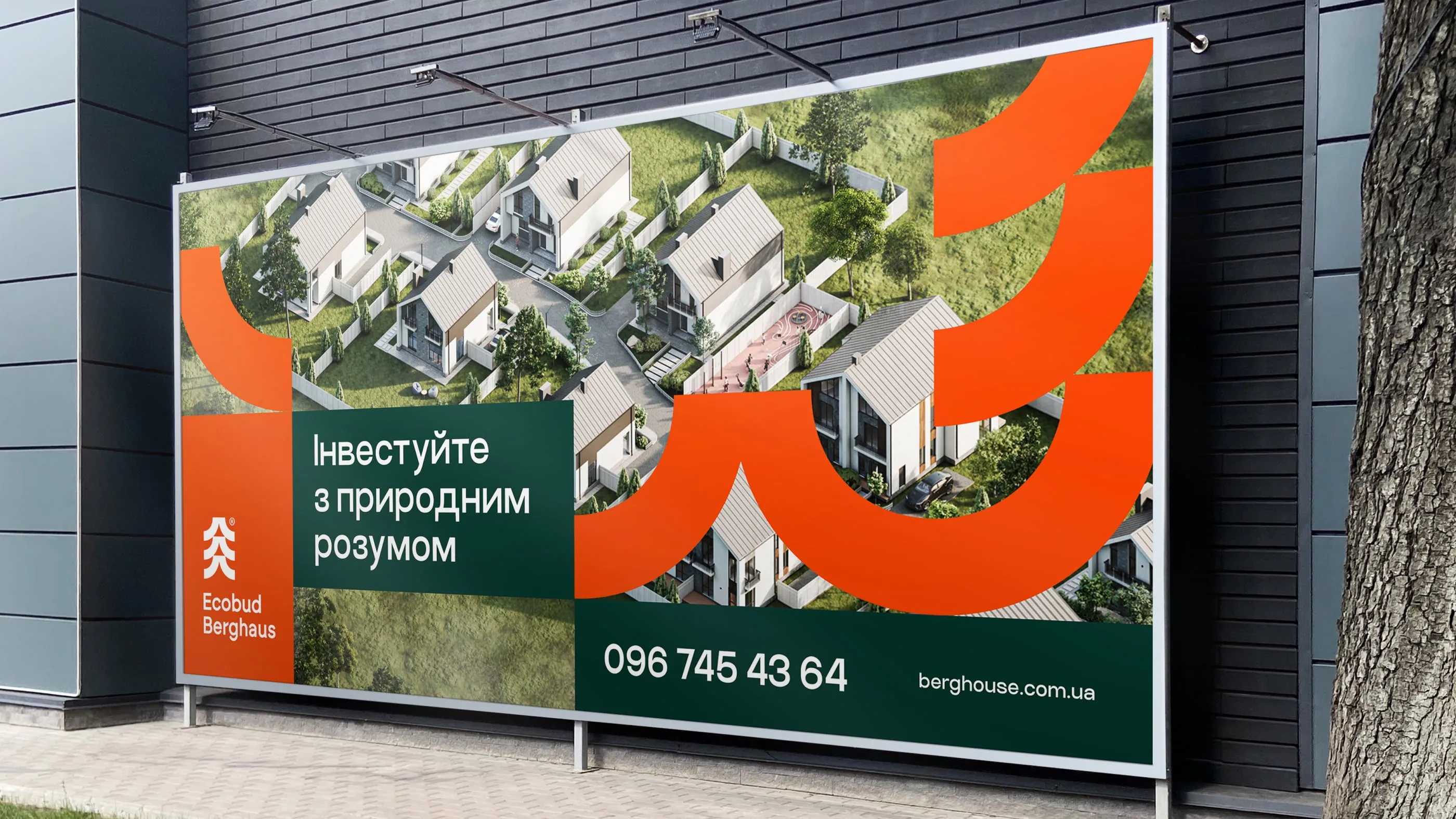
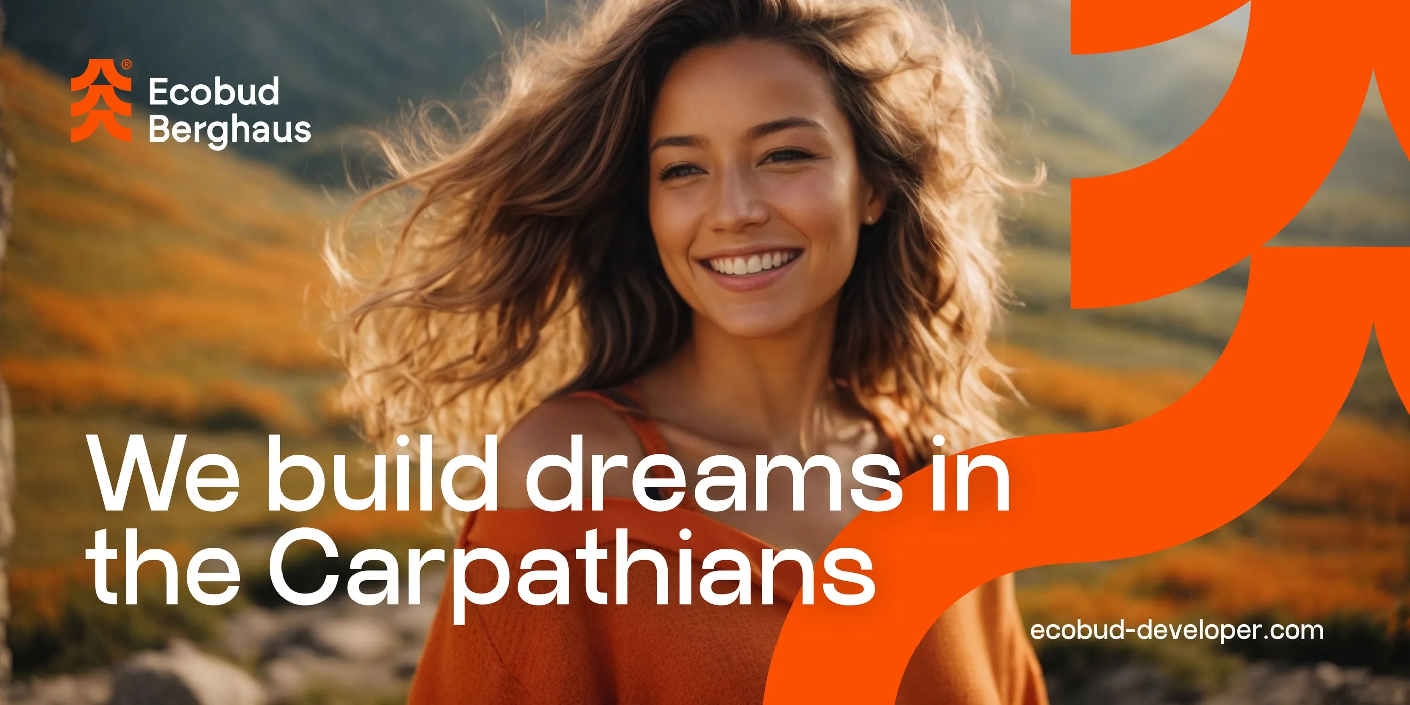
- Outdoor and campaign layouts
Construction brands tend to look heavy and interchangeable. Resort brands tend to look soft and vague. Ecobud Berghaus needed to stand apart from competitors in the building industry while still promising a calm life in nature. One identity had to carry an investment pitch, a site hoarding and a branded shopping bag without changing its character.
- 01 — Two audiences
Investors and future residents read the same signs but look for different reasons to trust them.
- 02 — Crowded category
Developer branding is full of generic roofs and blue gradients that nobody remembers.
- 03 — Many surfaces
The system had to work on uniforms, flags, stationery, billboards and building-site banners.
One mark, three ideas
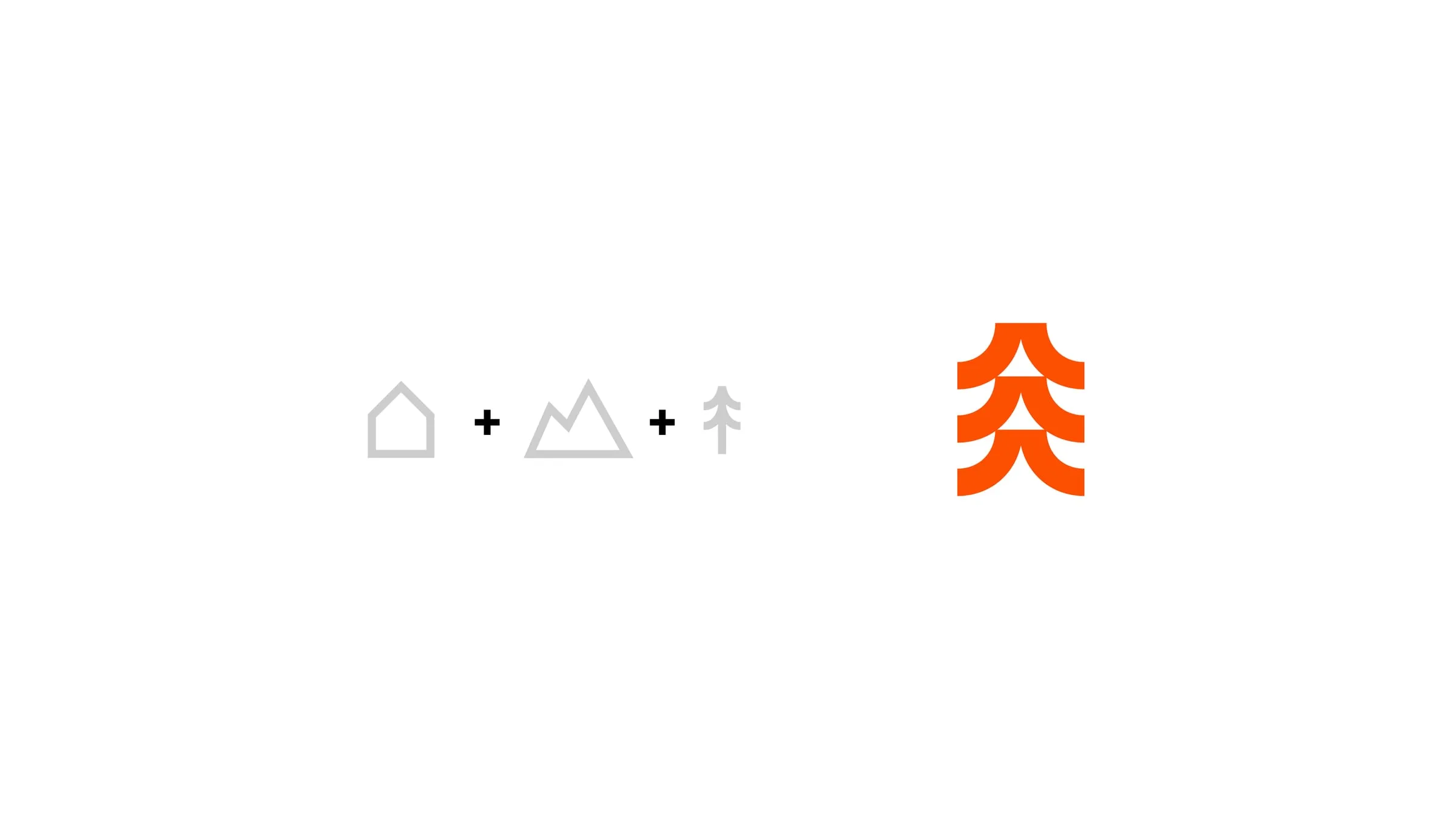
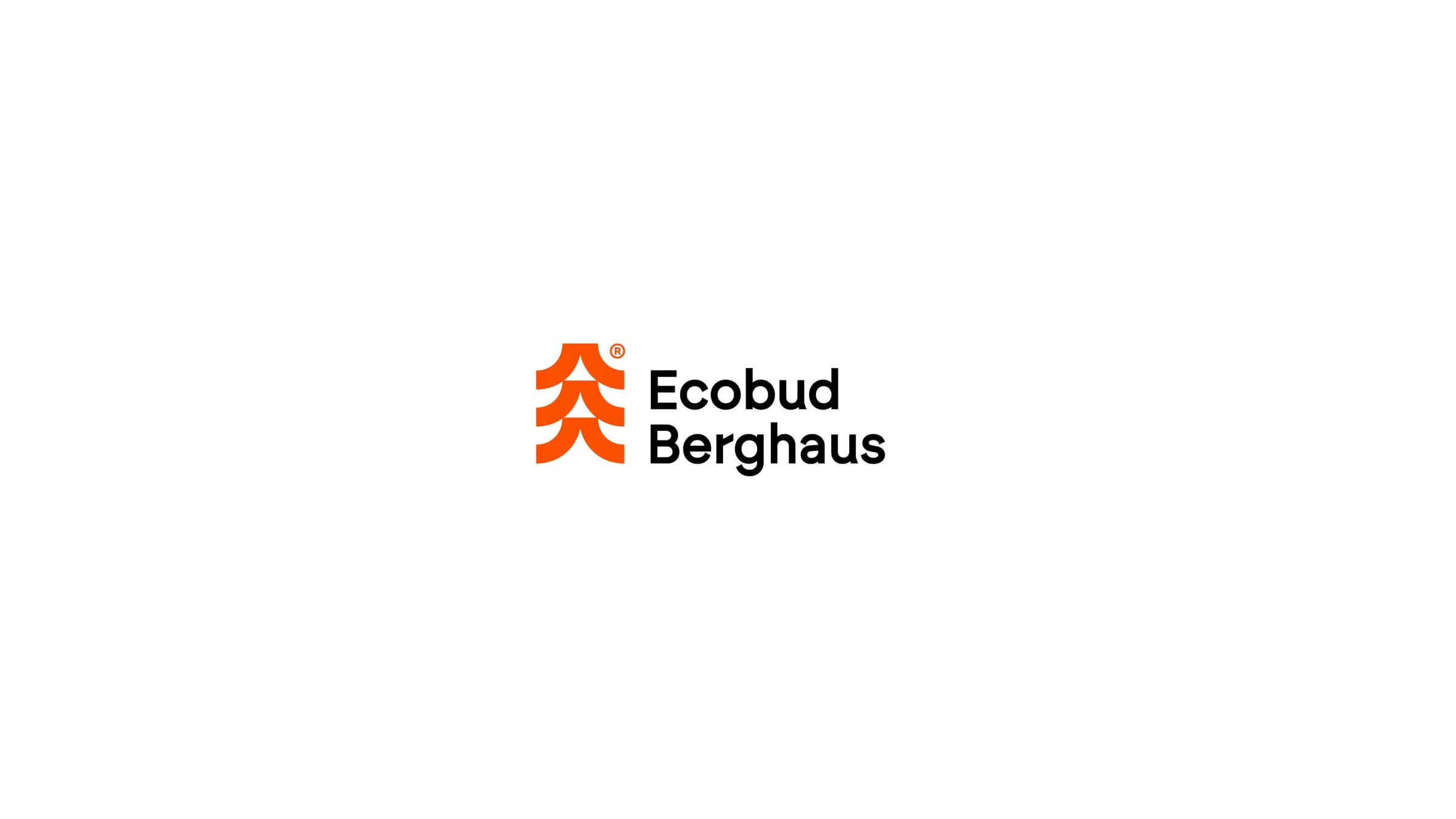
We started from what the company actually sells: a house, in the mountains, among the trees. Instead of placing three icons side by side, we fused them. The mark is a stack of arcs that reads as a fir tree, a pitched roof and a mountain ridge, depending on how you look at it. It stays legible at pin size and holds a full flag on its own.
Two colours with a job each
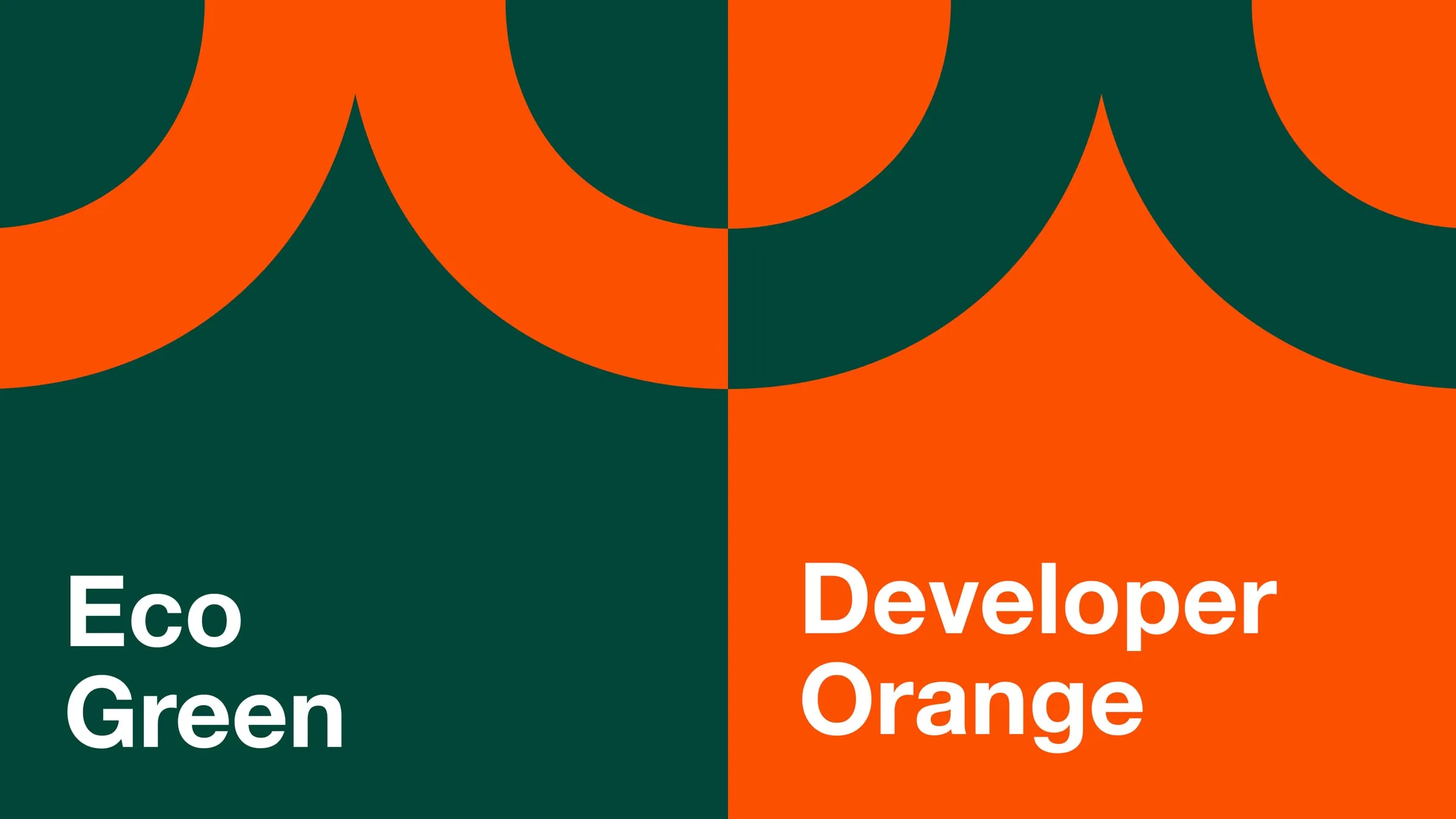
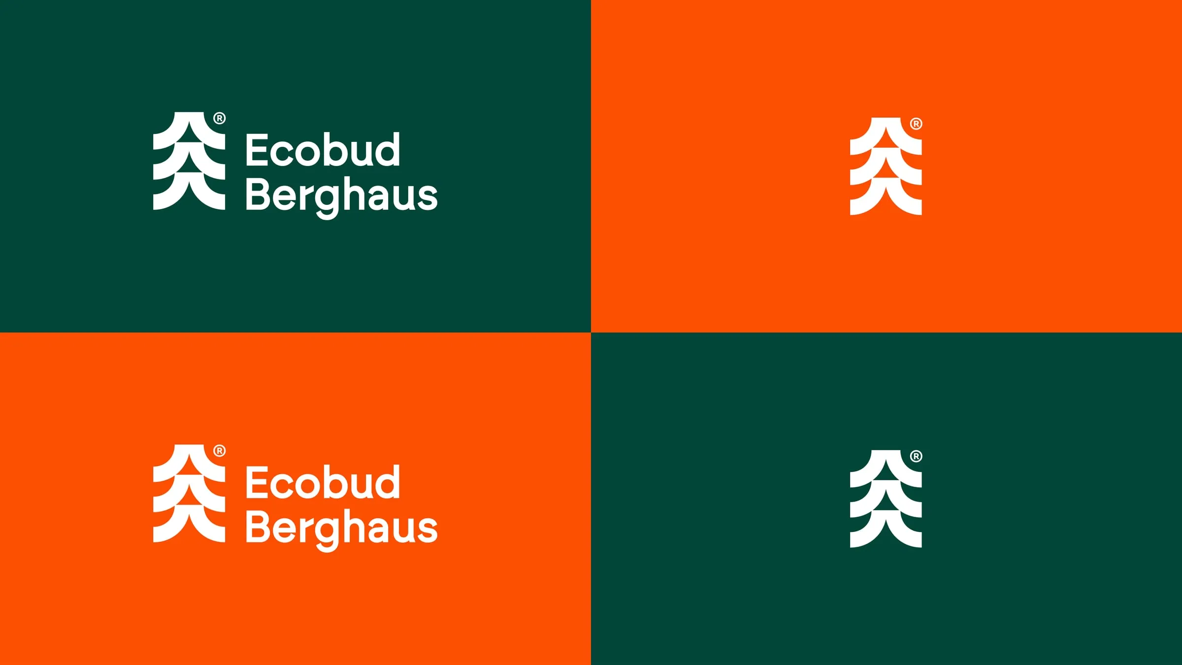
We kept the palette to two colours and gave them names that explain their roles. Eco Green is the forest: deep, calm, the ground for most layouts. Developer Orange is the builder's signal: the colour of site safety, energy and momentum. Together they are hard to confuse with anyone else in the market, and the logo works in either colour on the other.
The mark becomes the layout
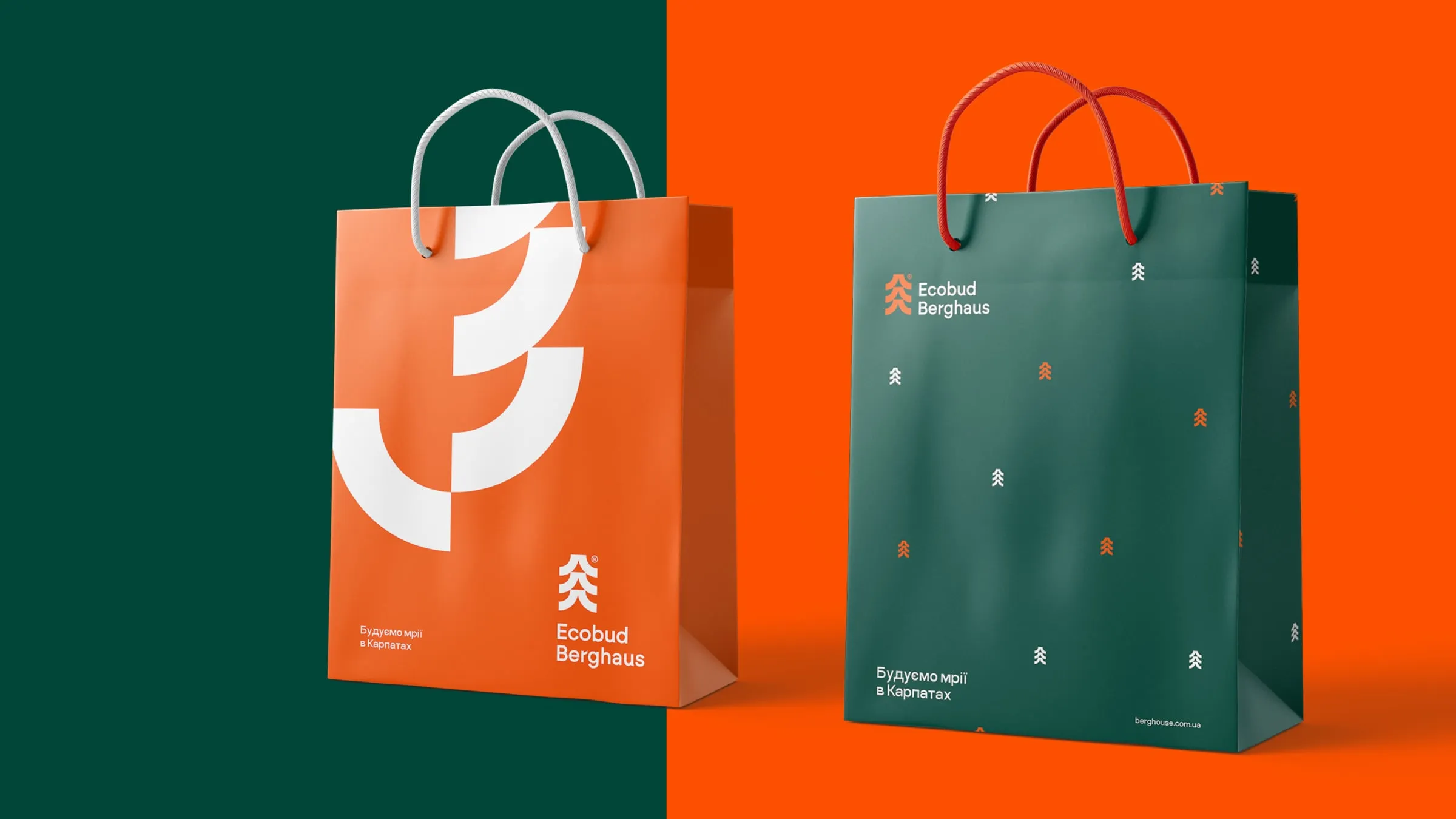
We cut the arcs of the logo out and scaled them up into a supergraphic. On a shopping bag, a presentation folder or a billboard, a single oversized fragment is enough to say Ecobud Berghaus before anyone reads the name. For quieter surfaces we built a pattern of small tree marks scattered across the green, like a forest seen from above.
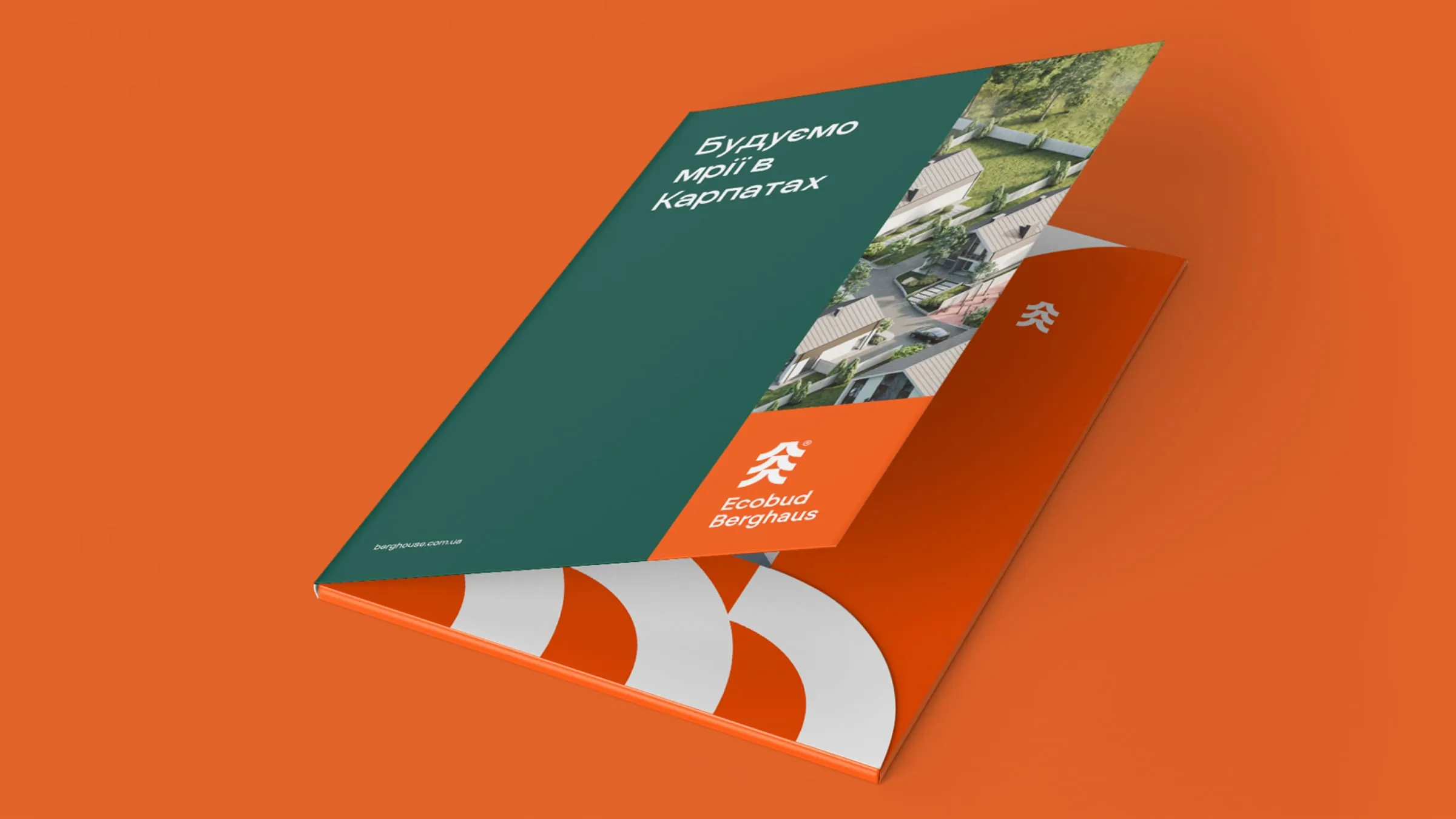
Headlines that sell a way of living
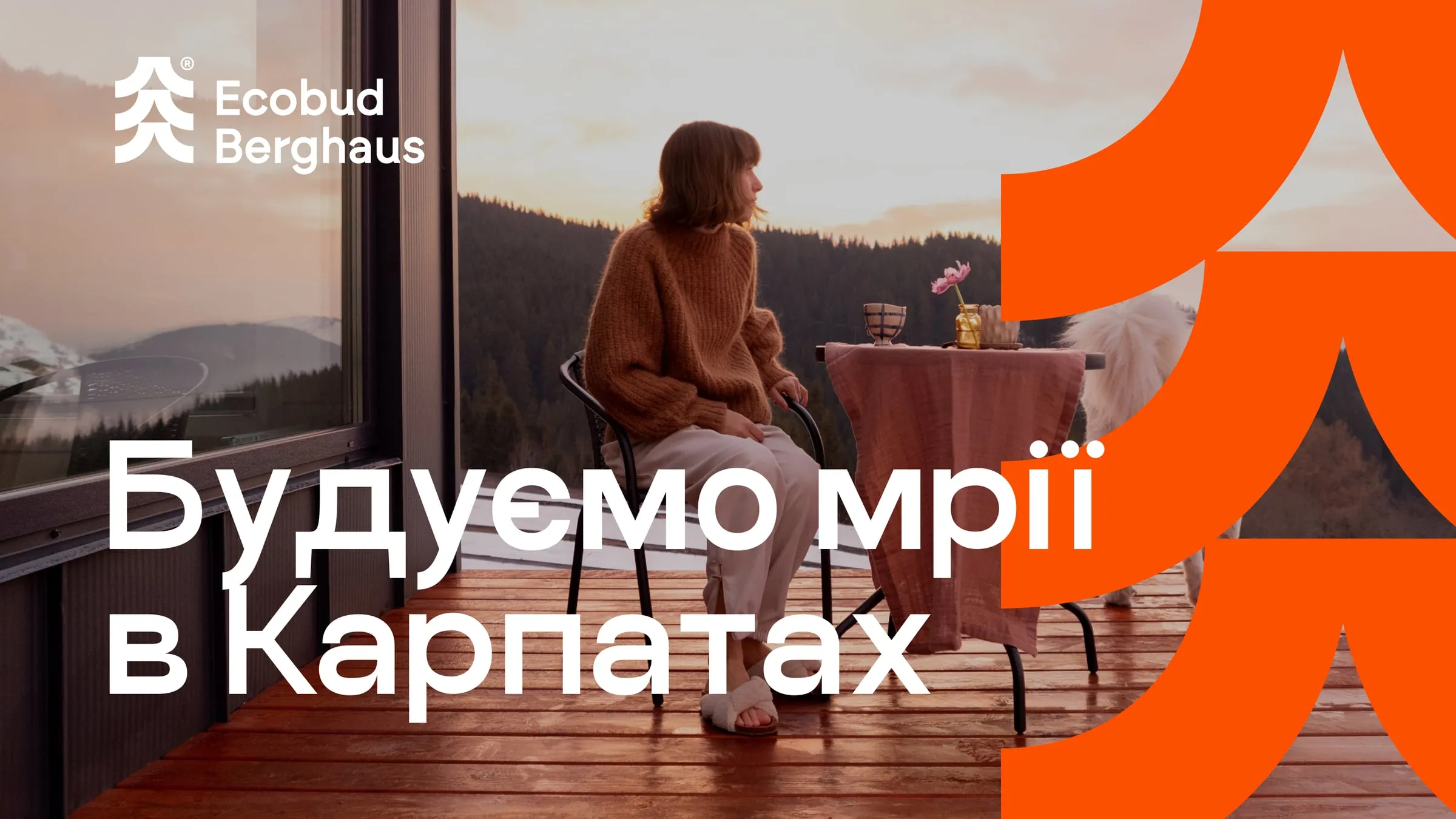
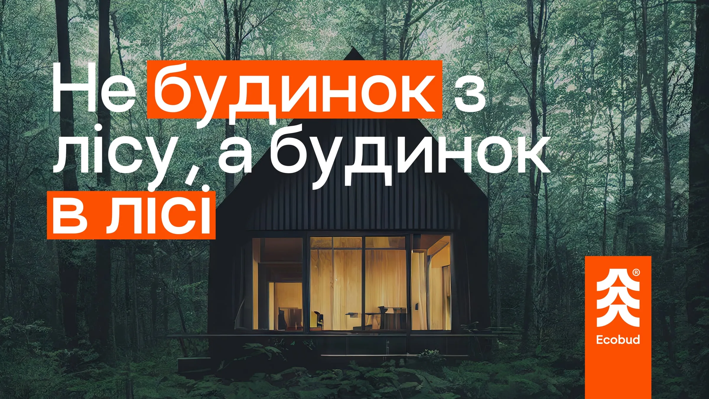
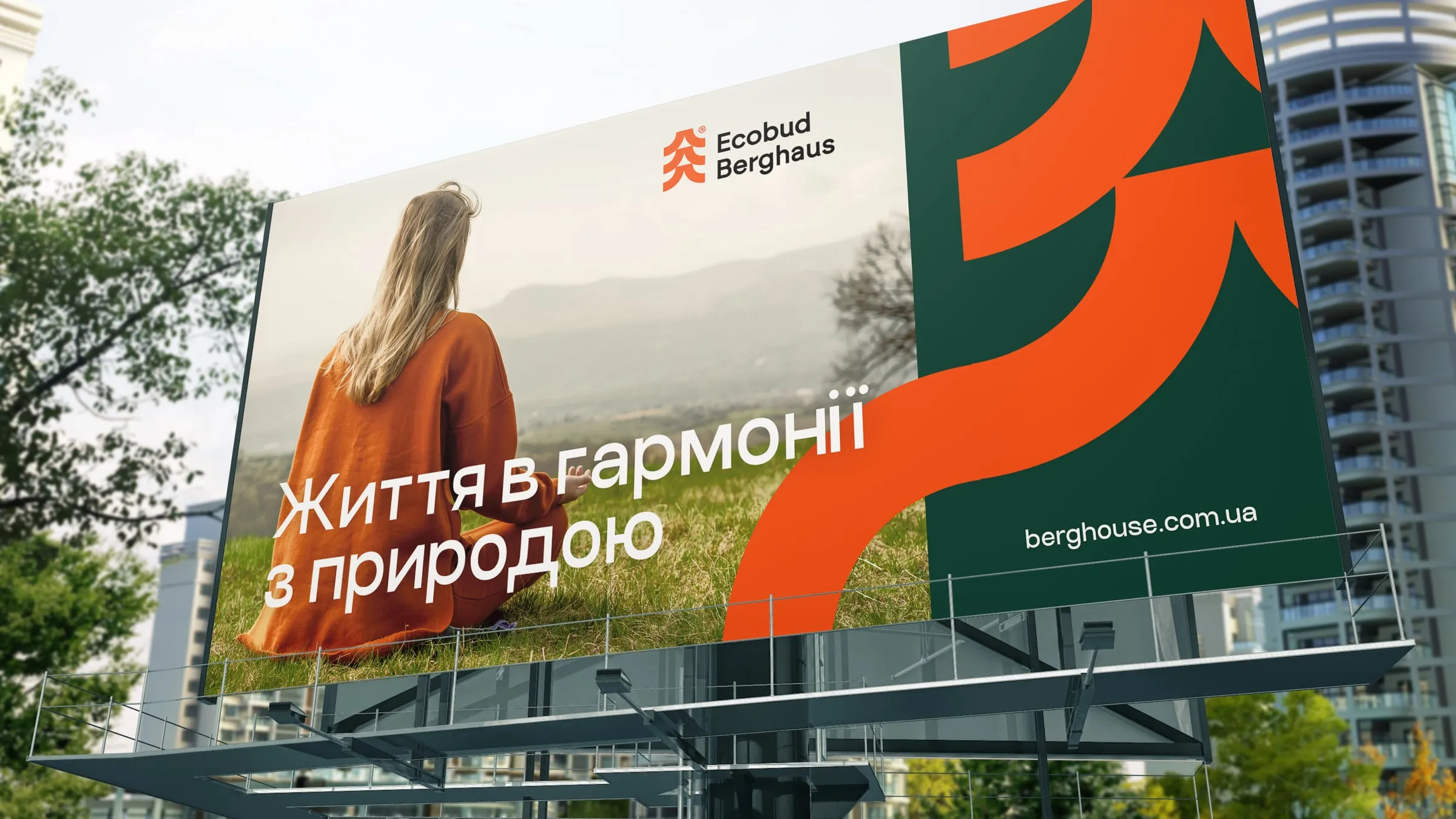
The campaign layouts pair warm mountain photography with short Ukrainian lines: "We build dreams in the Carpathians", "Life in harmony with nature", "Invest with natural sense". One line plays on words: not a house made of forest, but a house in the forest. We highlighted key words in orange so the message lands from across the road.
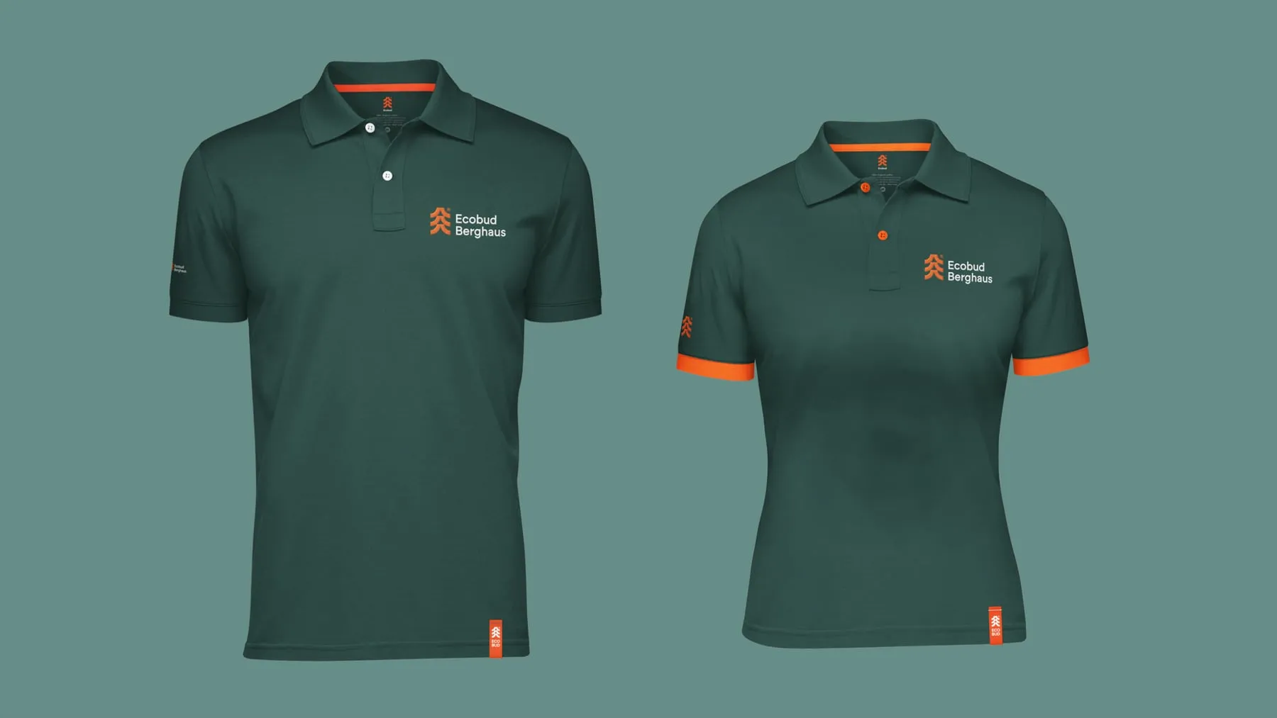
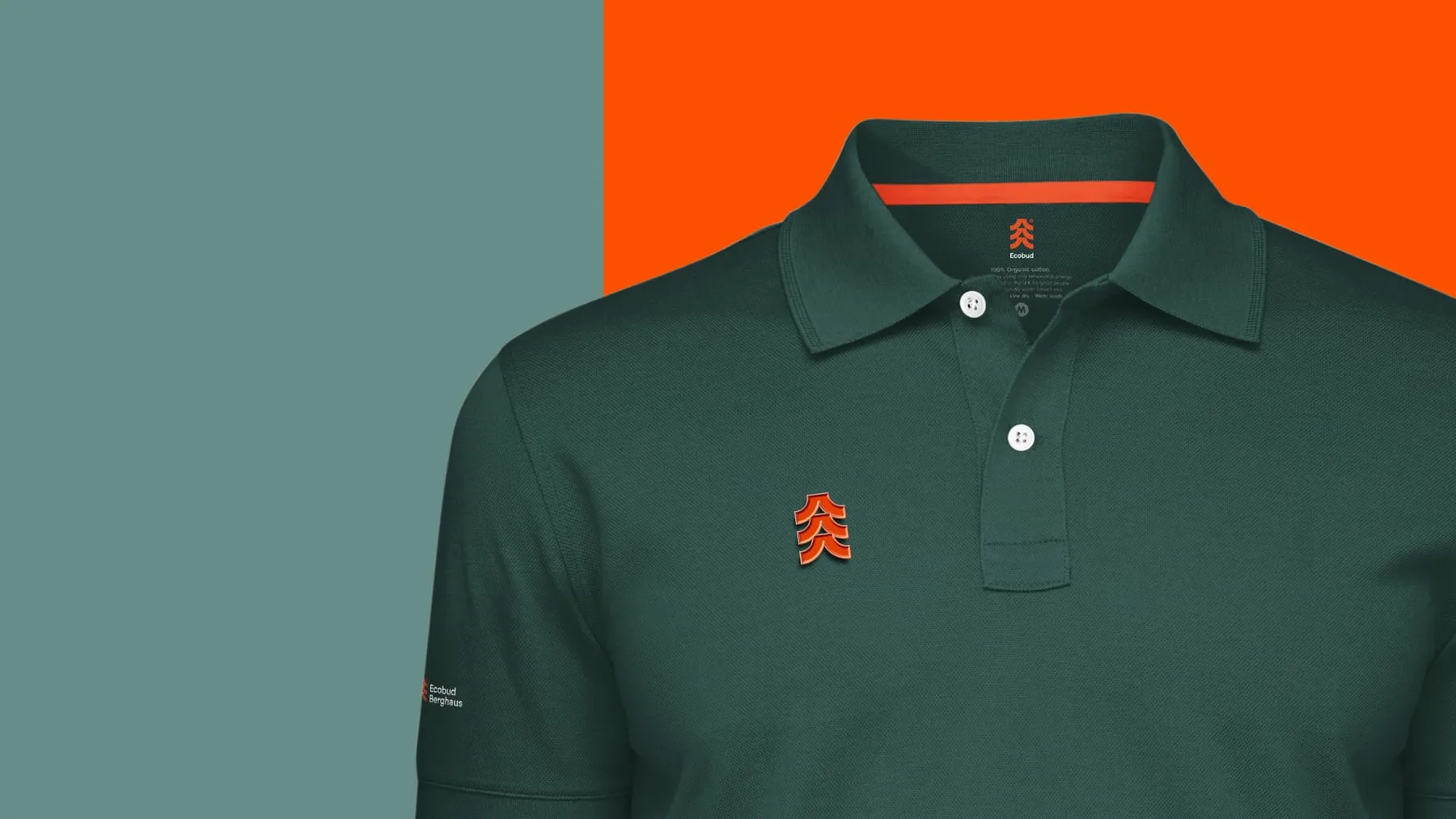
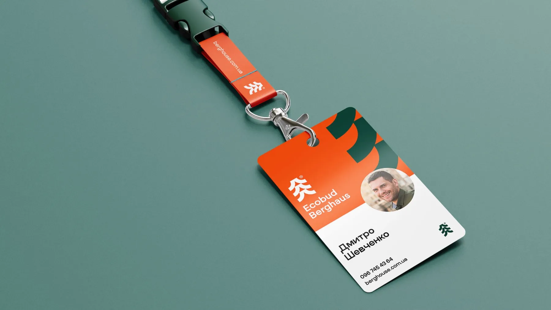
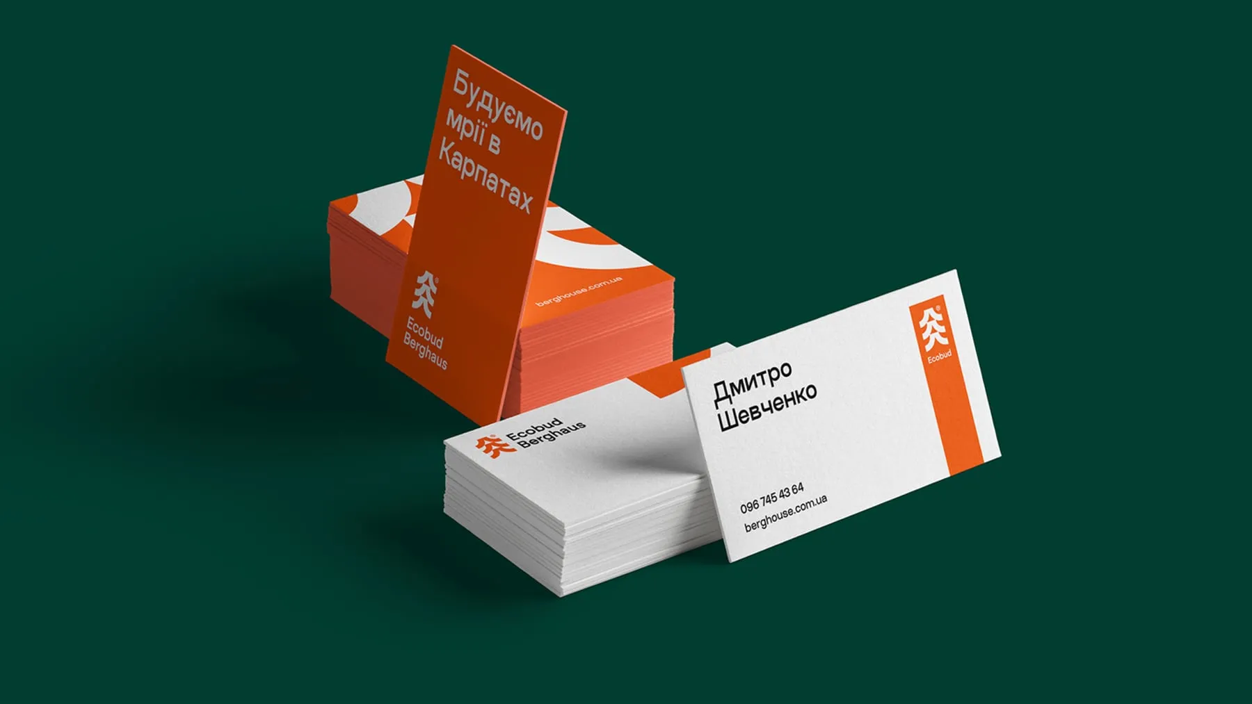
Ecobud Berghaus received a complete identity and a brandbook that explains how to use it. The team can now dress a sales office, a building site and a staff member in the same language, and brief any printer or agency without starting from zero. The mark, the two colours and the supergraphic give every new piece a clear starting point.
- Logo and brand mark
- Eco Green and Developer Orange palette
- Supergraphic and tree pattern
- Brandbook
- Stationery, uniforms and merchandise
- Billboard and hoarding layouts