E-commerce · Fashion retail · Poland
VINTAG.
A multi-brand fashion store where the clothes do the talking
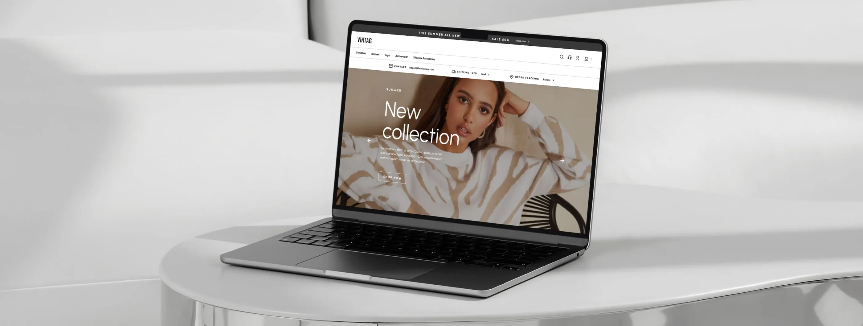
VINTAG is a multi-brand online store for womenswear in Poland. It carries dresses, tops, swimwear, knitwear and sets from different labels, which means a large, changing catalogue and shoppers who mostly arrive on a phone. The client asked us to design the store with two priorities: make choosing and buying easy, and make it look good enough that people want to browse. We designed the full shopping path, from home page to cart, on desktop and mobile.
- Home page
- Category page with filters
- Product page
- Mobile menu
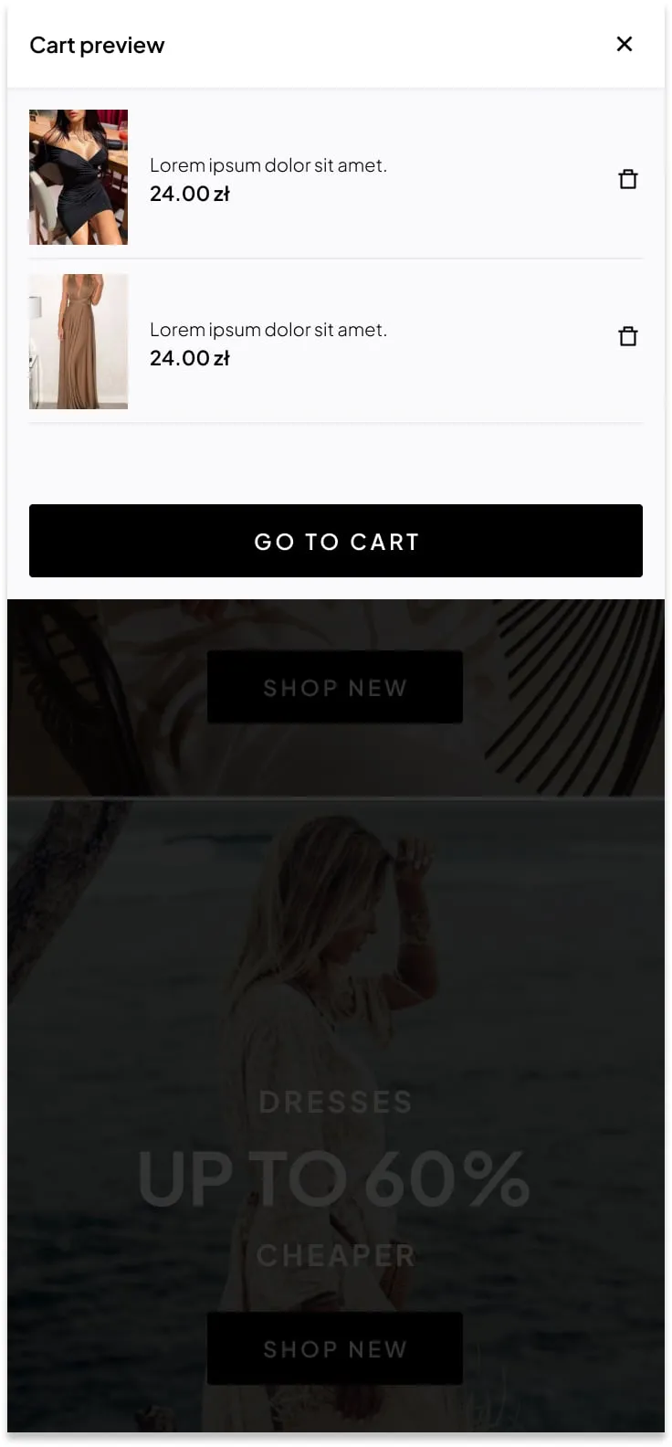
- Cart preview
- Mobile layouts
A multi-brand catalogue grows fast and gets messy. Shoppers need to narrow hundreds of dresses down to a few in seconds, on a small screen, without losing the pleasure of looking. At the same time, the store competes with big fashion platforms on trust: sizes, delivery and returns have to be clear before the shopper hesitates.
- 01 — Big catalogue
Hundreds of items across many categories had to stay easy to filter and compare.
- 02 — Mobile first
Navigation, product choice and cart all had to work comfortably on a phone.
- 03 — Purchase doubts
Size, shipping and returns questions had to be answered on the product page itself.
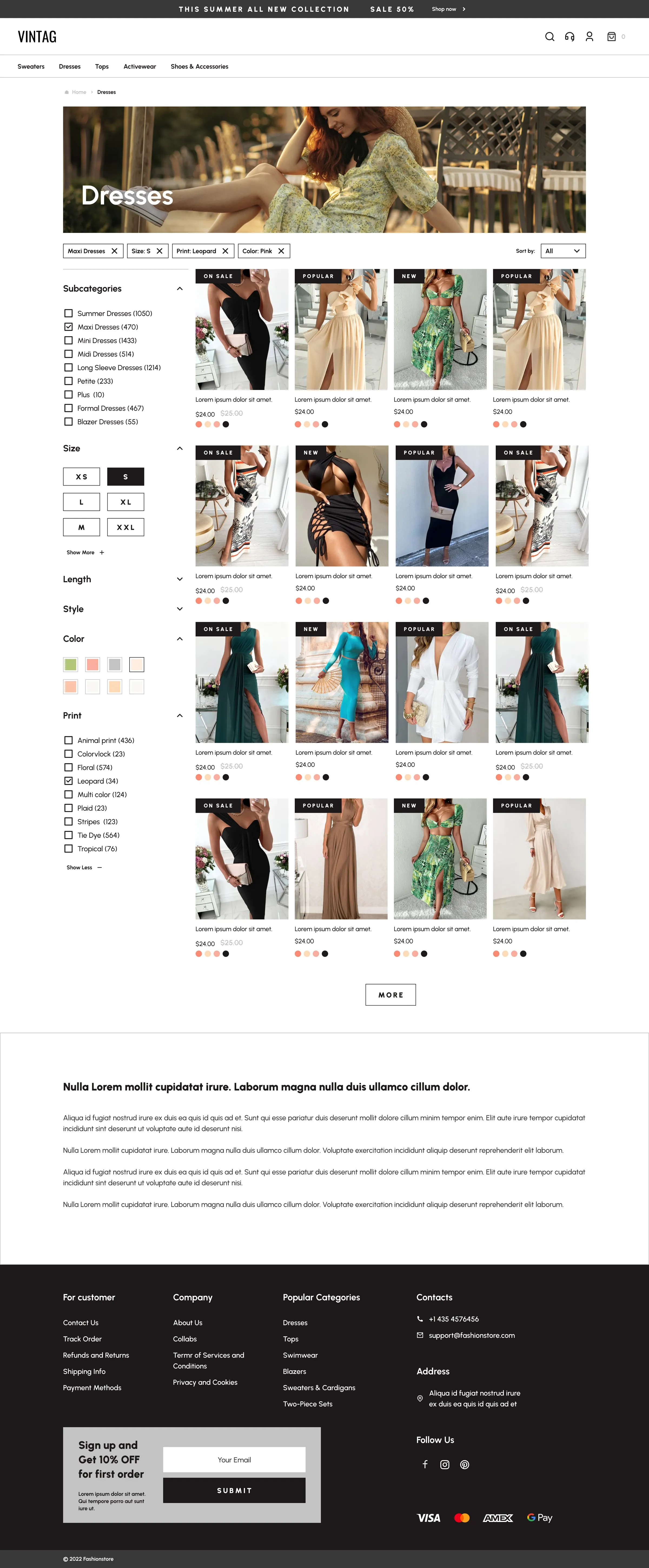
Filters you can see and undo
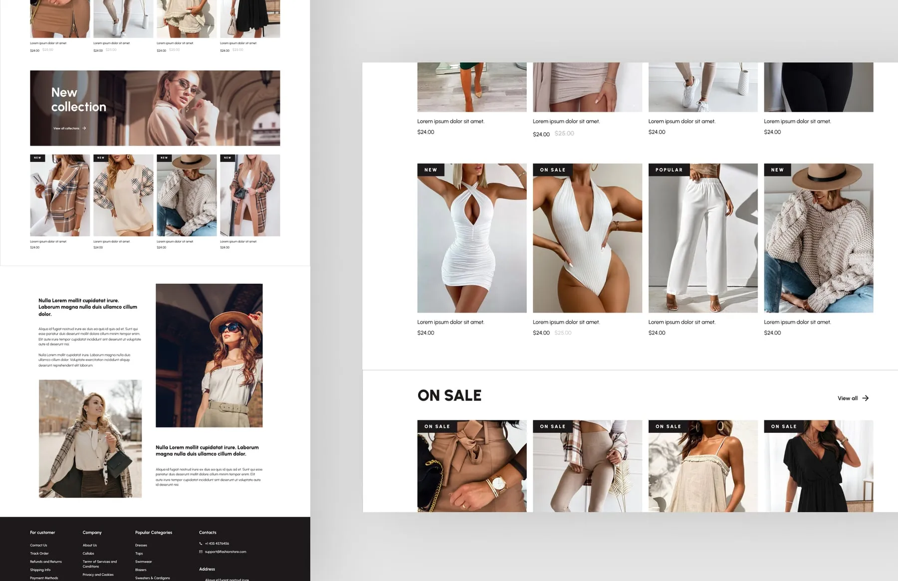
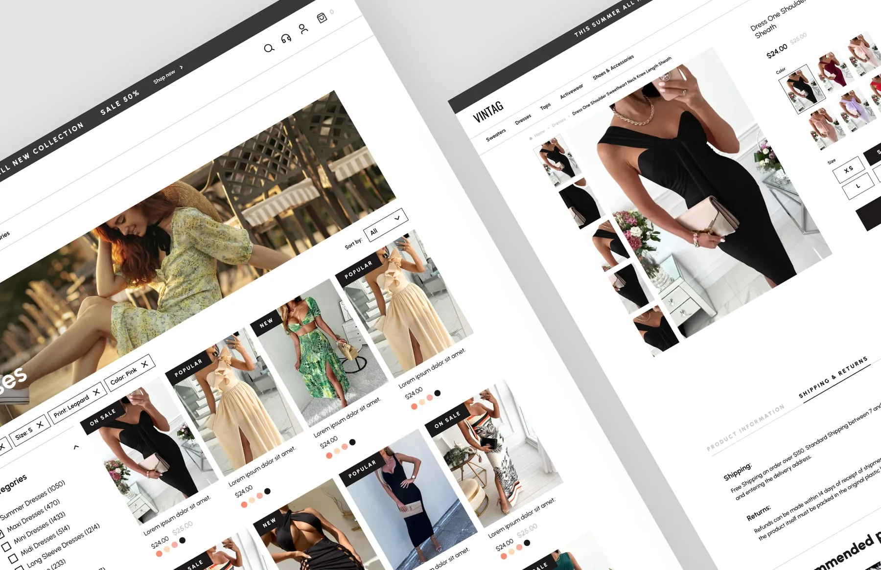
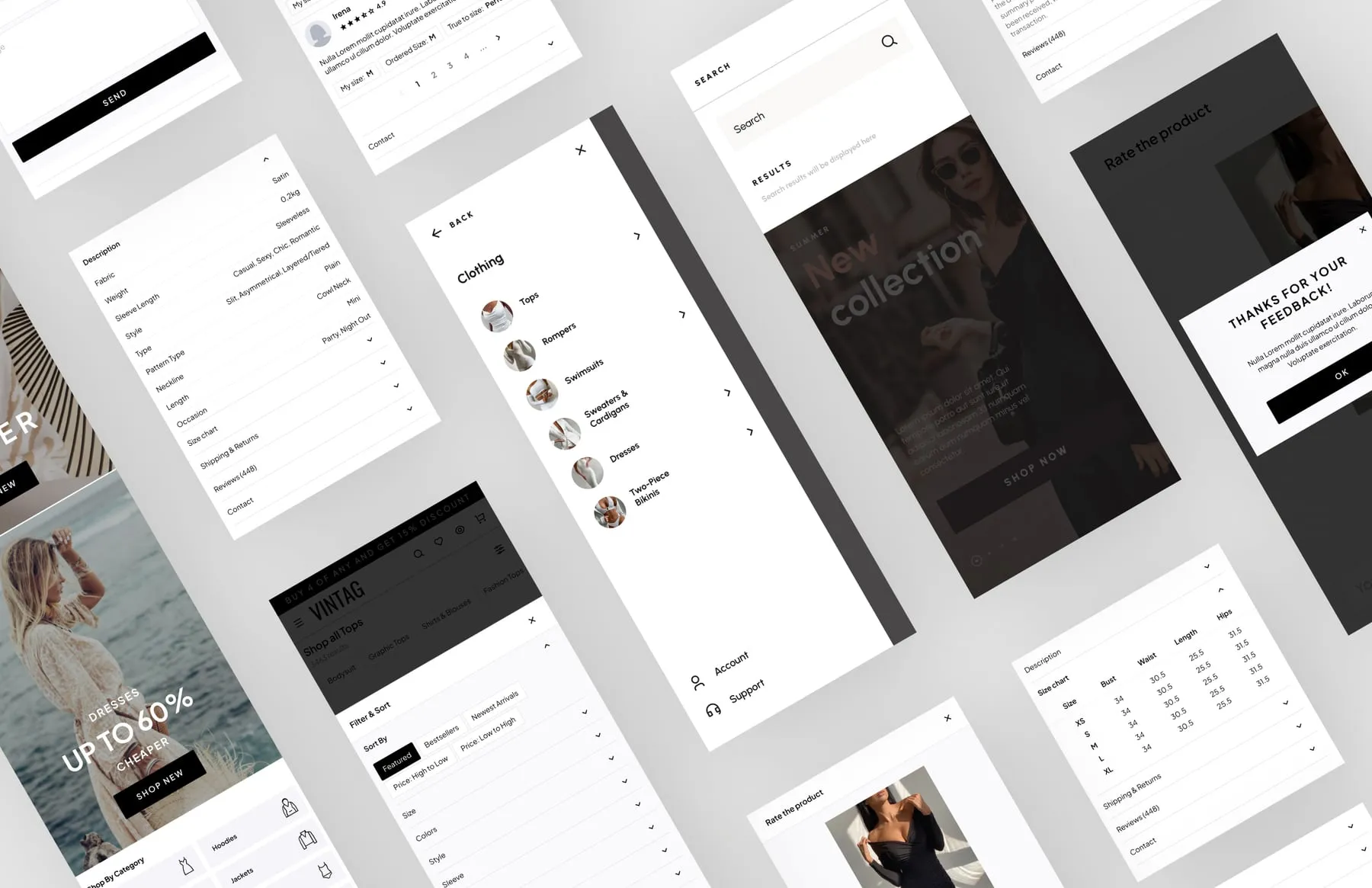
On the category page we put the filters where the eye already is. Desktop gets a sidebar with subcategories and item counts, size buttons, length, style and colour. Every active filter appears as a removable chip above the grid, so a shopper always knows why she sees what she sees. Product cards carry New, On sale and Popular labels and colour dots, so the grid works as a shortlist.

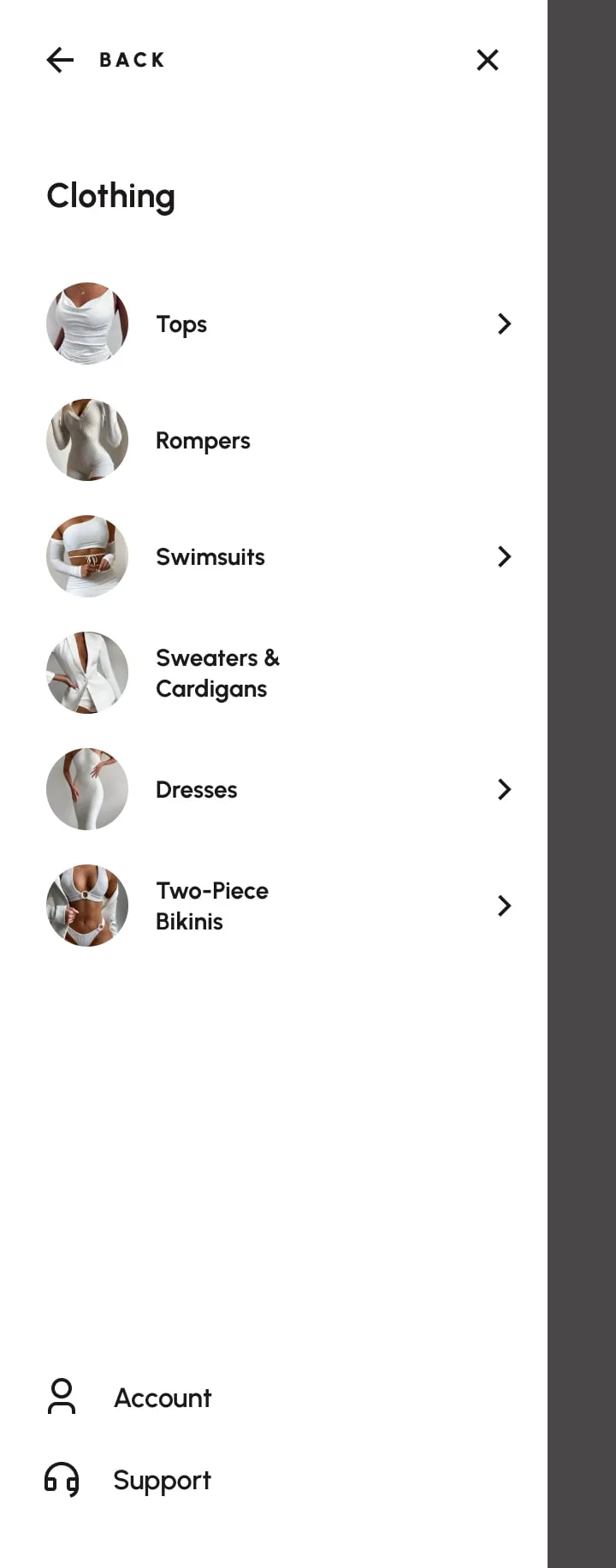
A menu that shows the clothes
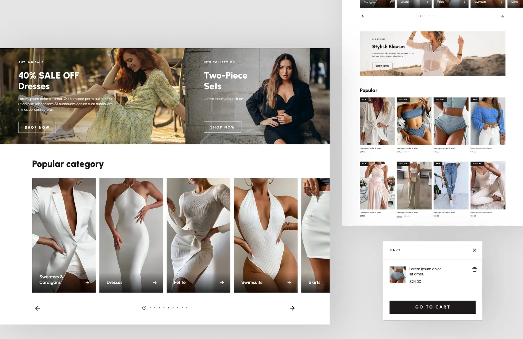
Category names alone are slow to scan. In the mobile menu each category has a small photo next to its name, so Tops, Rompers, Swimsuits and Dresses are recognised at a glance. Account and support sit at the bottom, within reach of the thumb. On desktop the home page opens with a large seasonal banner, coupon blocks and category tiles that lead straight into the catalogue.

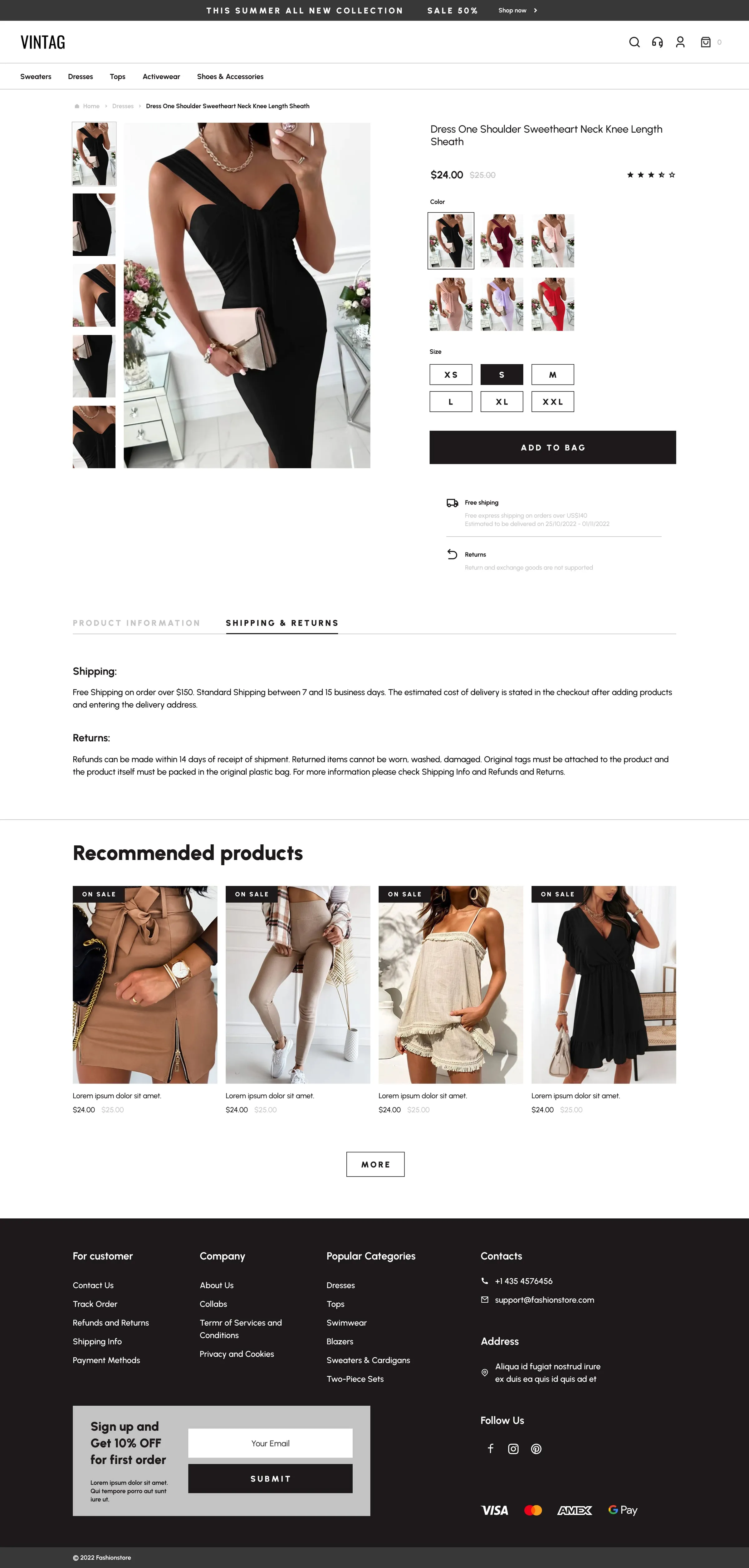
A product page that answers the next question
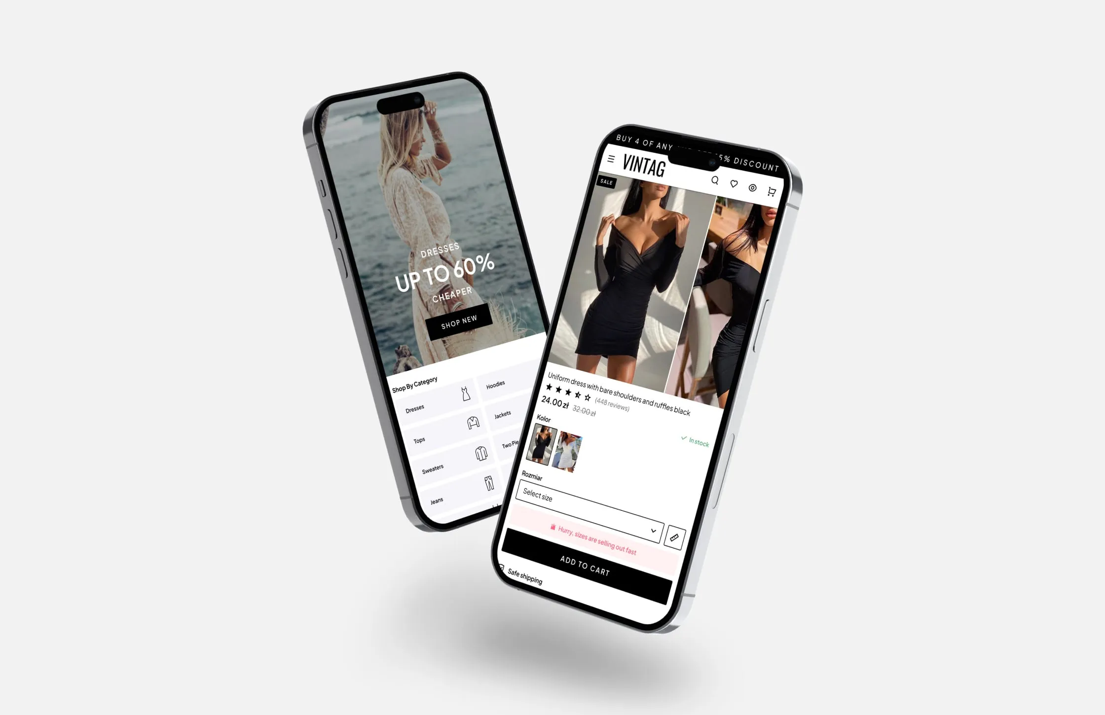
We designed the product page around the doubts that stop a purchase. Large photos and a thumbnail strip come first, then colour swatches as images and size as buttons. Directly under the add-to-cart button sit short promises on shipping, returns and customer satisfaction, followed by collapsible sections for description, size chart, shipping and reviews. A gentle low-stock note adds urgency without shouting.

Localised for the Polish shopper
The VINTAG mobile screens use prices in złoty and Polish labels for colour and size. The cart opens as a preview panel over the page, so adding an item never throws the shopper out of browsing. A slim black bar at the top carries the current offer. The interface itself stays black, white and grey, so the product photography supplies all the colour.

VINTAG received a complete, responsive store design covering every step from first visit to cart. Shoppers can narrow a large catalogue with visible filters, check sizes, delivery and returns on the product page, and add items without leaving the page they are browsing. The neutral interface lets the store add new brands and seasons without redesigning anything.
- Home page with seasonal banners and coupons
- Category page with filters and chips
- Product page with size, colour and delivery info
- Mobile menu with visual categories
- Cart preview panel
- Responsive layouts for desktop and mobile