Print & AI · Handmade ceramics
GLINA.
A season of photos, scenes and copy for a ceramics studio that cannot book a shoot

GLINA is a two-person studio that throws stoneware by hand and sells it through its own shop and on Instagram. Every season brings around two dozen new pieces, and each launch needs product photos, scenes, a campaign and descriptions in three languages. A studio this size cannot hire a photographer, a stylist and a copywriter four times a year. We built the identity and a content system that does that work with them, from the first brief to the last post.
- Logo, identity, stationery and packaging
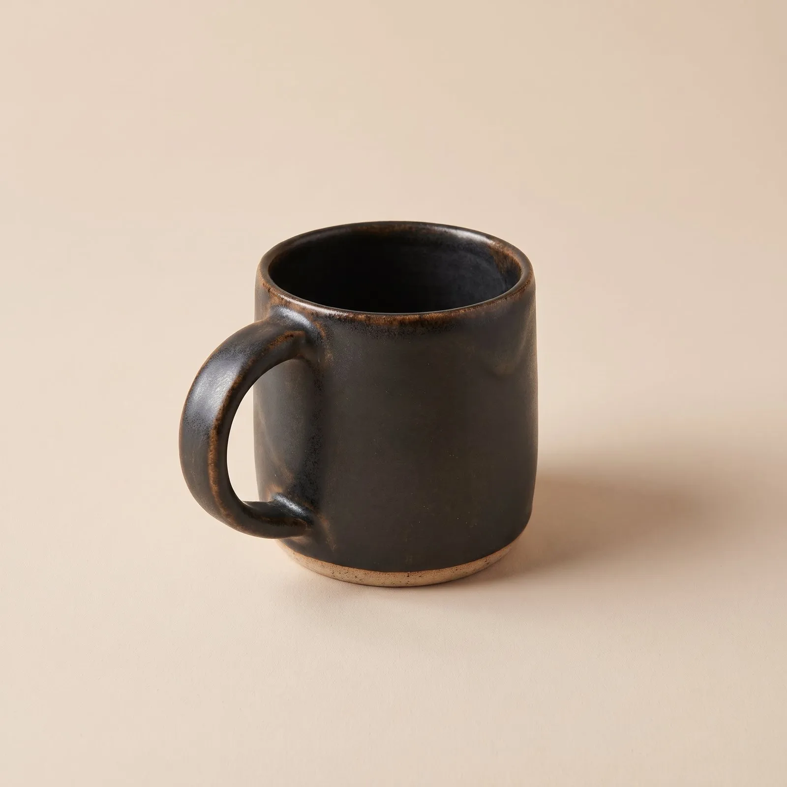
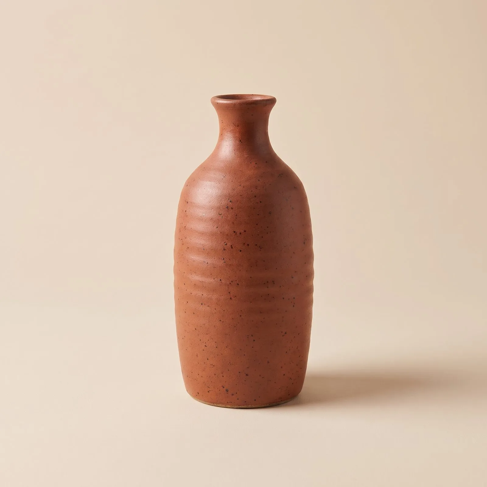
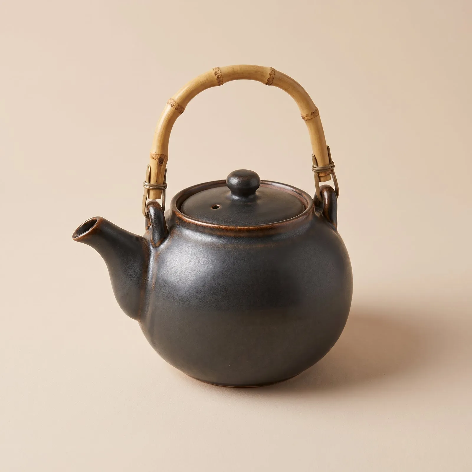
- Product photos in one reference light
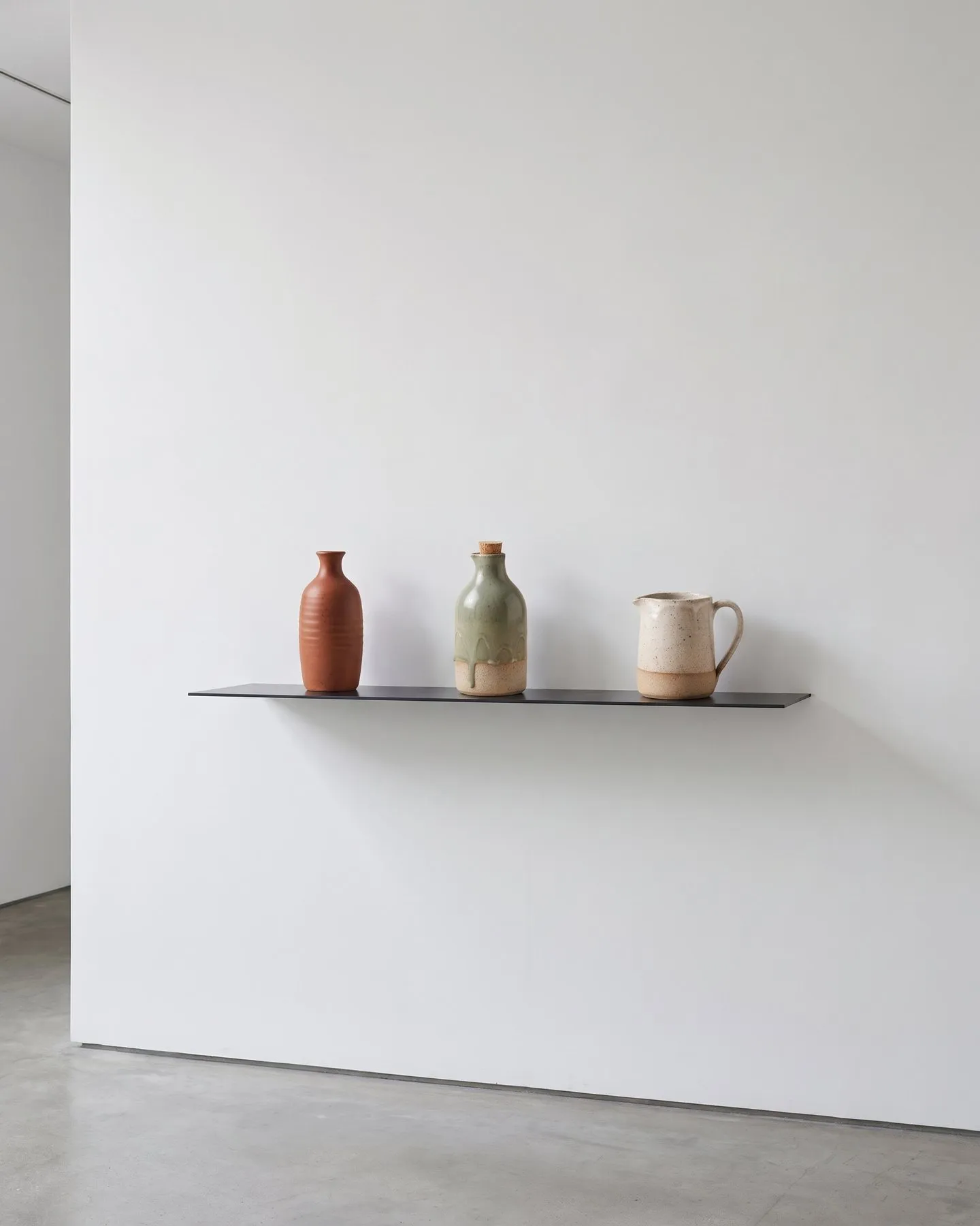
- Still-life scenes for the shop and feed
- Seasonal campaign in four formats
- Monthly feed plan and short reels
- Description assistant for three languages
Handmade pieces differ from batch to batch, and customers buy them for the glaze and the clay. The images have to show both as they are. The shop, the feed and the campaign are made weeks apart and still have to look like one brand. The people running the system are potters, so every step has to be simple enough to repeat without us.
- 01 — True to the glaze
Speckles, drips and raw rims are part of the product and stay in every image.
- 02 — Four launches a year
Each season needs a full set of photos, scenes and posts within a few weeks.
- 03 — Three languages
Descriptions go out in English, German and Ukrainian in the same voice.
A mark drawn from a bowl in section
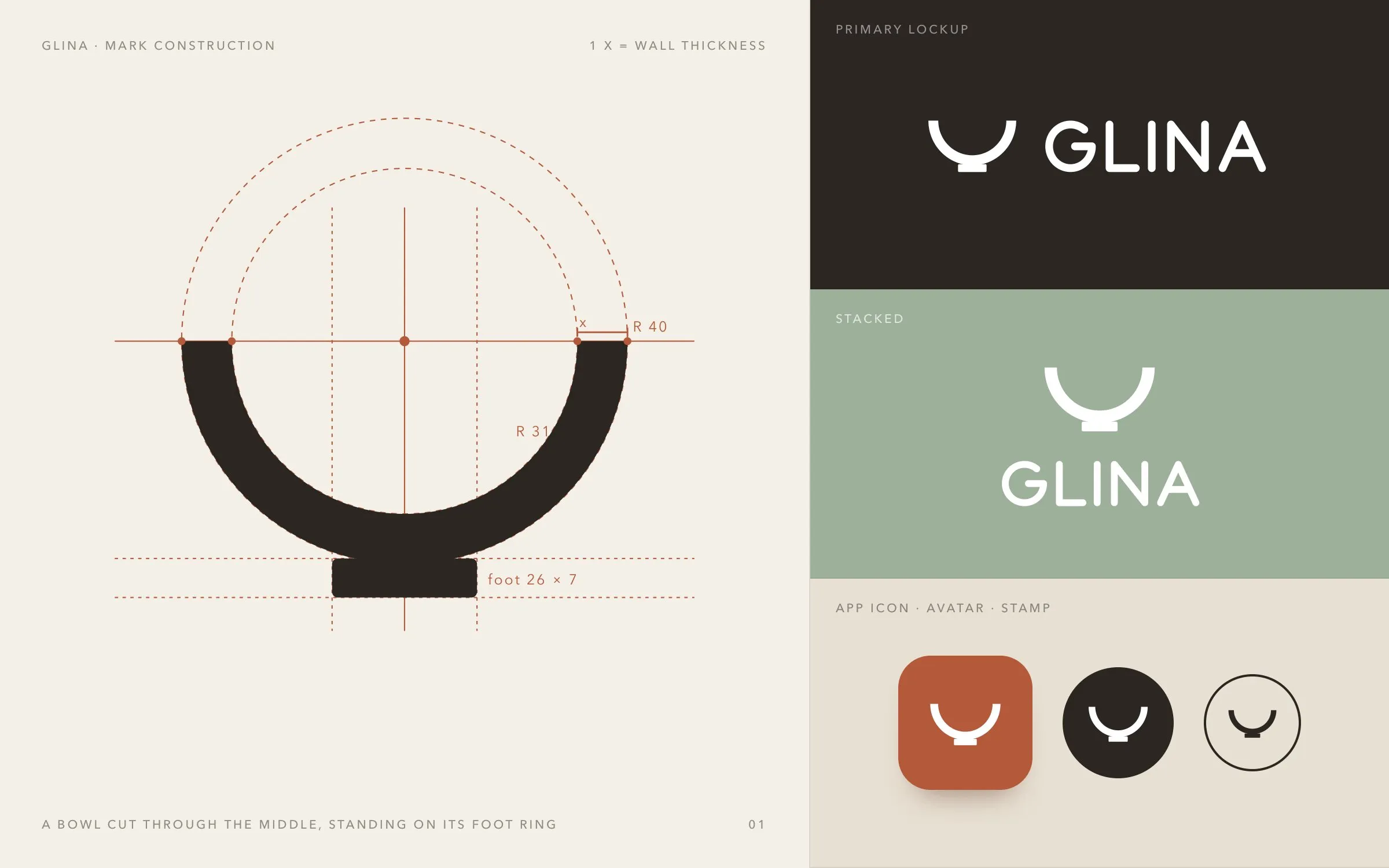
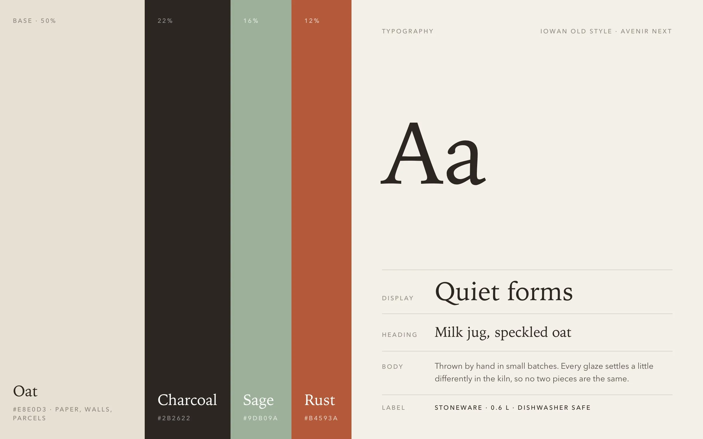
The mark is a bowl cut in half, the section a potter makes to check the thickness of a wall, standing on its foot ring. It is built from two circles one wall apart, so the line stays even from a sticker to a shop sign. Next to it sits a wordmark with round, even strokes. The four colours come from the glazes in the collection, with oat as the base and rust used sparingly. Iowan Old Style sets the headlines and Avenir Next the labels, prices and care notes.
One reference light for every piece
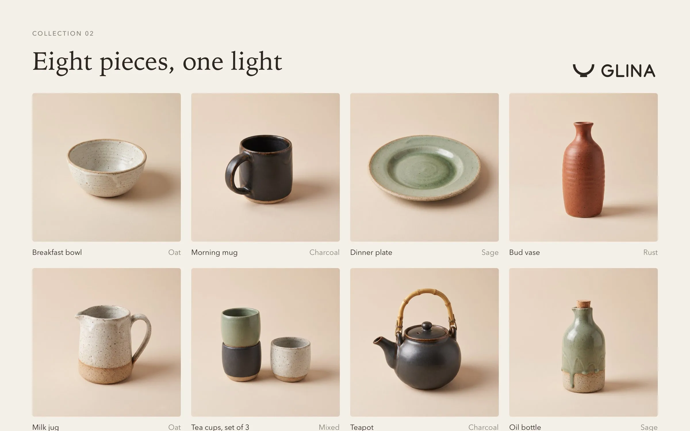
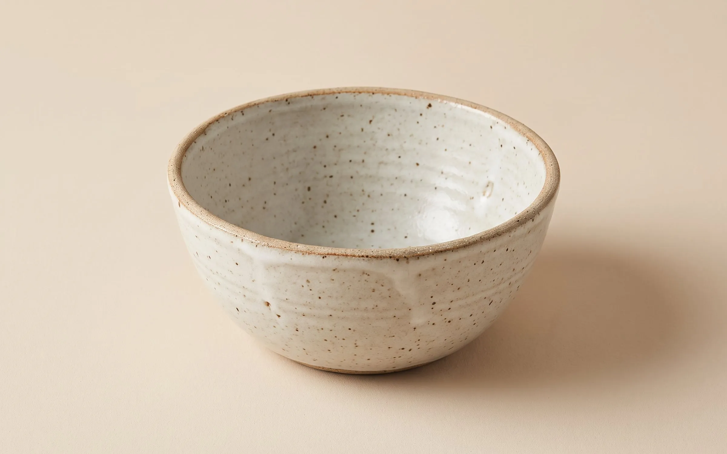
We started with a single photo of a bowl on an oat background, lit softly from the upper left. Every product shot after it uses that photo as a reference, so a mug from March and a vase from September sit side by side in the shop without a seam. In a live project the input is the studio's own phone photo of each piece, which keeps the glaze in the image the same as the glaze in the box.
Quiet architecture around every piece
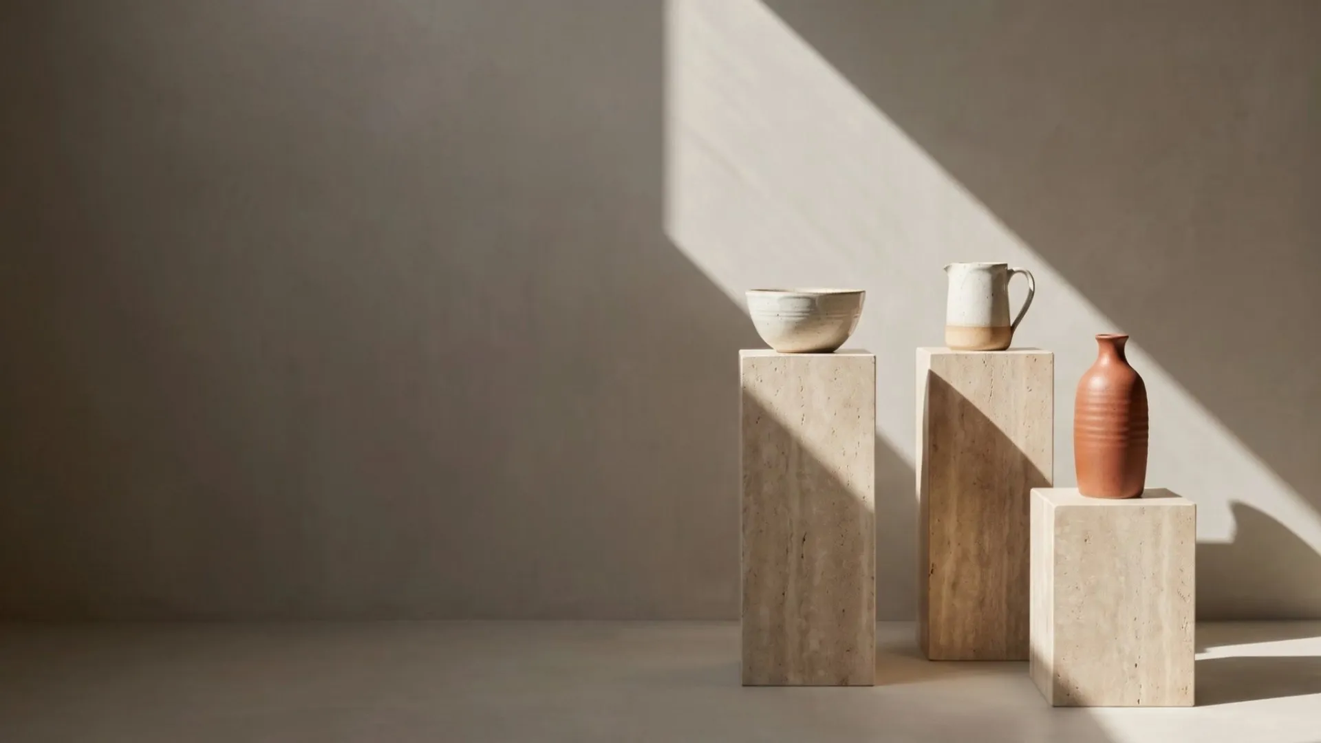
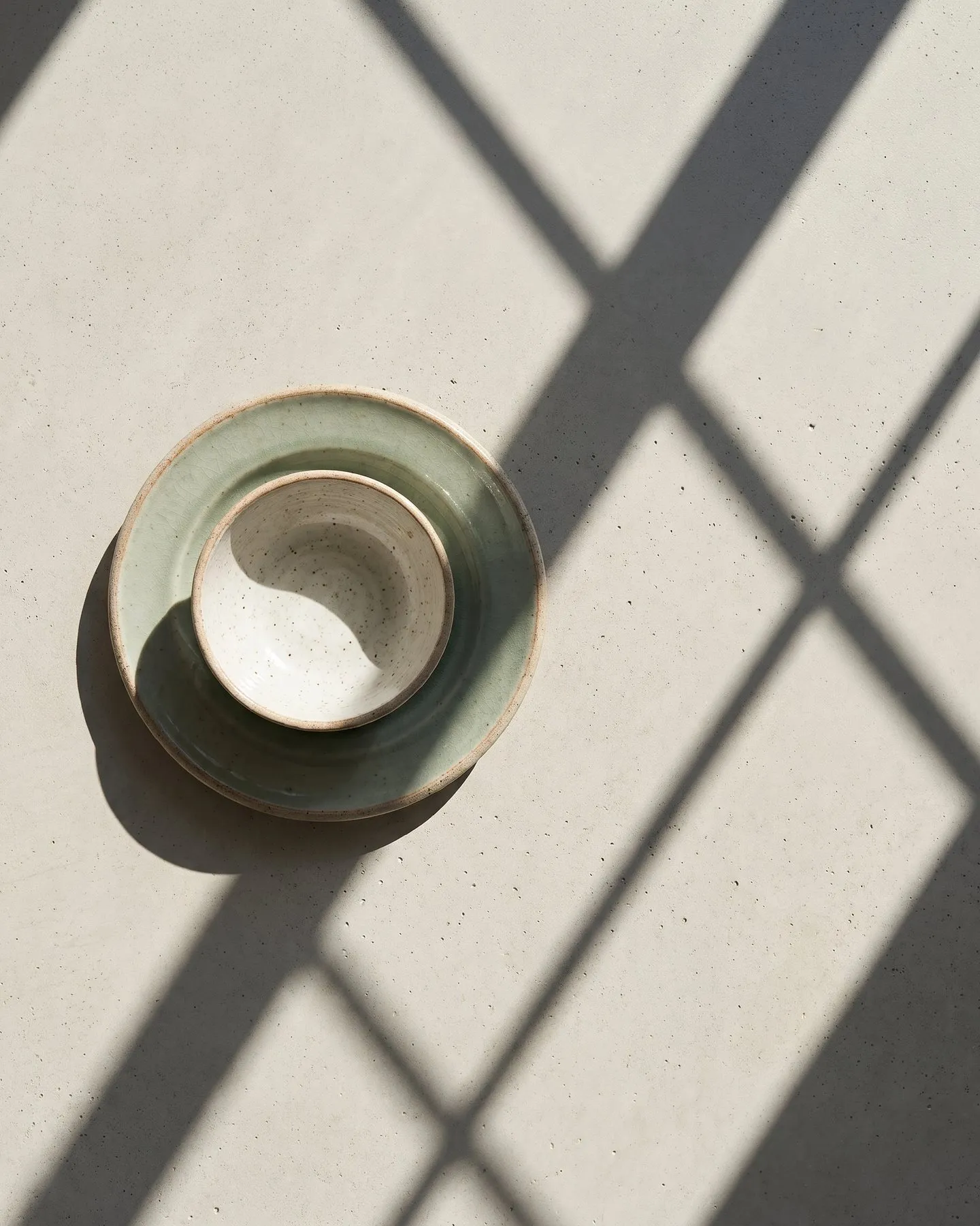
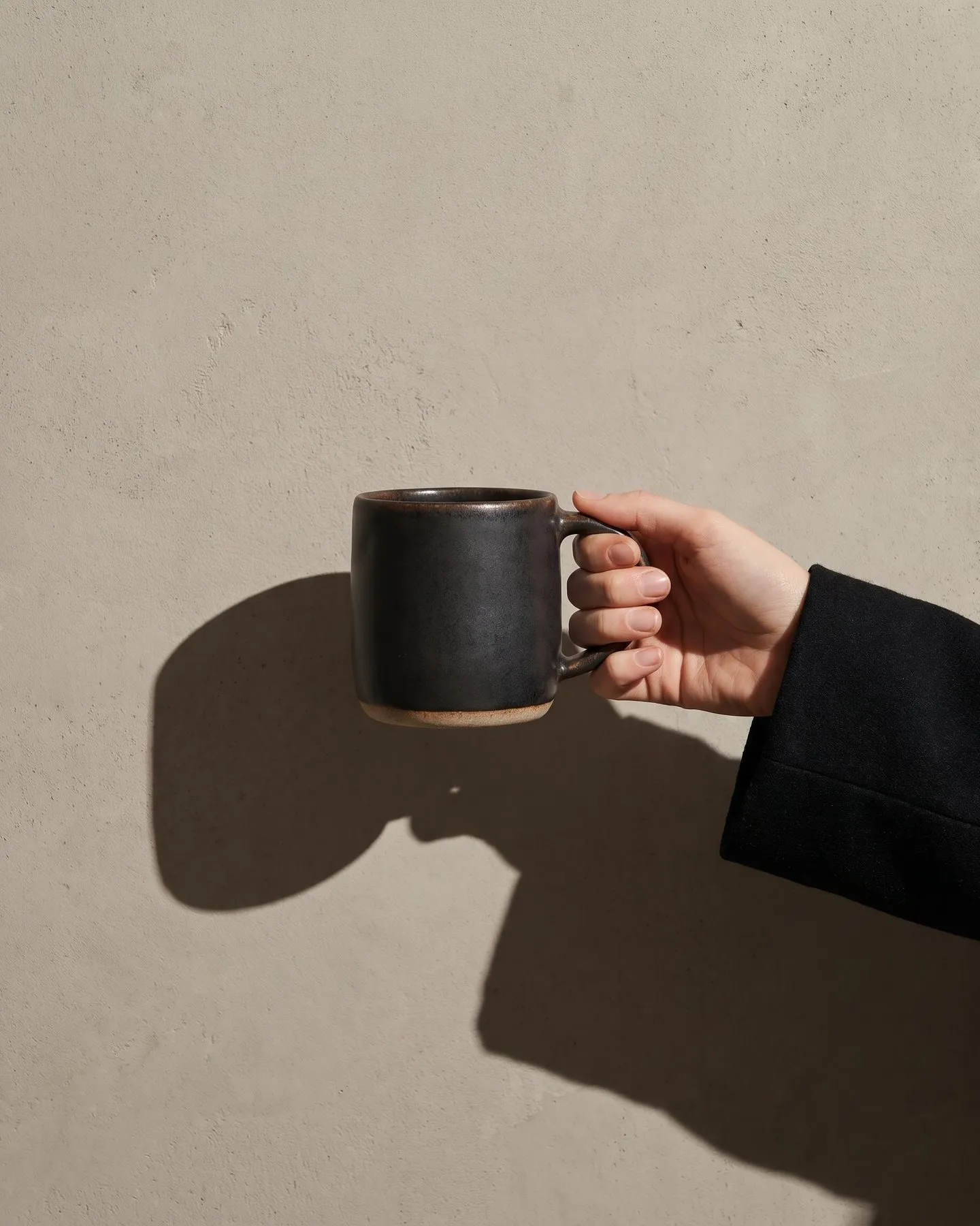
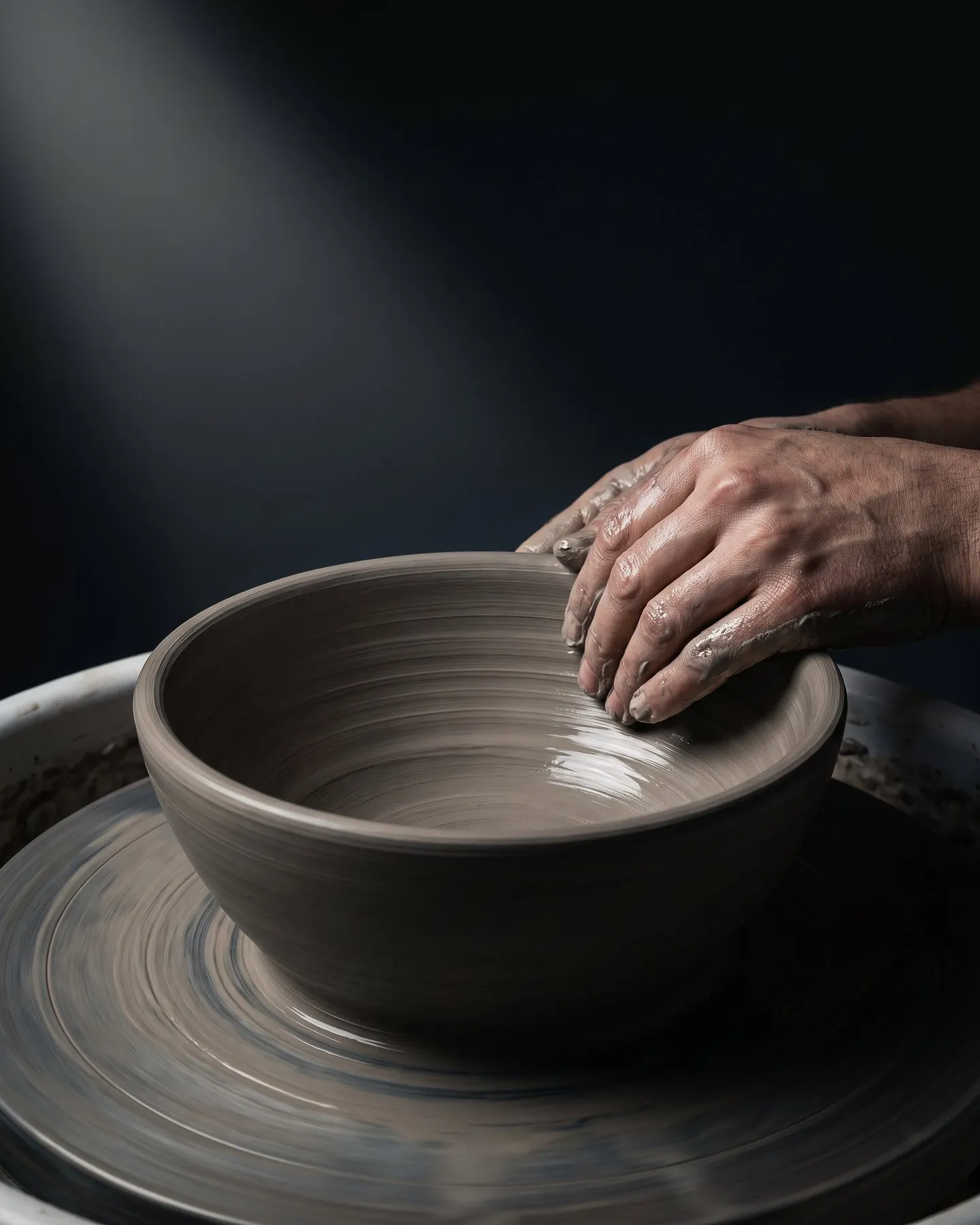
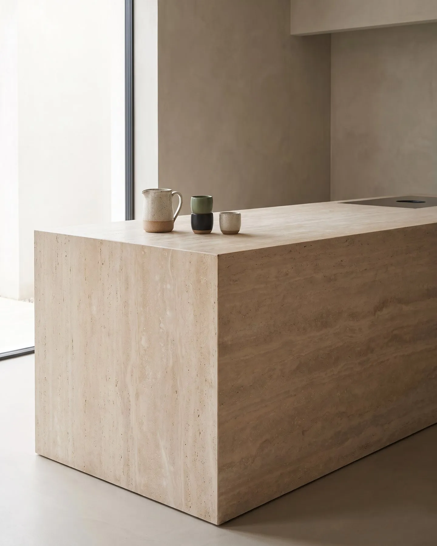
We kept the scenes as calm as the pieces. Travertine plinths, honed stone, warm grey plaster and one hard beam of light give each object room and leave the colour to the glaze. There is no food, fabric or seasonal prop to date an image, so the same settings return every season and the feed holds together over the year. People appear only as a hand or a sleeve, to show the scale of a mug or the weight of a jug.
A campaign cut four ways
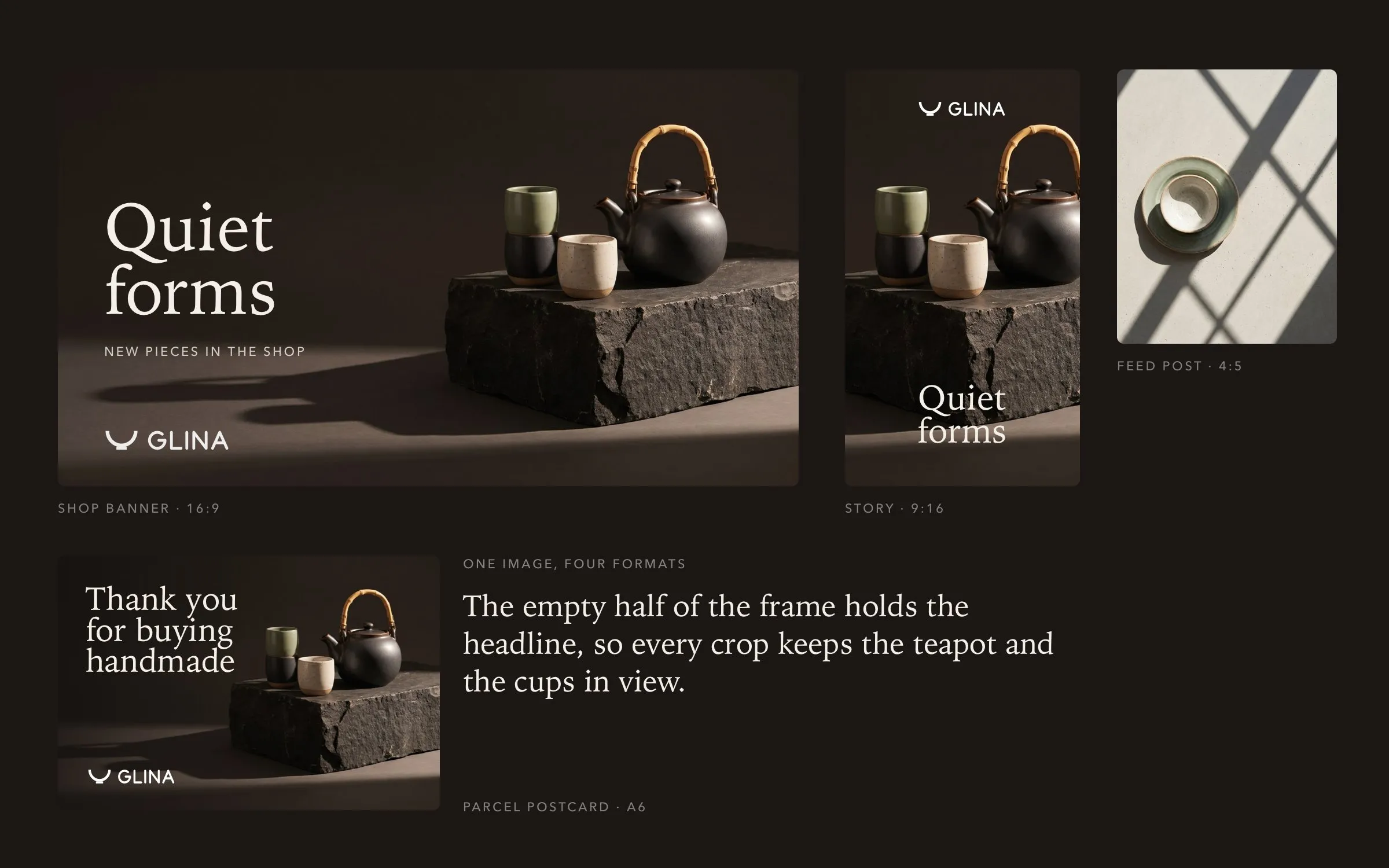
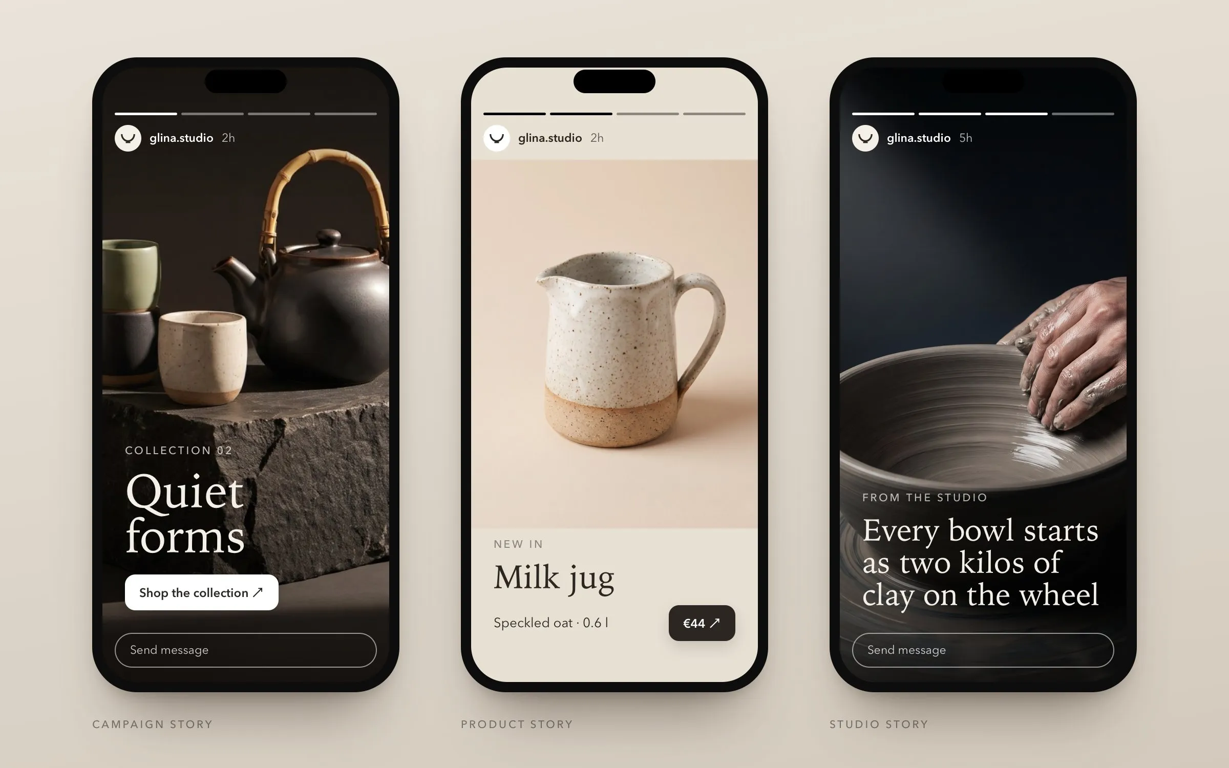
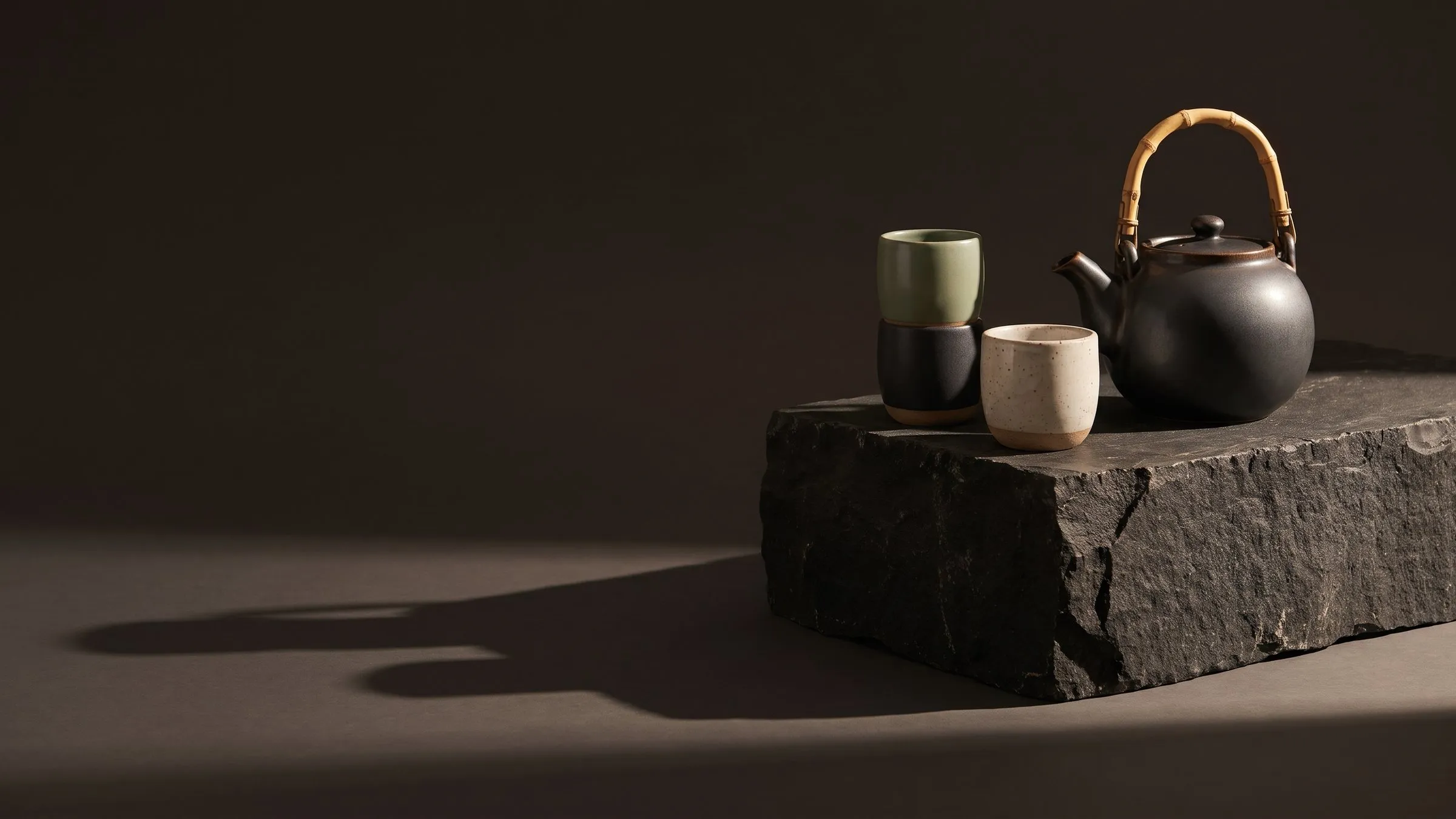
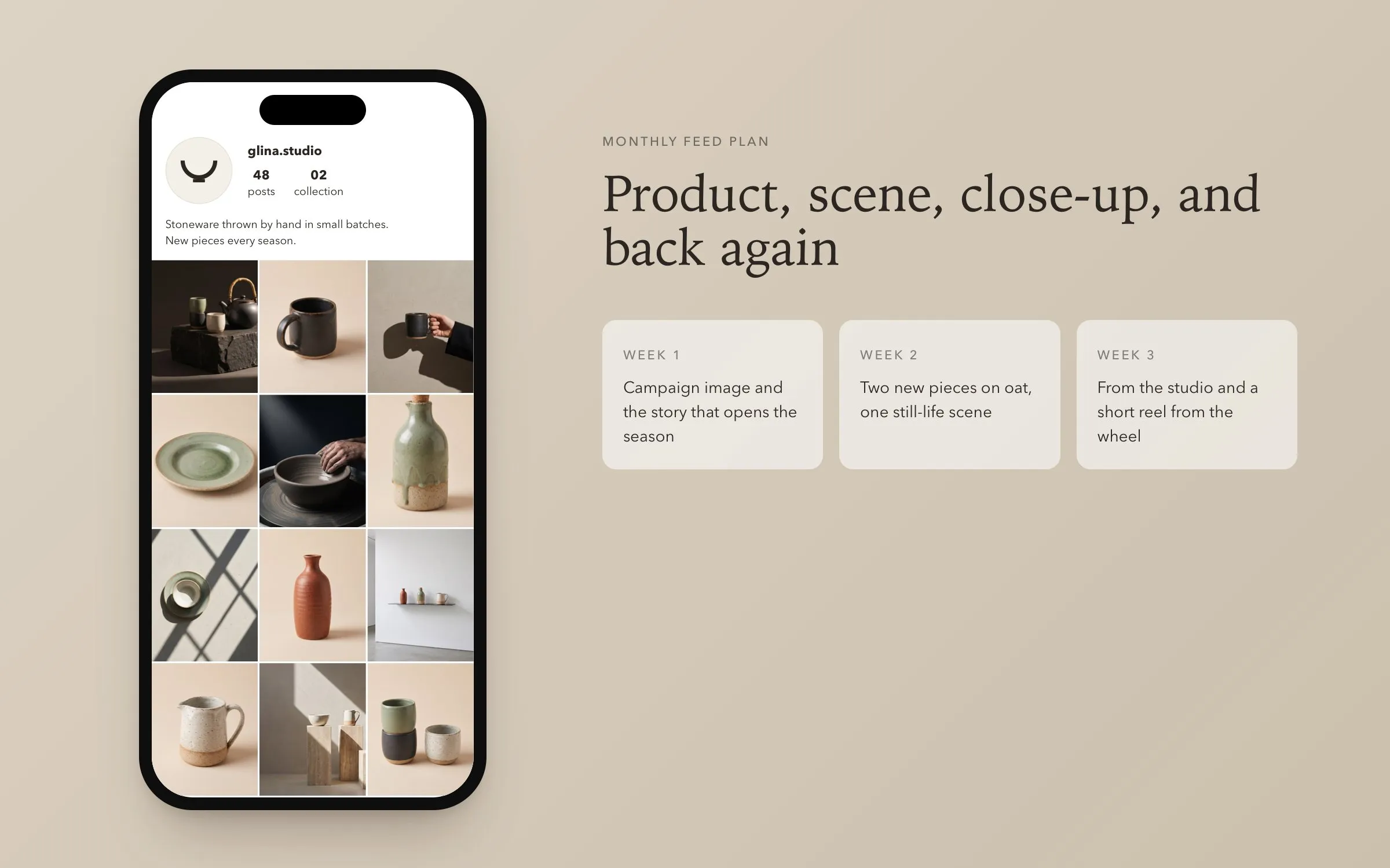
The Collection 02 campaign starts from one image of the teapot and the cups on a block of dark basalt, lit by a single beam. The dark half of the frame holds the headline. From it we cut a shop banner, stories, a feed post and a postcard that goes into every parcel. Stories follow three templates for the campaign, a new piece and the studio, so a new post takes minutes. The monthly feed alternates product, scene and close-up, and short reels add slow camera moves to the same stills.
Descriptions drafted in three languages
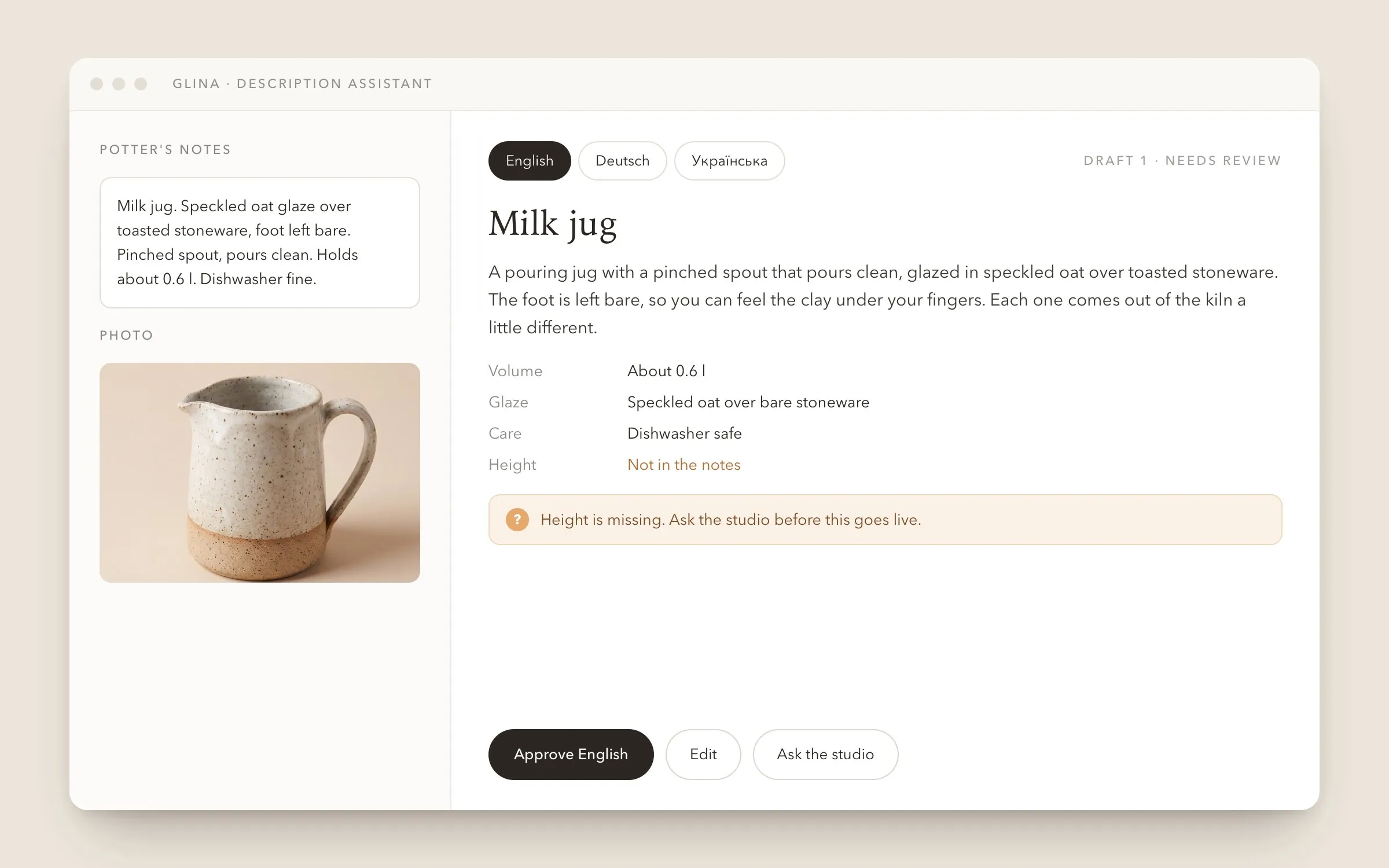
Each piece needs a name, size, glaze notes, care instructions and a few lines about how it was made. The assistant takes the potter's notes and the photo and drafts the description in English, German and Ukrainian in the brand's voice. When a size or a material is missing from the notes, it asks instead of guessing. A person reads and approves every text before it goes live.
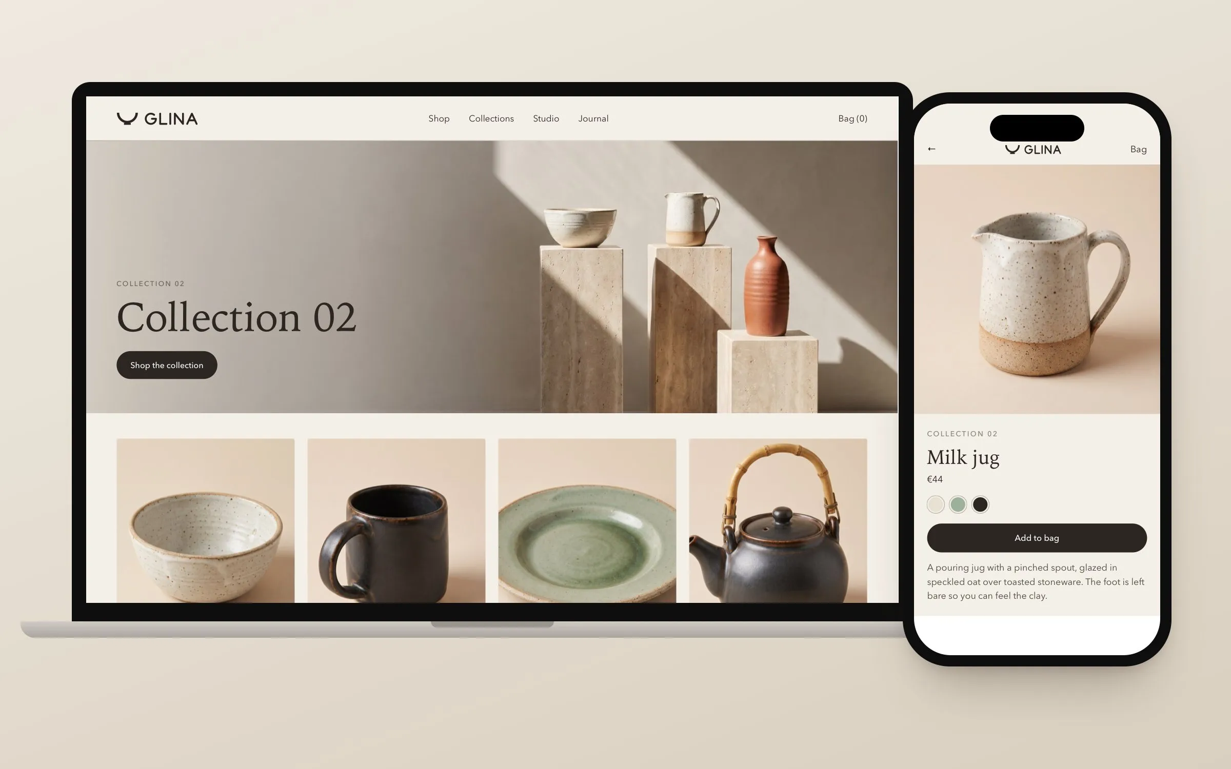
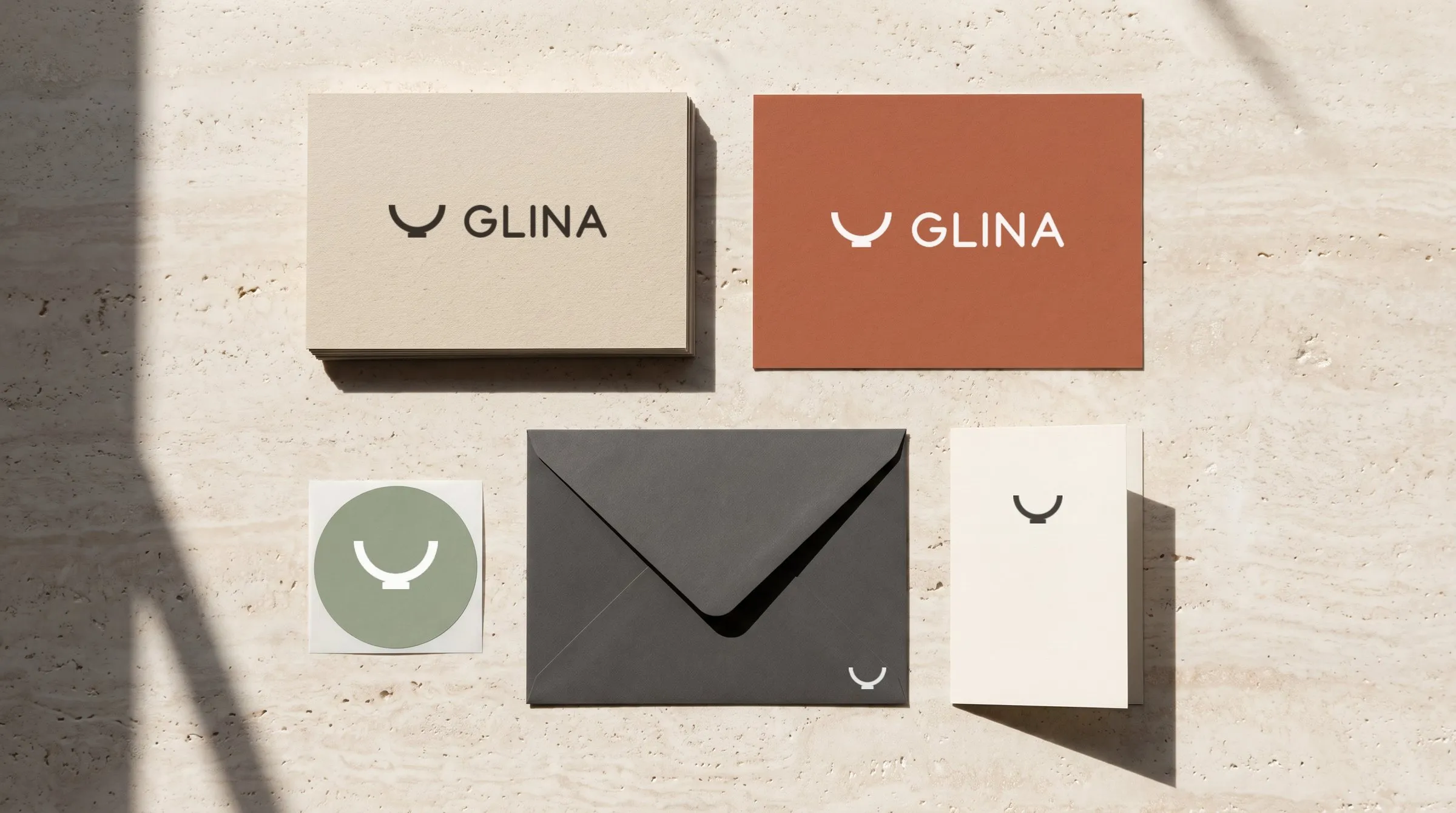
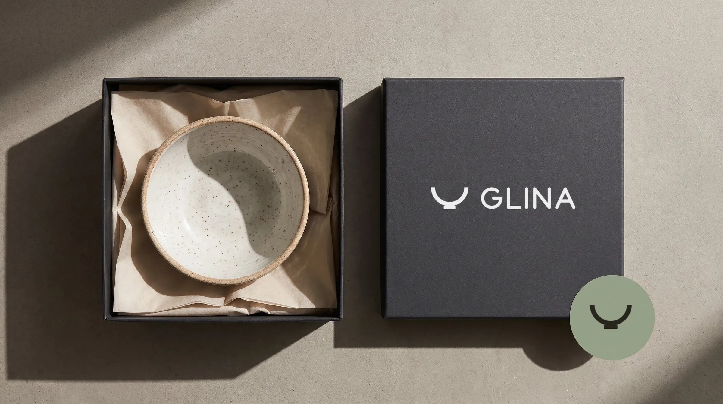
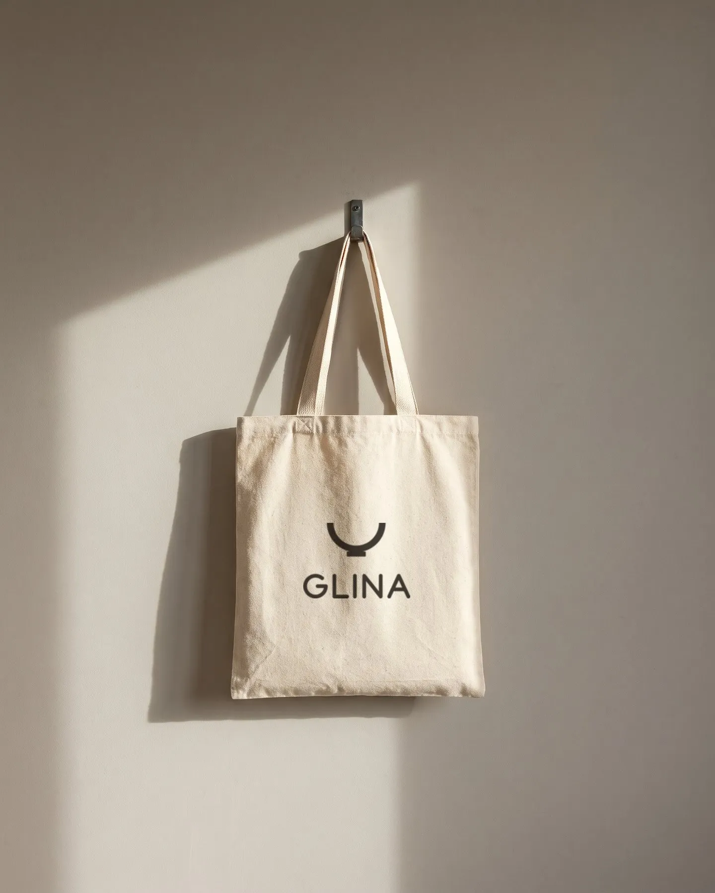
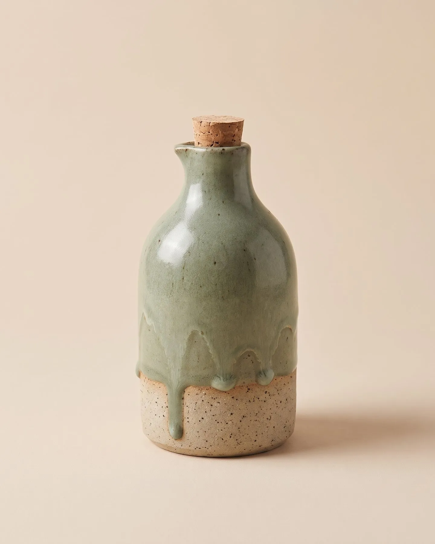
GLINA has an identity and a content system for a whole season. It covers a reference style for product photos, a set of architectural settings that return in every scene, campaign templates in four formats, stories and a planned feed, and an assistant for descriptions. The two potters can run the next launch with the same templates.
- Logo system, palette, type and stationery
- Product photos in one reference light
- Still-life scenes in recurring settings
- Seasonal campaign in four formats
- Monthly feed plan and short reels
- Description assistant with human approval