Branding · Menswear · Ukraine
Iceman.
Four old logos replaced by one that refuses to sit still
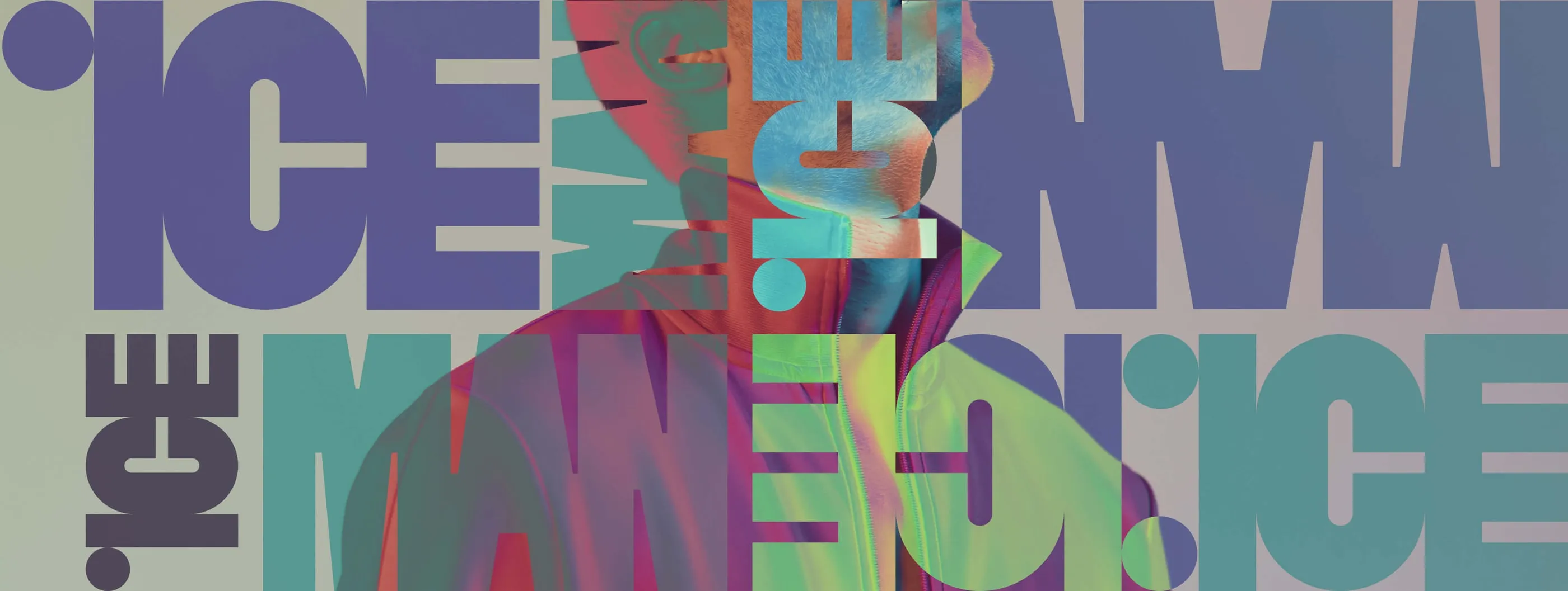

Iceman is a well-established menswear label. Its customers trusted the quality, but the brand looked its age and spoke to the wrong generation. The client wanted to refresh the branding, packaging and marketing materials to reach a younger, more fashion-aware audience, without losing the reliability people already expected. The brief asked for modern masculinity and style. We rebuilt the identity from the logo out.
- Logo
- Typographic pattern
- Colour palette
- Hang tags and labels
- Campaign layouts
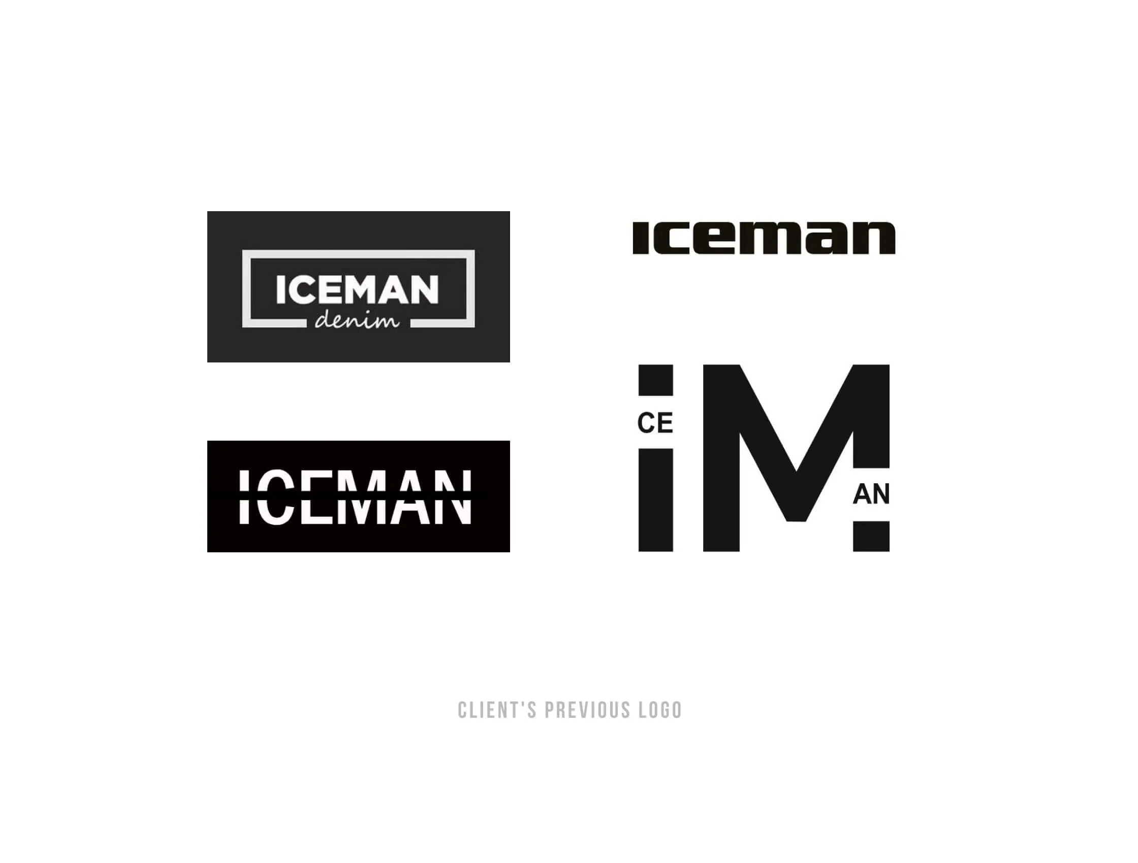
Over the years Iceman had collected four different logos: a framed denim badge, a lowercase wordmark, an all-caps version and a split monogram. None of them was wrong on its own, but together they told customers there was no single brand. A rebrand had to choose one voice and make it strong enough to carry clothing, tags and campaigns.
- 01 — Split identity
Four logos in use meant no recognisable face for the brand.
- 02 — Ageing image
The look did not speak to the younger audience the client wanted to win.
- 03 — Keep the trust
Any change had to keep the sense of quality existing customers valued.
Start by counting the logos
We put all the existing logos side by side: a framed denim badge, a lowercase wordmark, an all-caps version and a split monogram, each from a different moment in the brand's life. Seen together, the problem was obvious. The new identity keeps only the name and drops everything else, so it could start from a clean page and speak with one voice from the first tag to the last poster.
A wordmark with a dot
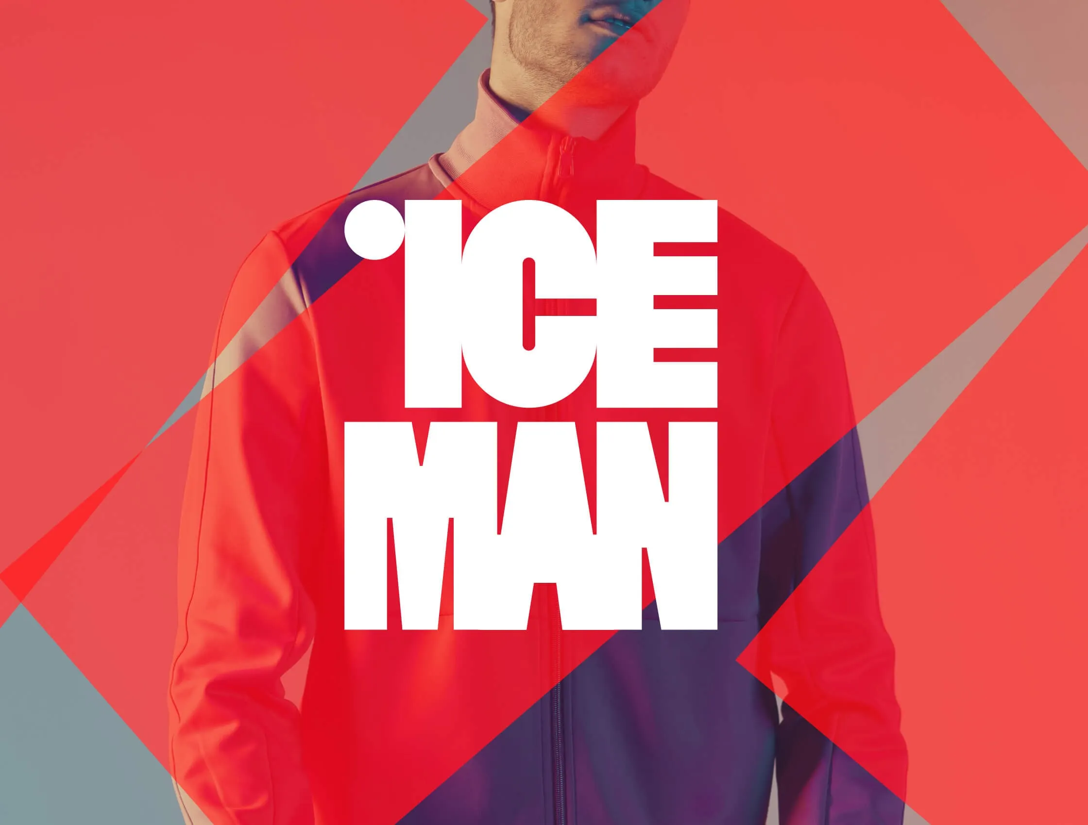
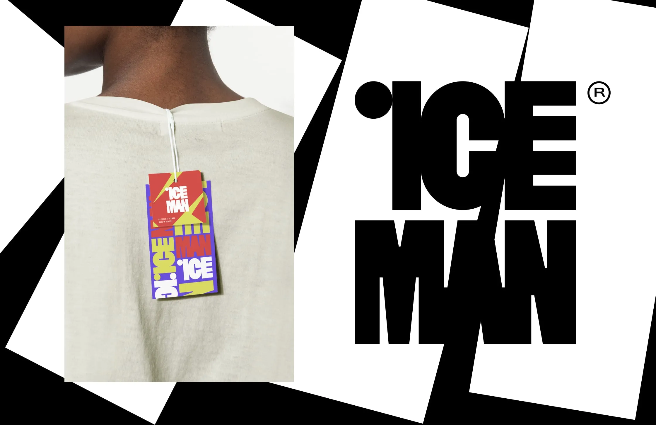
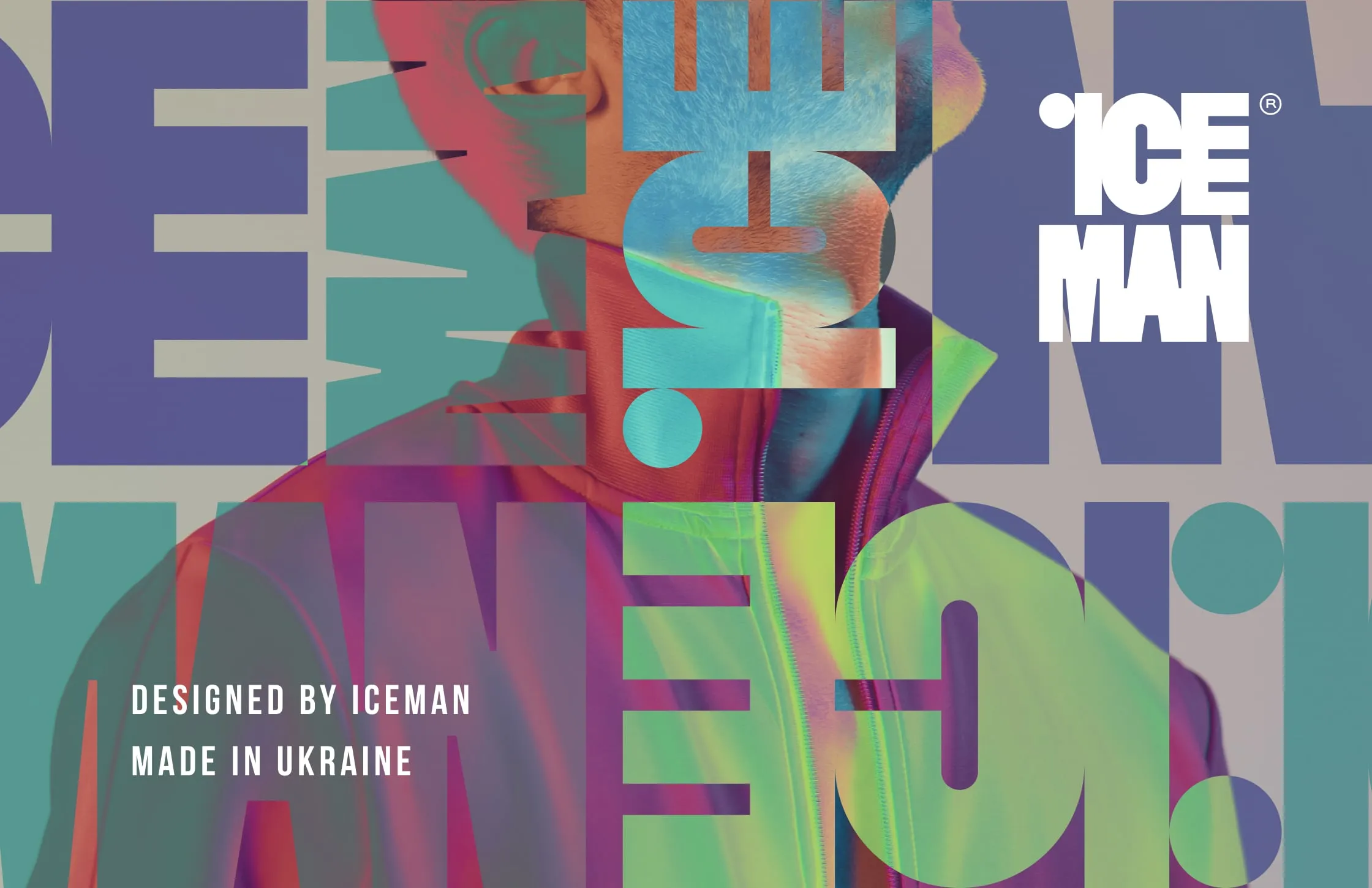
The new logo stacks ICE over MAN in tall, tightly packed condensed letters. The dot of the i floats above the C as a separate circle, a small detail that gives the mark its character and works as a shorthand on its own. The block shape fits a woven label, a hang tag and a full poster without changes.
Type as pattern
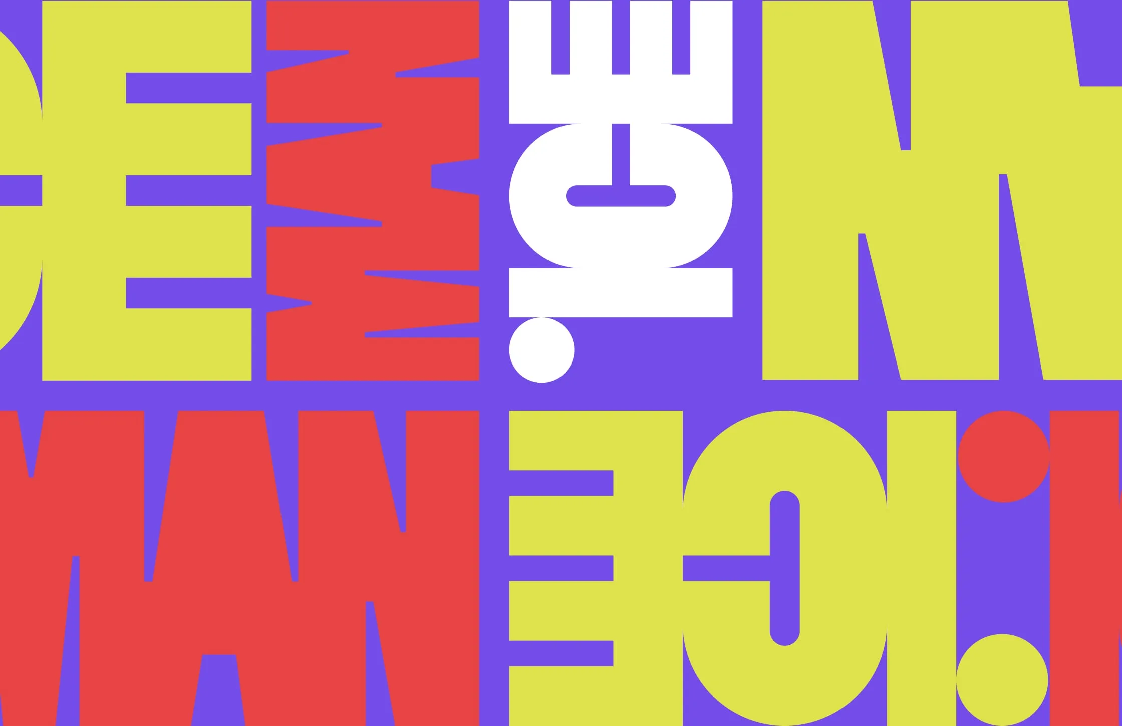
Letters from the wordmark are rotated, mirrored and repeated to fill whole surfaces. In flat red, violet and acid yellow they make a loud graphic wall. Layered over photography with a gradient, they become a background for campaign images. The pattern gives Iceman a look that is recognisable even when the full logo is not visible.
Photography cut into shards
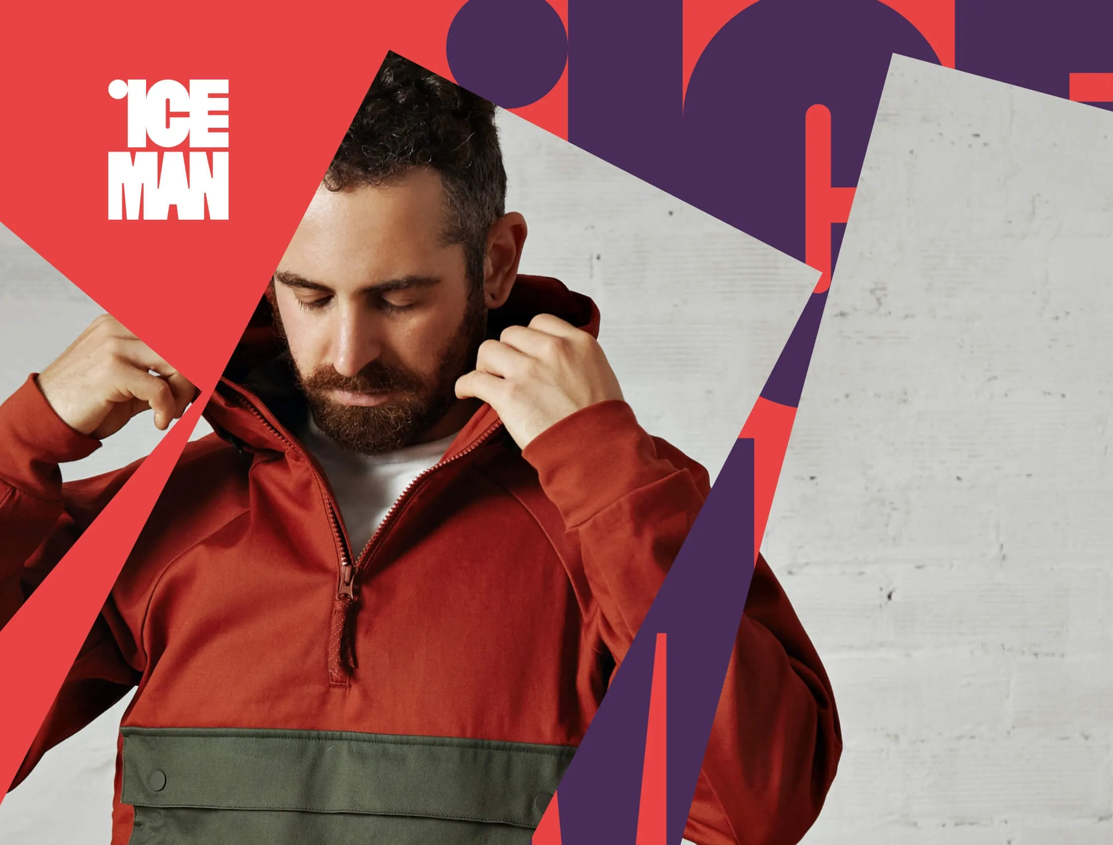
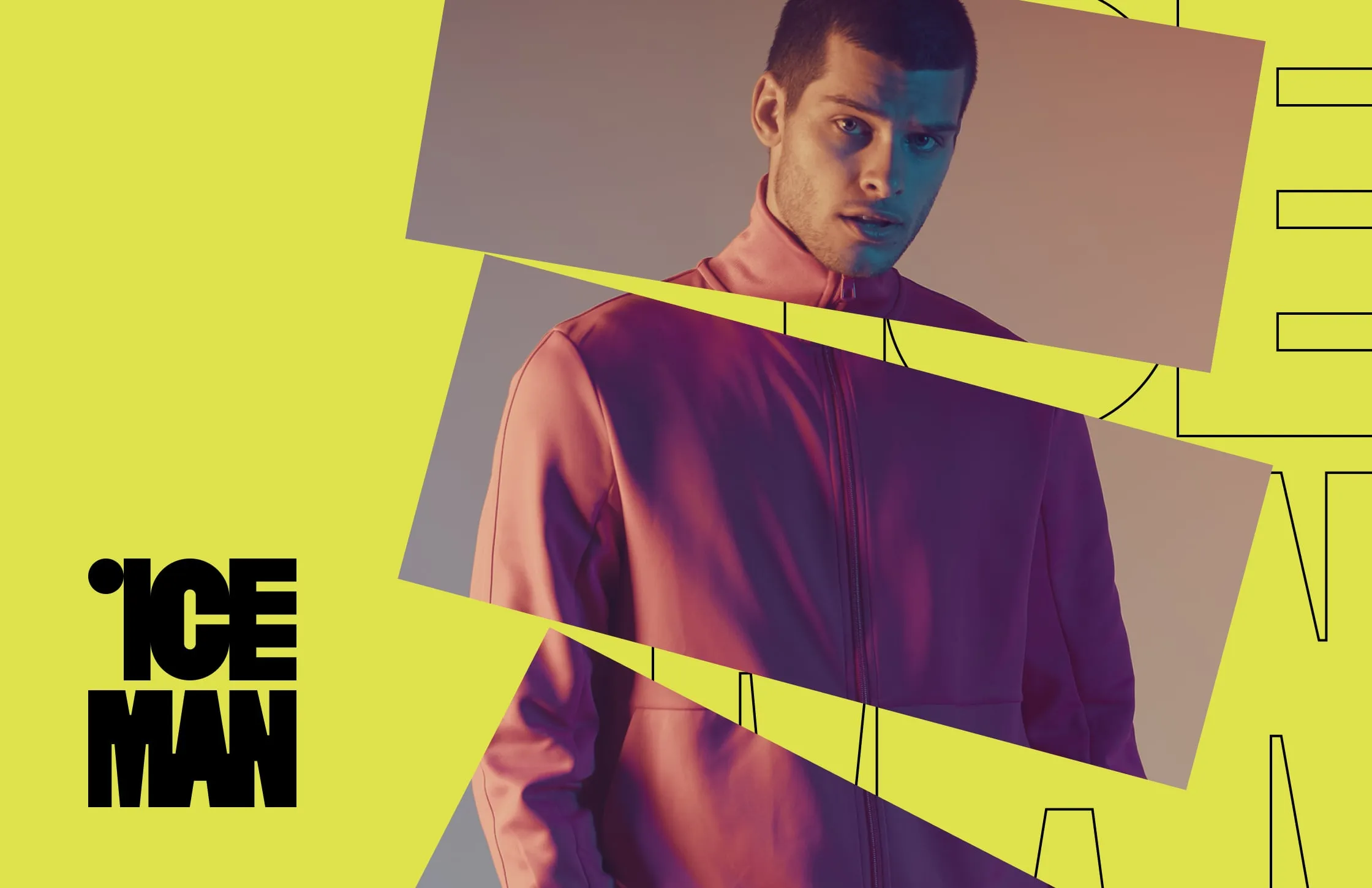
For campaign imagery we slice product photos with sharp diagonal planes of colour. The model stays in focus while the angled shapes add movement and tension, a direct answer to the brief for modern masculinity. The same device works on hang tags and posters, so a single photo shoot can feed the whole system.
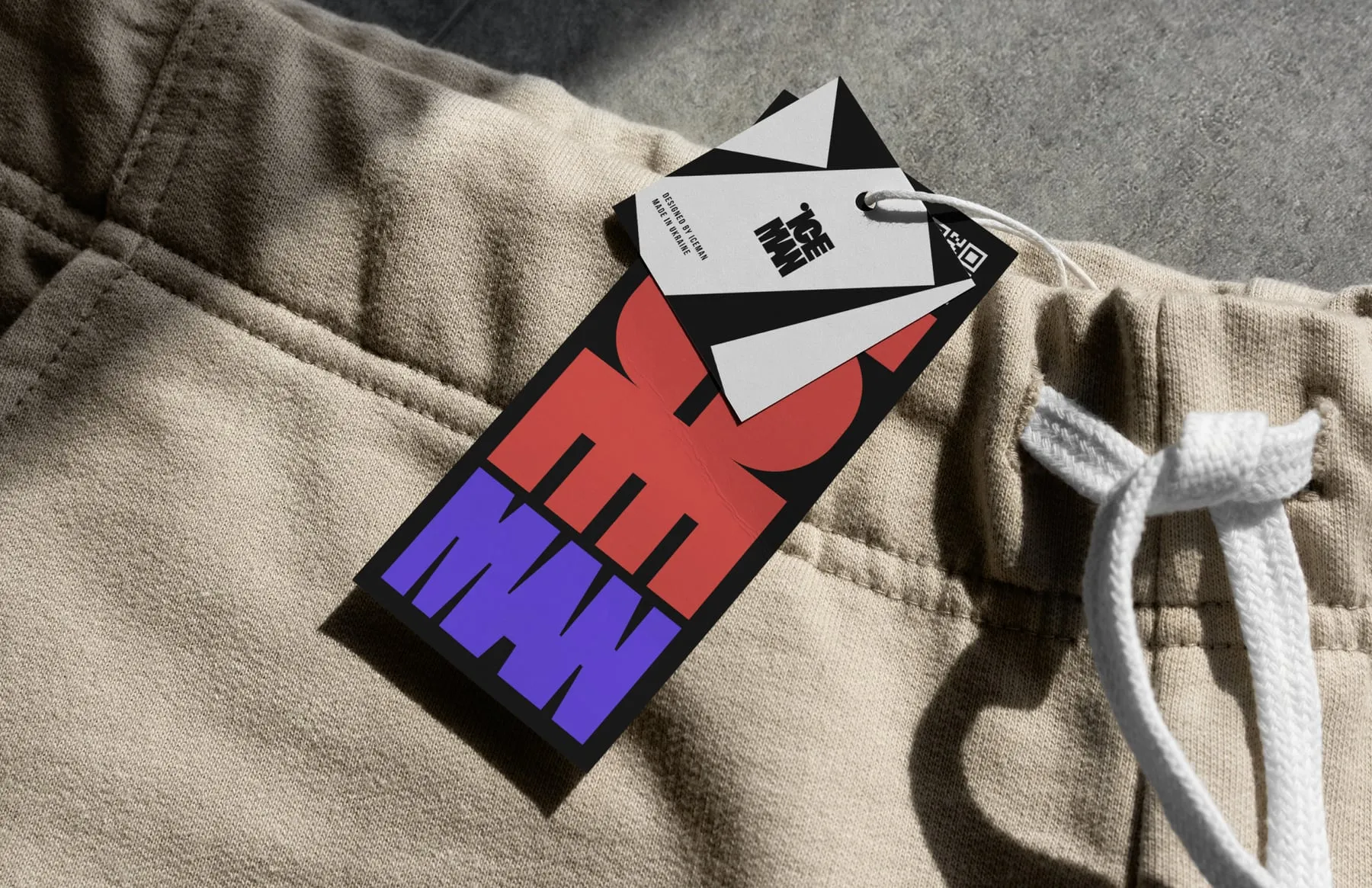
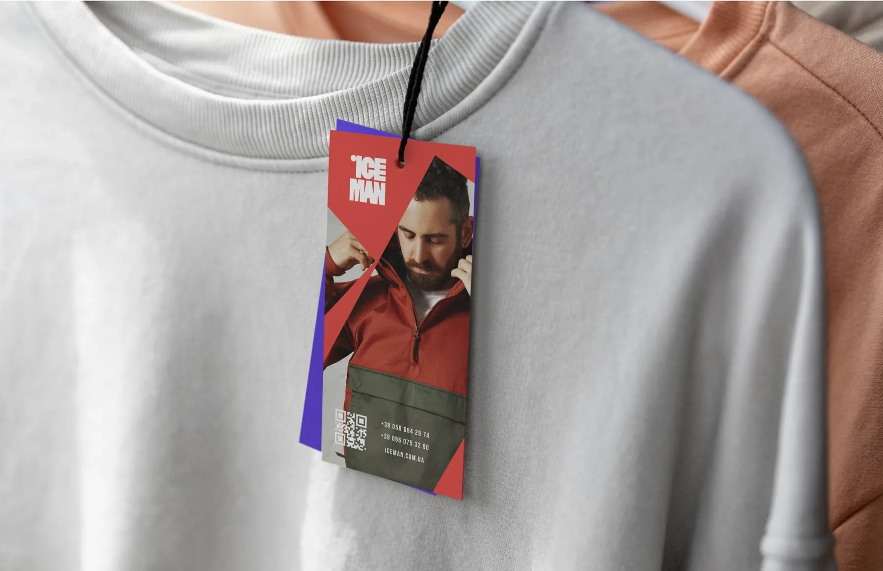
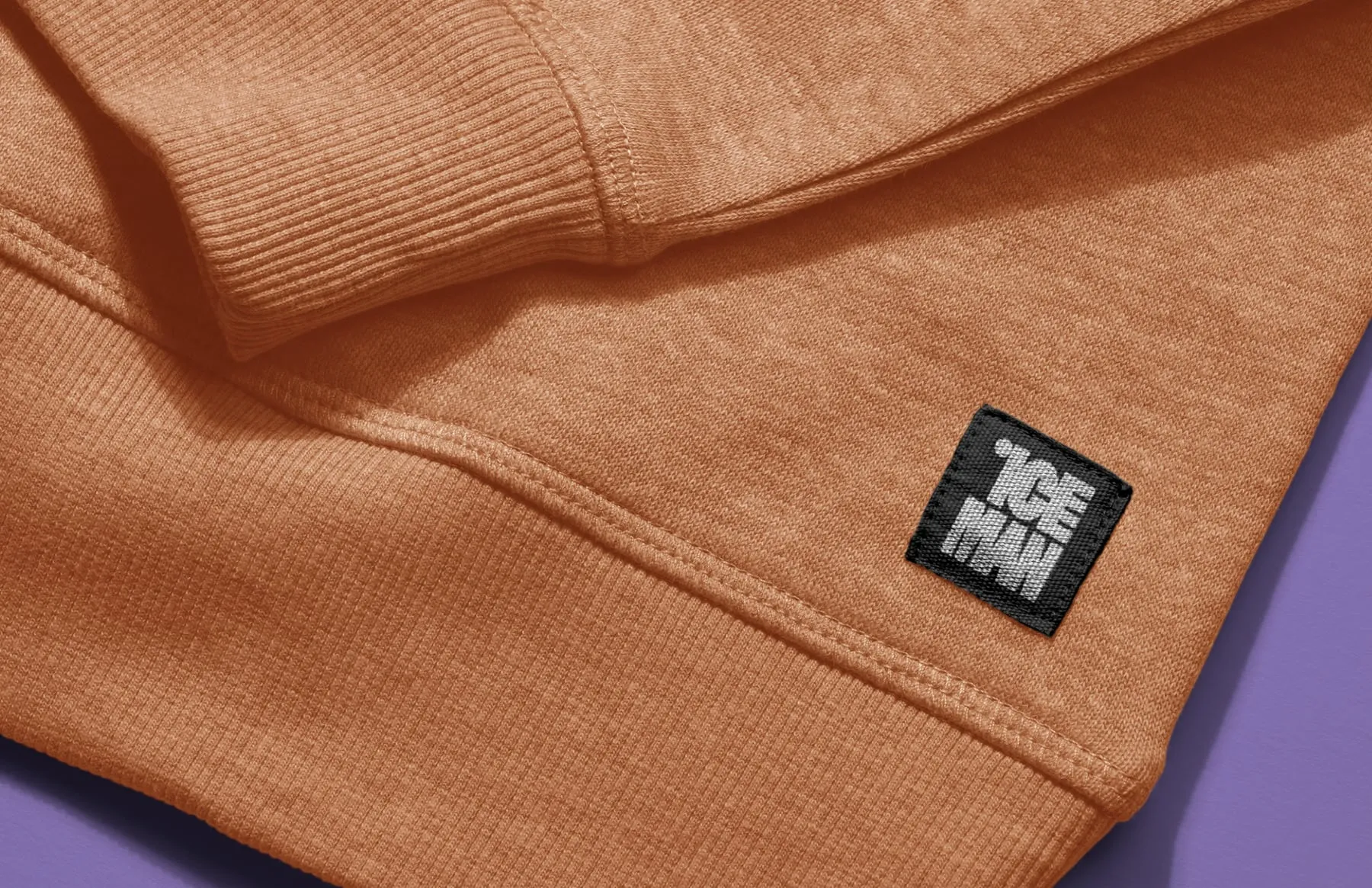
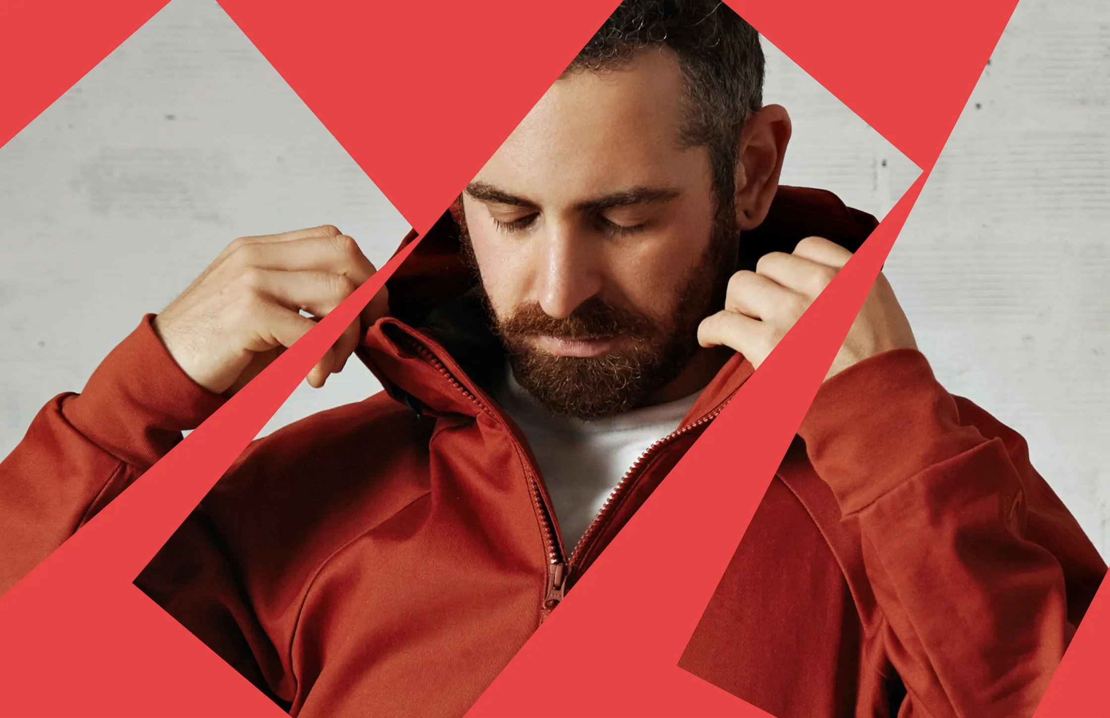
Iceman now has one logo instead of four, and a visual system that looks like a fashion brand rather than a supplier. The wordmark, the type pattern, the three-colour palette and the sliced photography give the team a kit for tags, labels, packaging and campaigns. Each piece is loud on its own and clearly part of the same family.
- New wordmark
- Typographic pattern
- Red, violet and yellow palette
- Hang tags and woven labels
- Campaign image style
“I was amazed the team could turn my concepts and ideas into such a great logo. It was quite a journey, and I'm thrilled with the result.”