Website · Fitness technology
Lifters.
A gym app website that looks like the gym, not a wellness brand


Lifters International is a small software company with two products. Lifters is an app where gym-goers track progress, find workouts and match with other fitness enthusiasts. The Lifters Food API gives developers and businesses access to a growing food database. The company needed one website that could sell an app to people who train and an API to people who build, without splitting into two brands.
- Marketing website
- App product page
- Food API product page
- About page
- Contact form
Two products, two audiences. The app speaks to people in the gym. The API speaks to developers who care about modules, documentation and stack. The team also had a story worth telling: Lifters started as a social site, became a dating site for fitness fans, then grew into a home for gym culture. The site had to carry all of that and still feel like one brand.
- 01 — Two audiences
Gym-goers and developers need different proof on the same site.
- 02 — Small team
A company of a few people had to look focused and confident, not small.
- 03 — Brand energy
A strength product needed raw energy, not the pastel calm of wellness apps.
Black, red and one arch
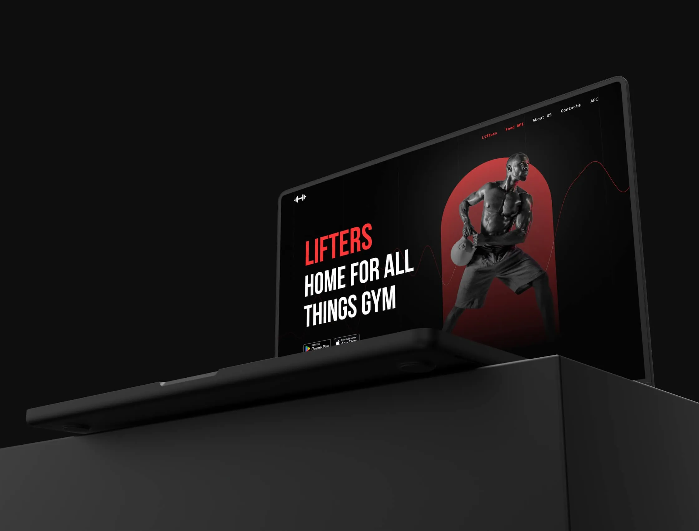
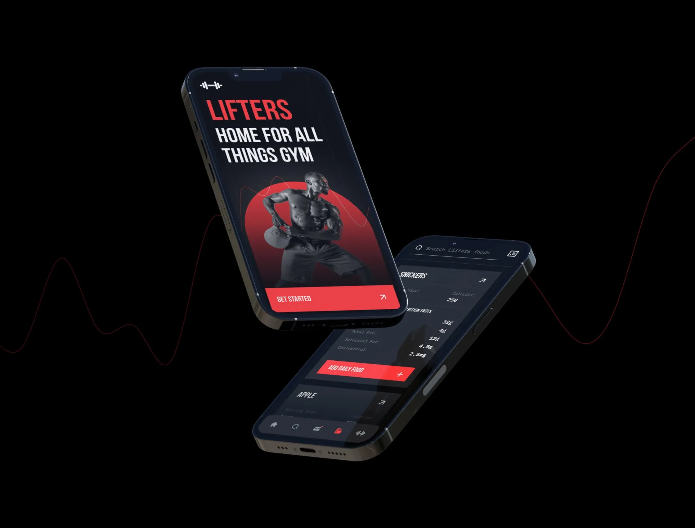
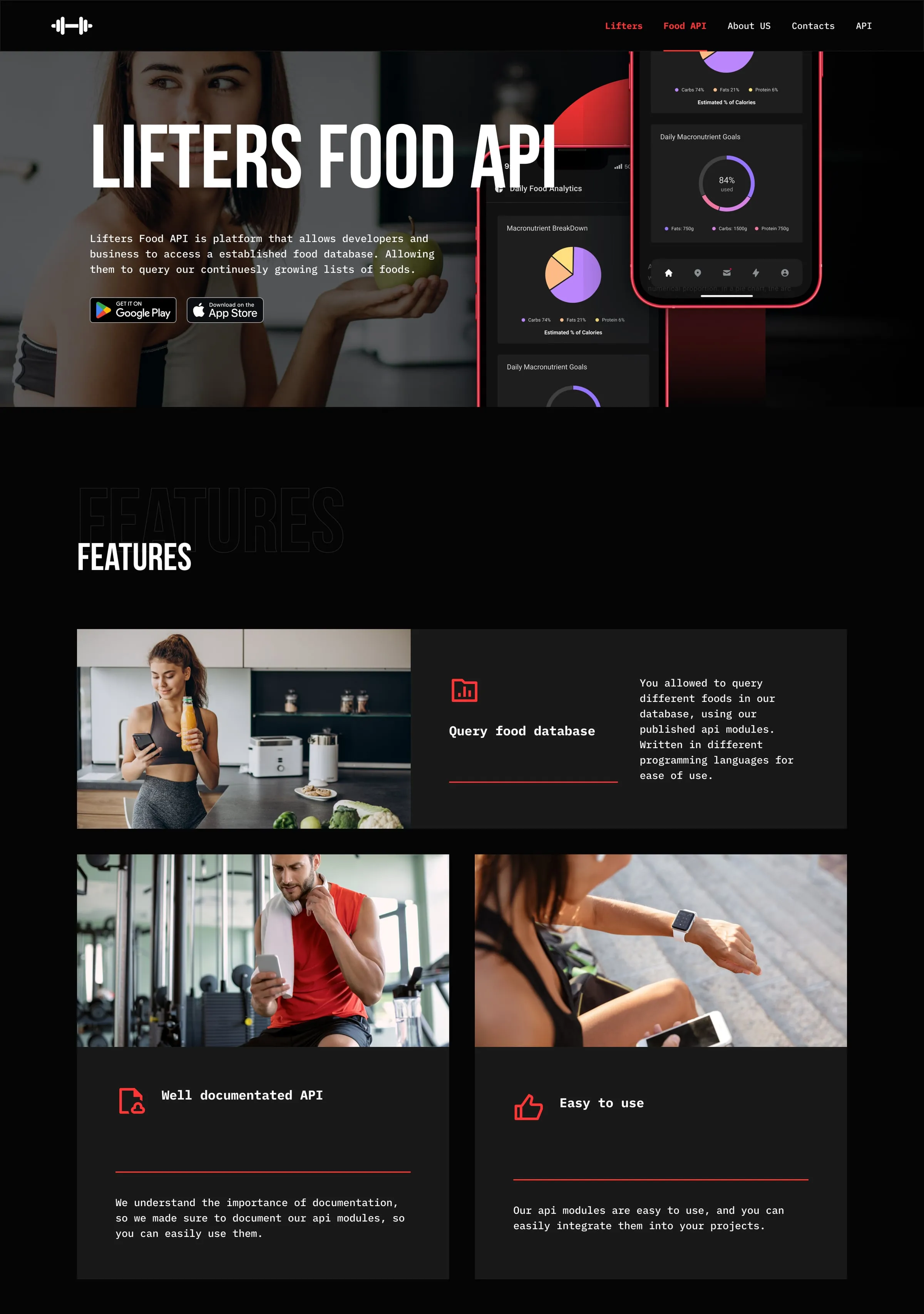
We built the brand on black, one hot red and condensed uppercase headlines. A red arch stands behind the athlete in the hero and returns as a frame for phones and portraits across the site. A thin red line, like a heart-rate trace, runs behind the hero. Body text is set in a monospaced face, a quiet nod to the developer side of the business.
Two products, one template
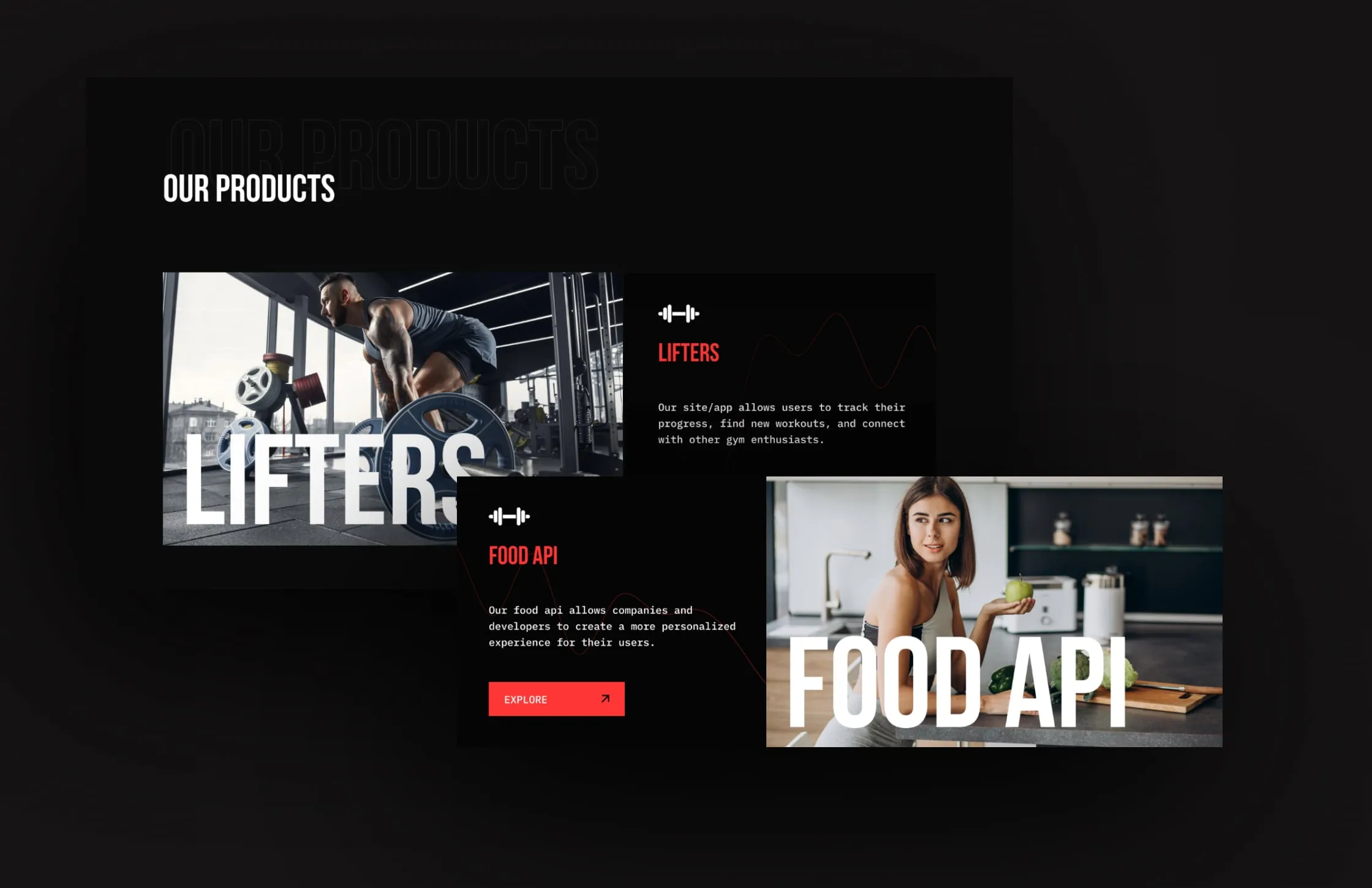
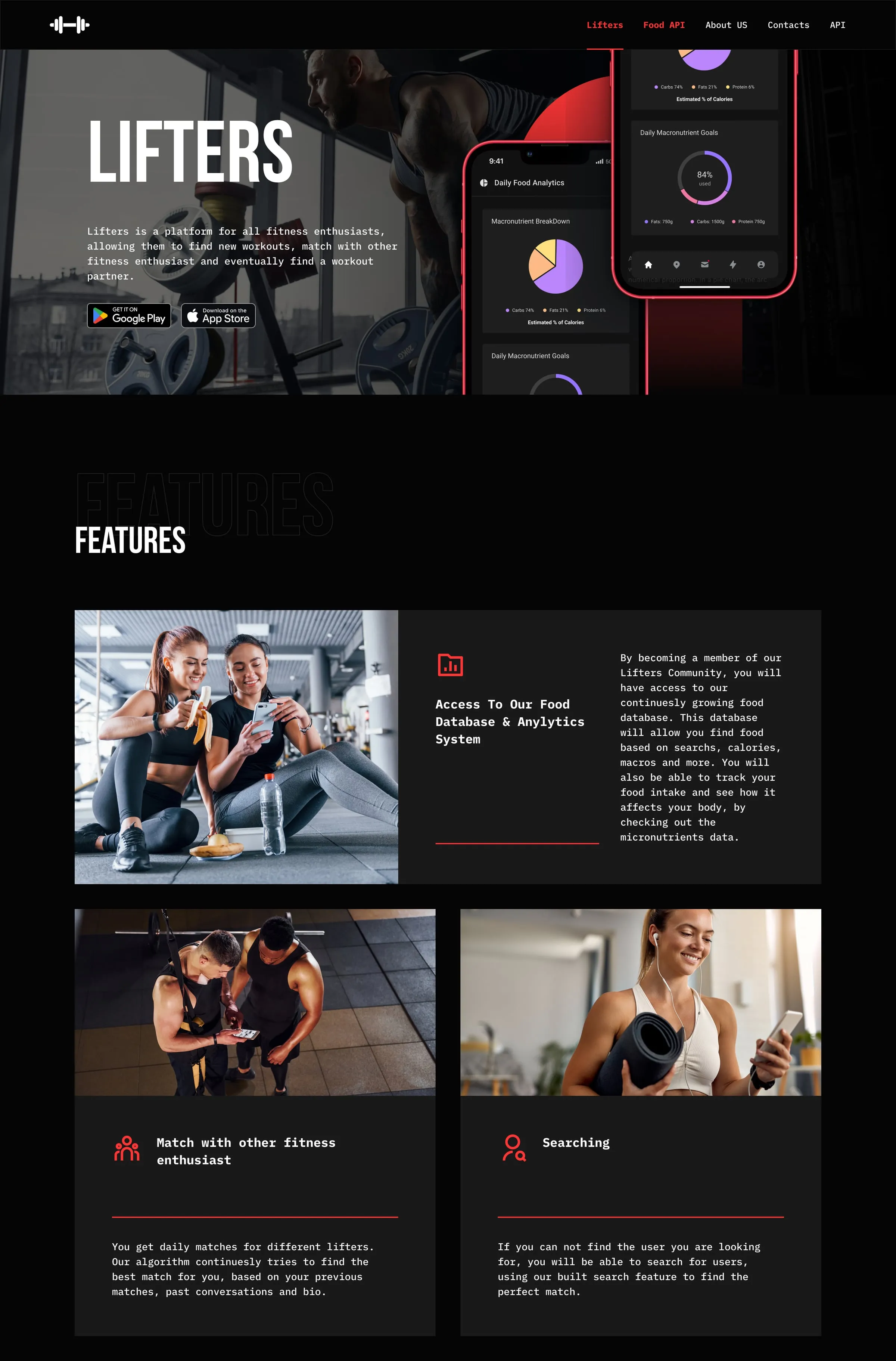
Both products share one page structure: a hero with app store badges, features, technologies, and a giant cut-out wordmark before the footer. The app page leads with the food database, matching and search. The API page adds a module list for Python, Node.js, JavaScript and React, plus notes on documentation and ease of use. Read one product page and you already know how to read the other.
Let the founders talk
The About page tells the company story in the team's own words, from a social site called Peers to a dating site to Lifters. Team cards give each person a portrait, a role and a line about what they own. Large outline headings sit behind each section title, so long passages read as chapters rather than a document. The mission closes the page in one sentence.
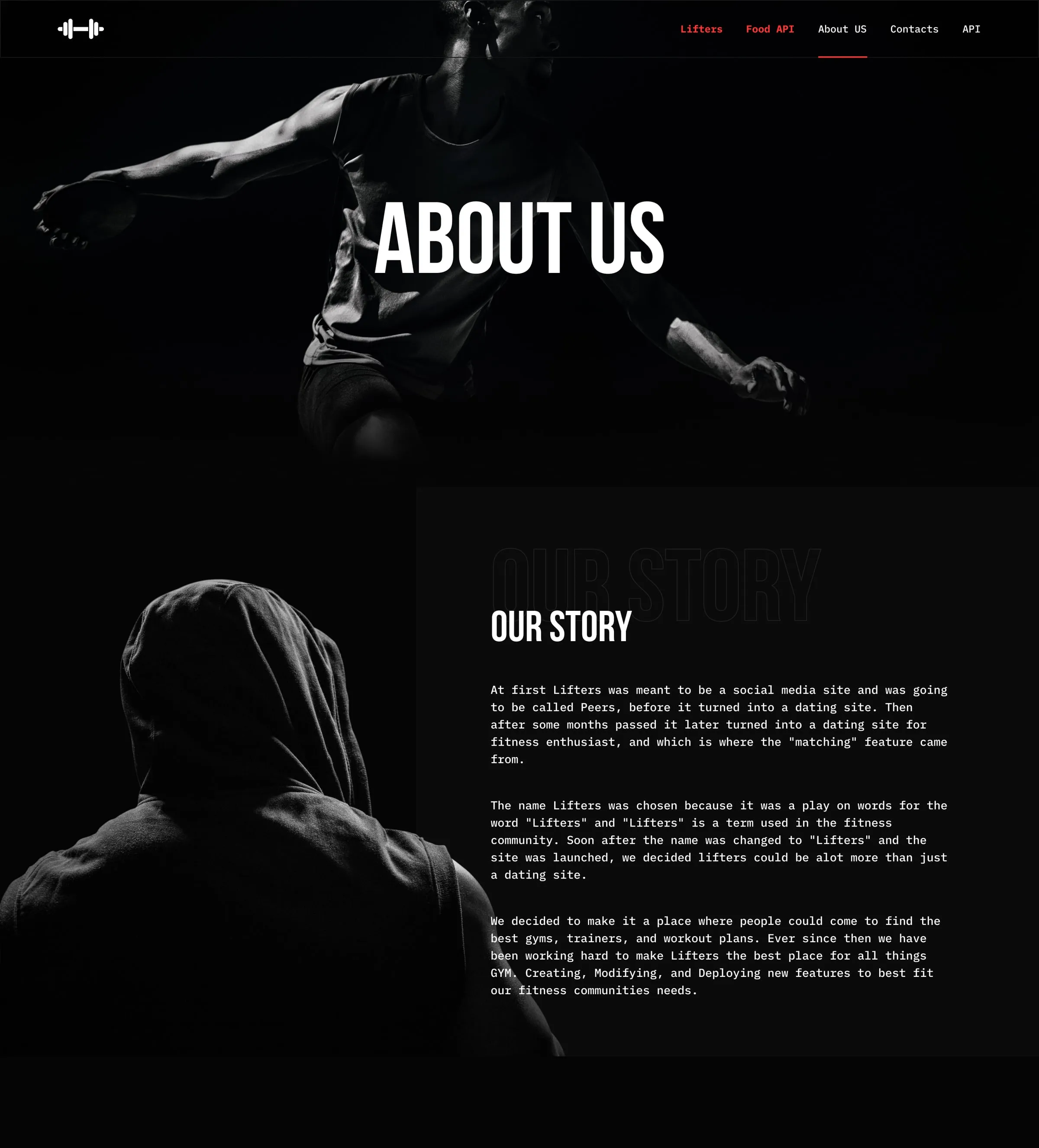
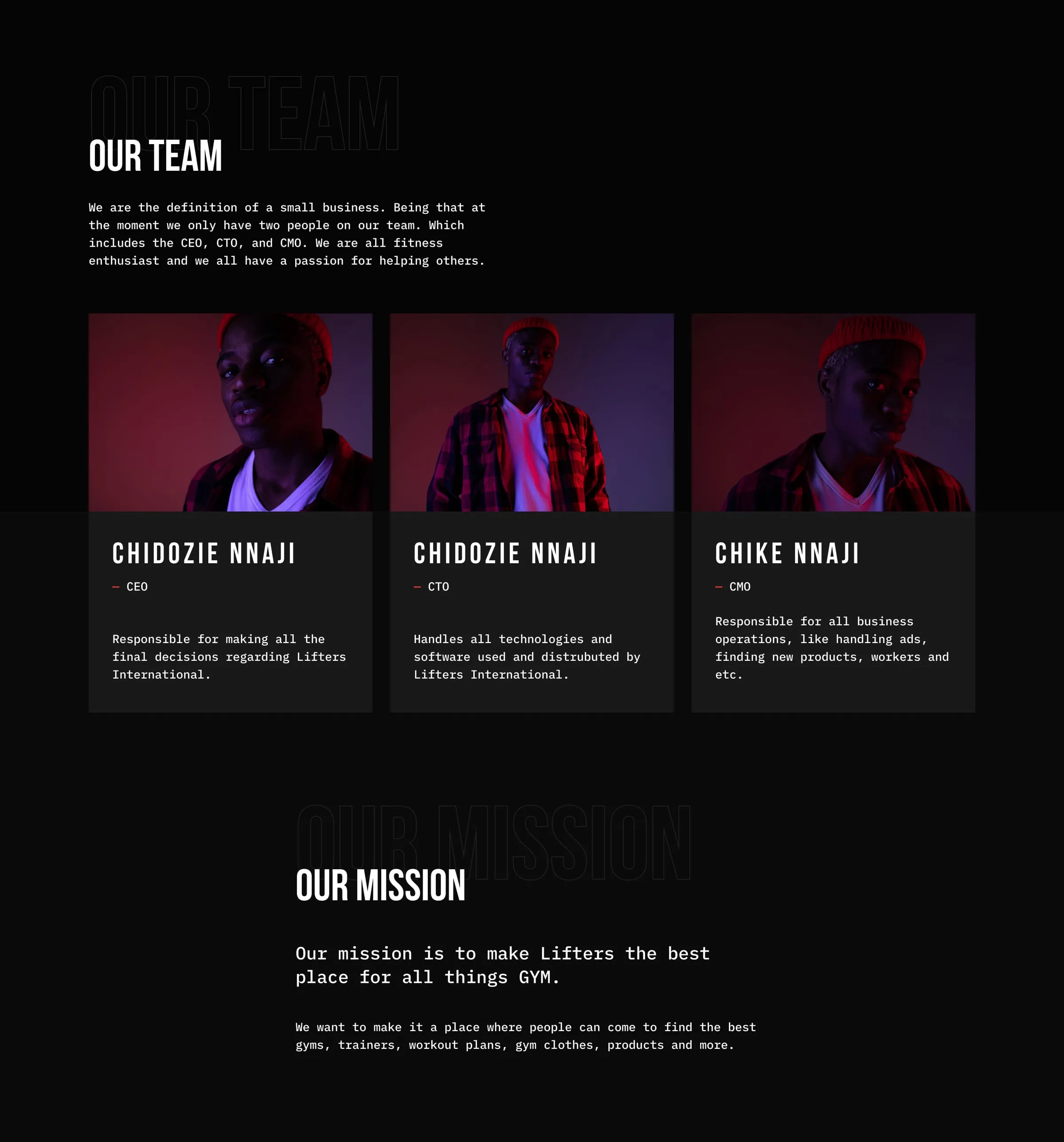
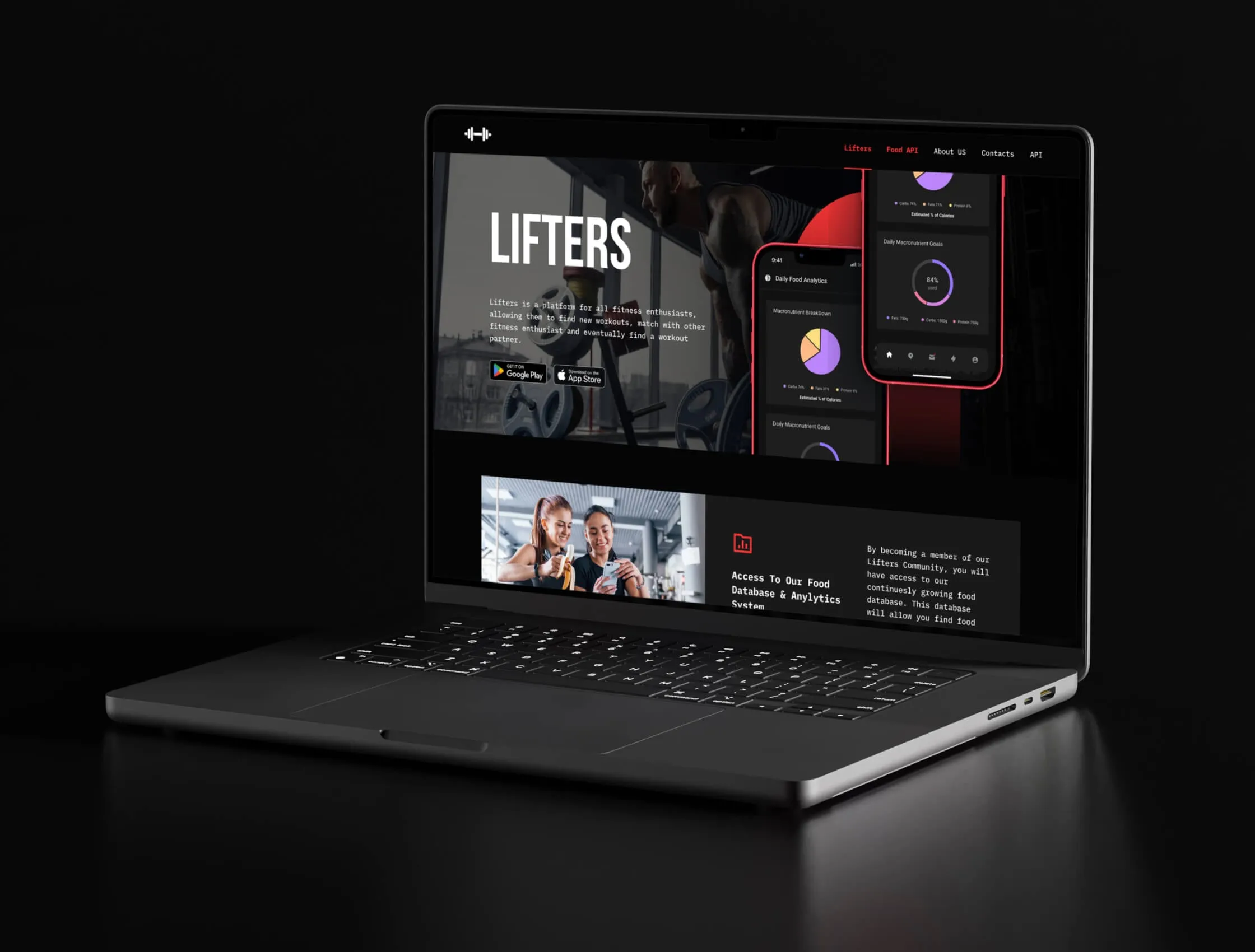
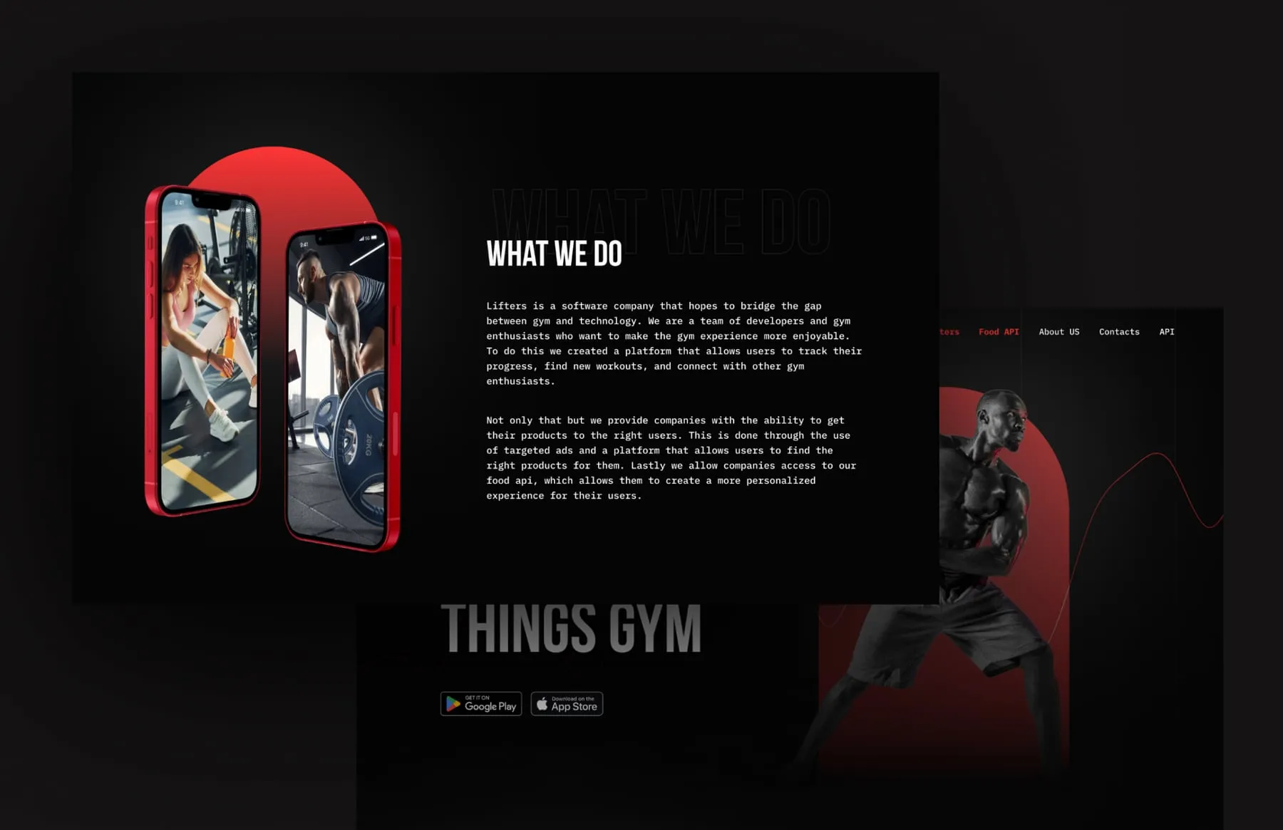
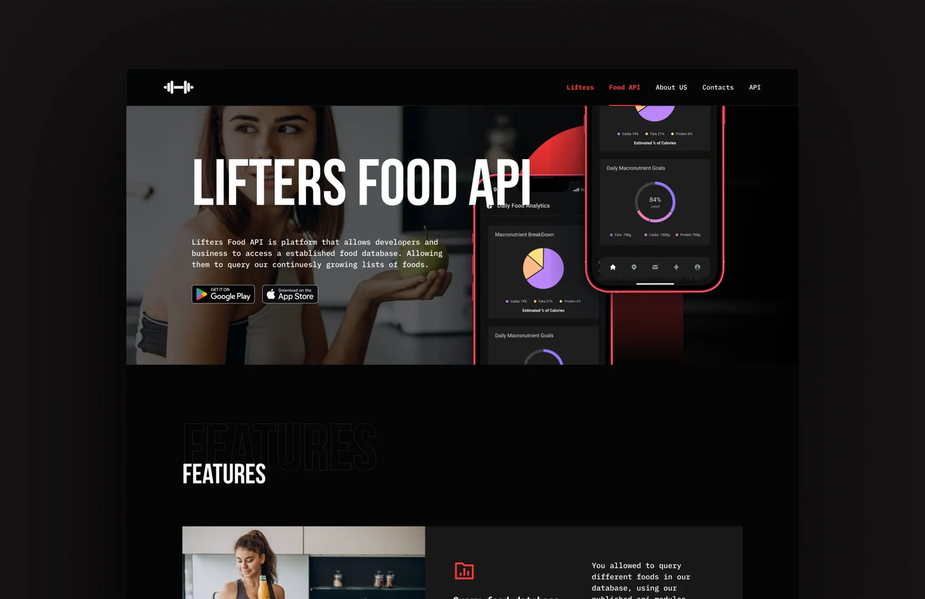
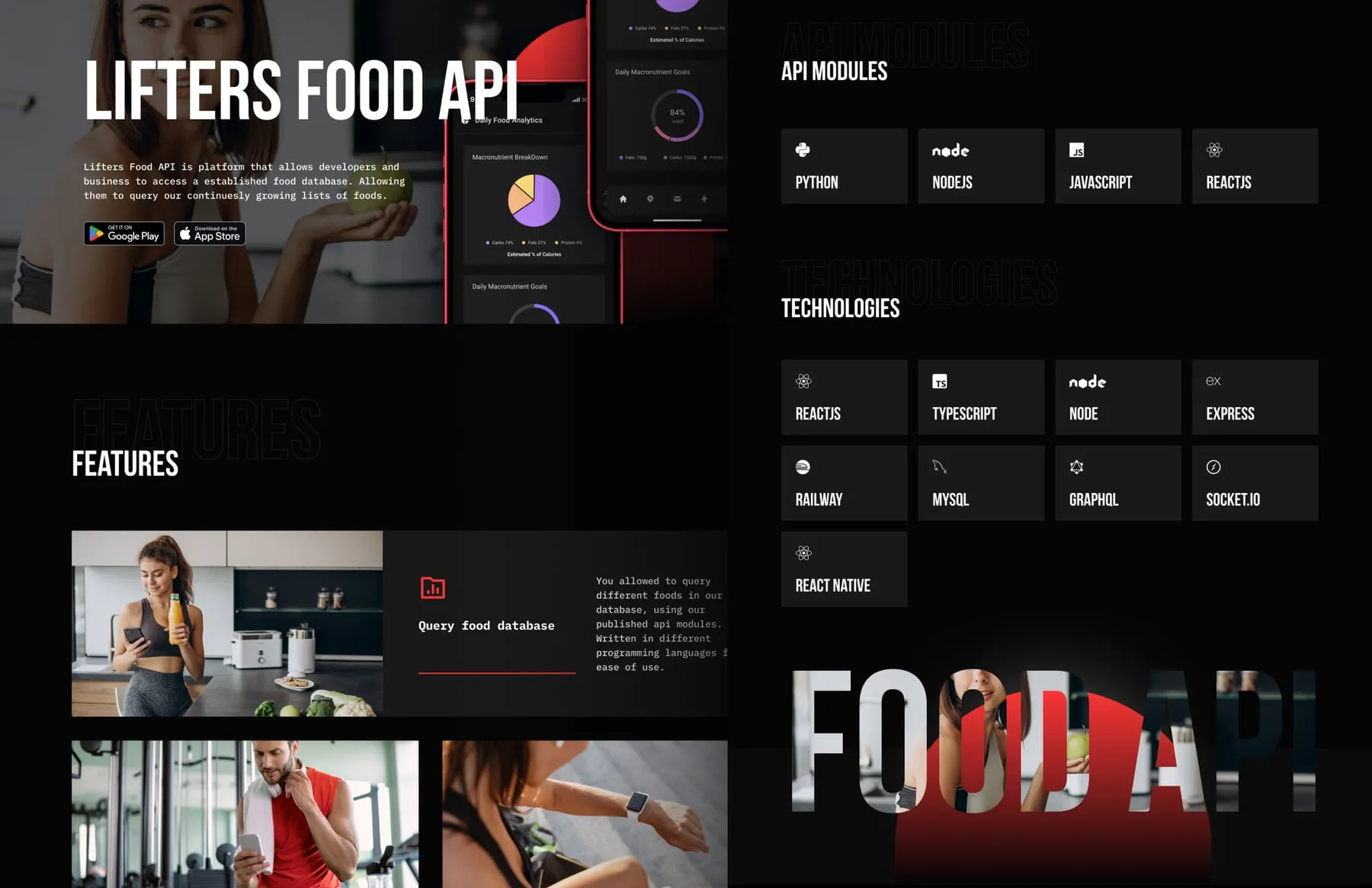
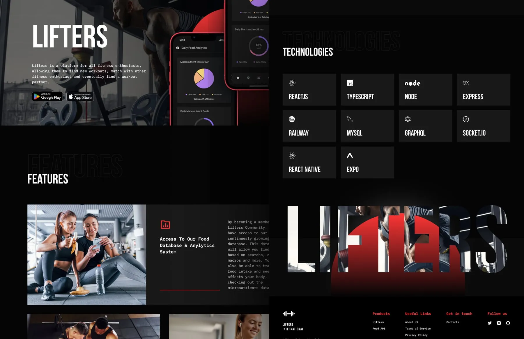
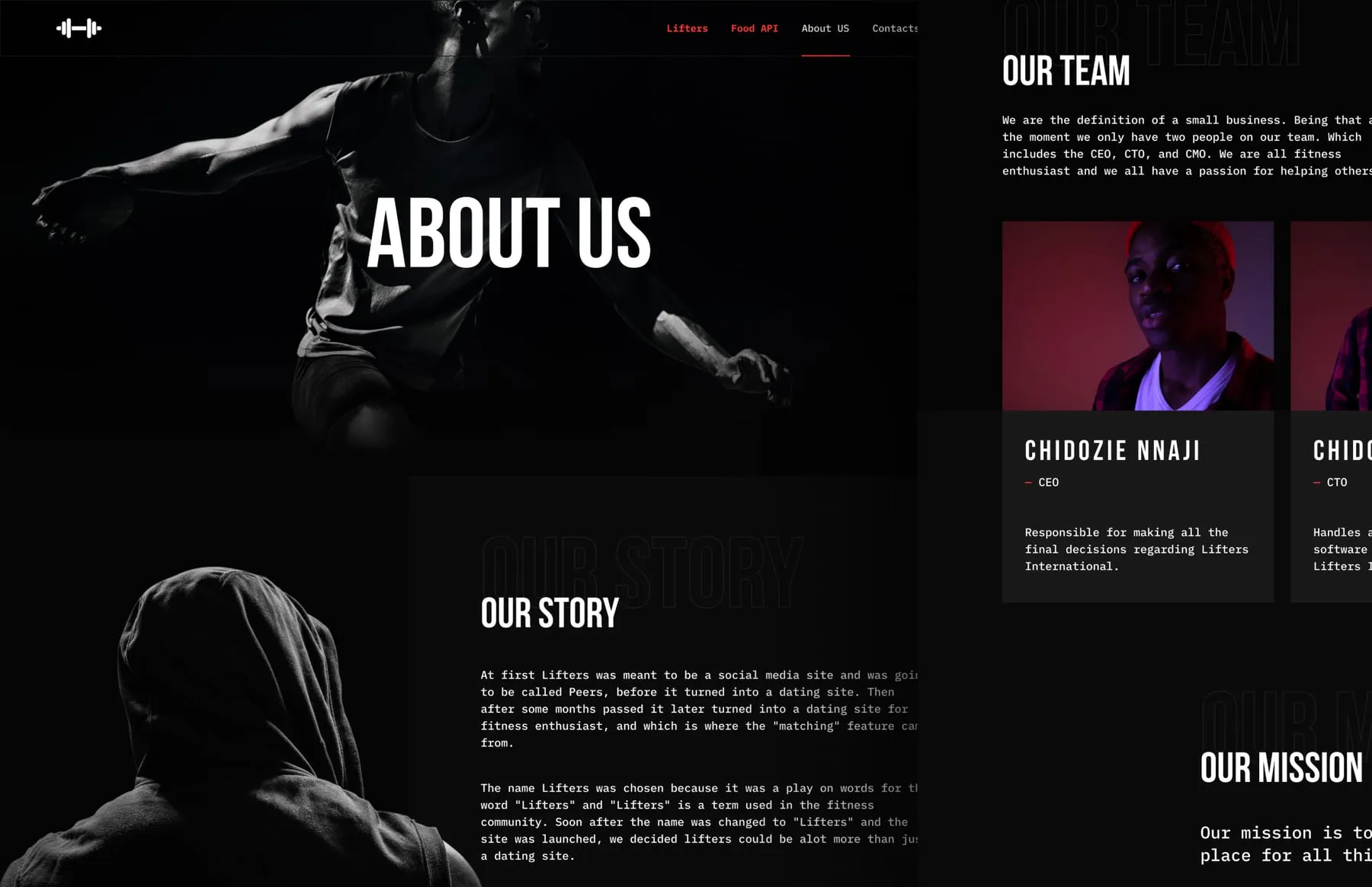
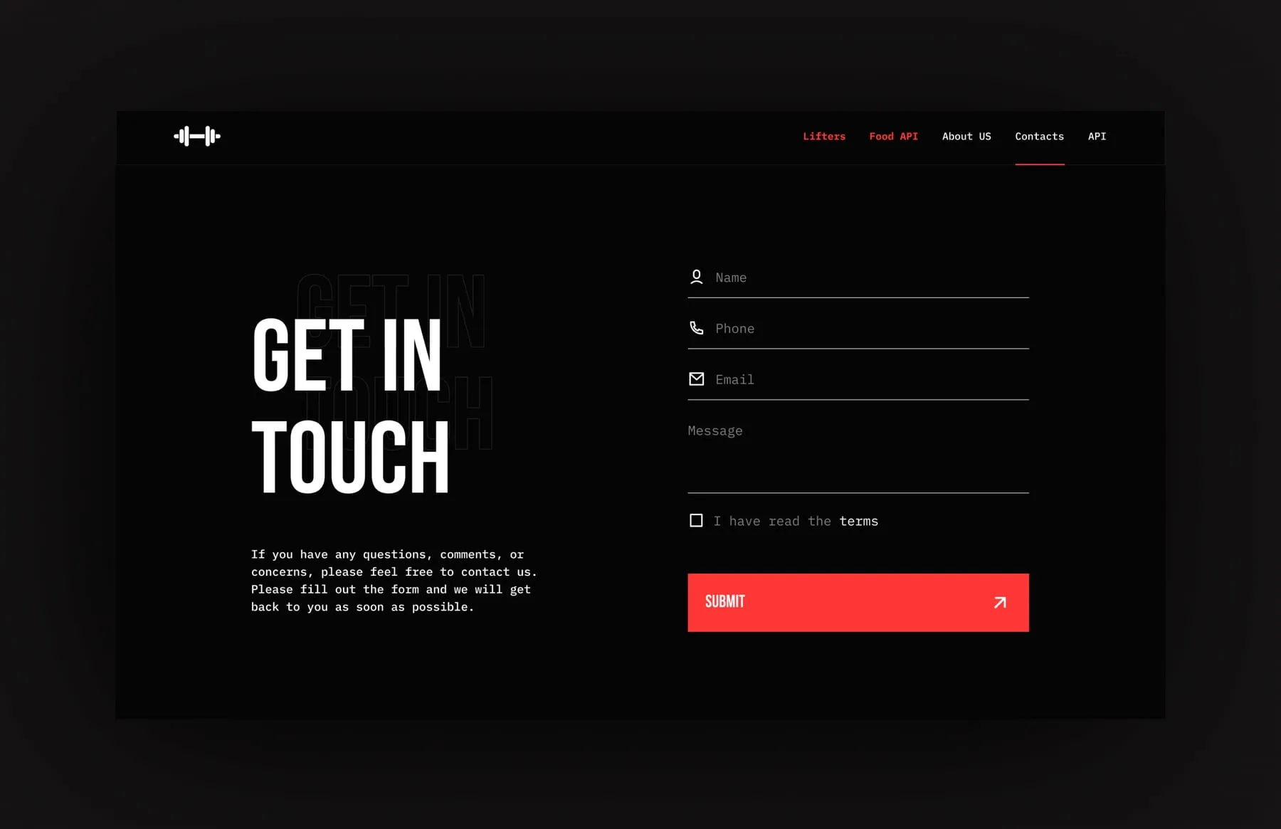
Lifters International got one designed and developed website for two products. Gym-goers find the app, its features and the app store links in the first screen. Developers find the API modules, technologies and documentation promise on a page that feels like the same company. The About and contact pages give a small team a clear voice and a direct line.
- Home page with both products
- Lifters app product page
- Lifters Food API product page
- About page with story, team and mission
- Contact page with form
- Shared footer with app store links
“Thanks to the team for moving our brand forward. The new site and style are working for us, and we keep seeing growth in traffic and sales. Great job!”