Website · Construction · Ähtäri, Finland
Rakennus Ruuhilehto.
A builder's website with the house shape built into every page
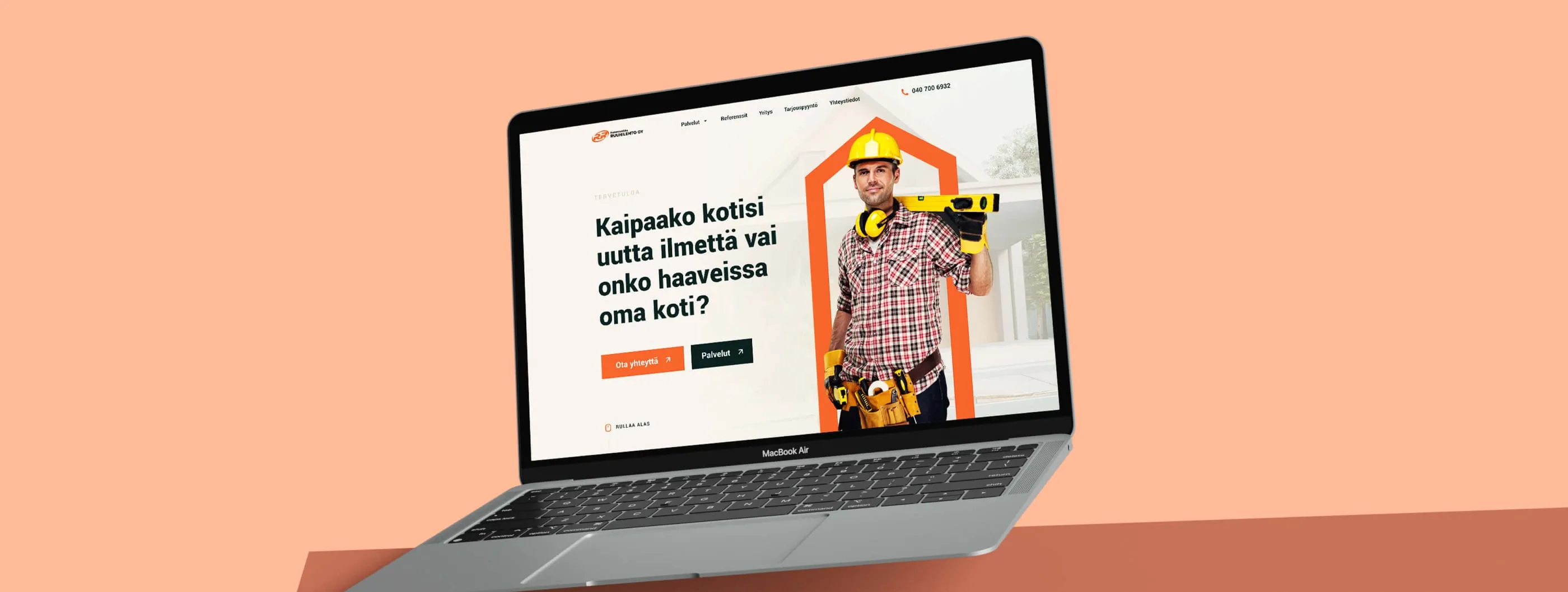

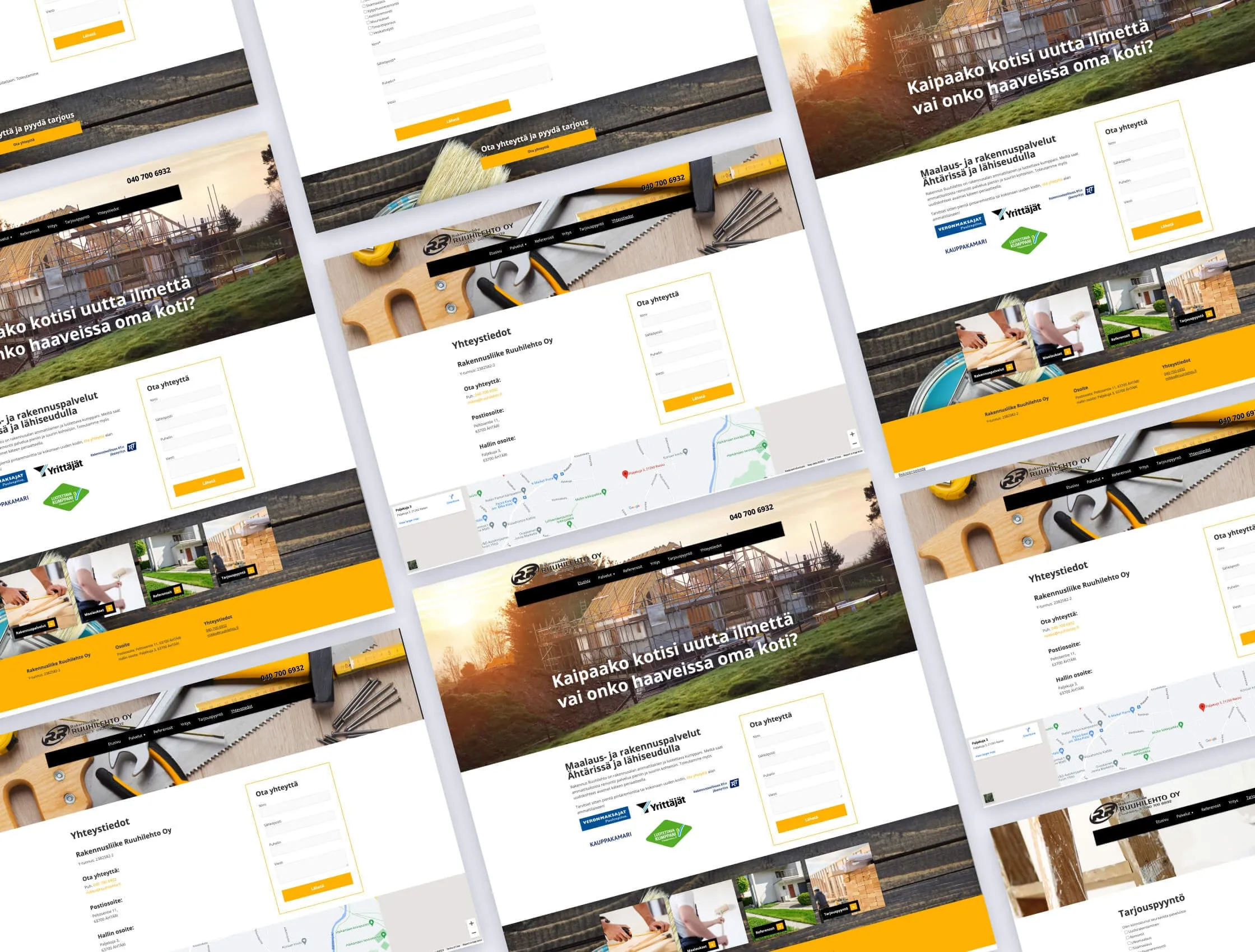
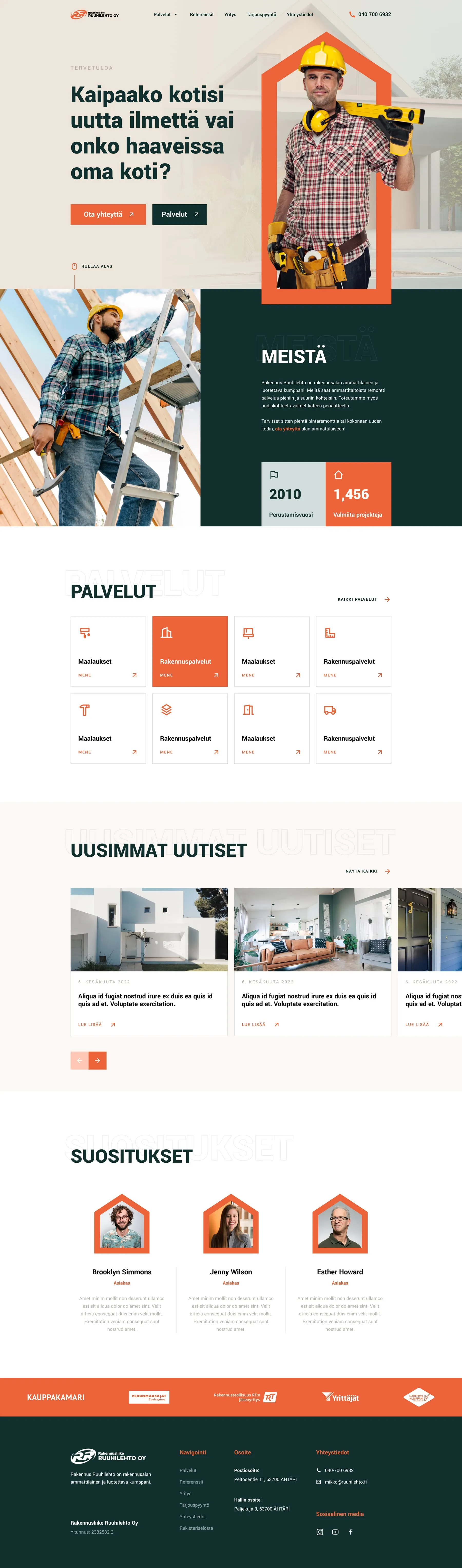
Rakennus Ruuhilehto builds and renovates private homes in Ähtäri, Finland, and takes on painting and construction work in the surrounding area. Its previous website already asked the right question: does your home need a new look, or are you dreaming of a home of your own? But the question sat on a busy page of dark wood textures, yellow bars and competing forms. We redesigned the site in Finnish around that same question, with a clearer structure and an identity that feels like the company's work.
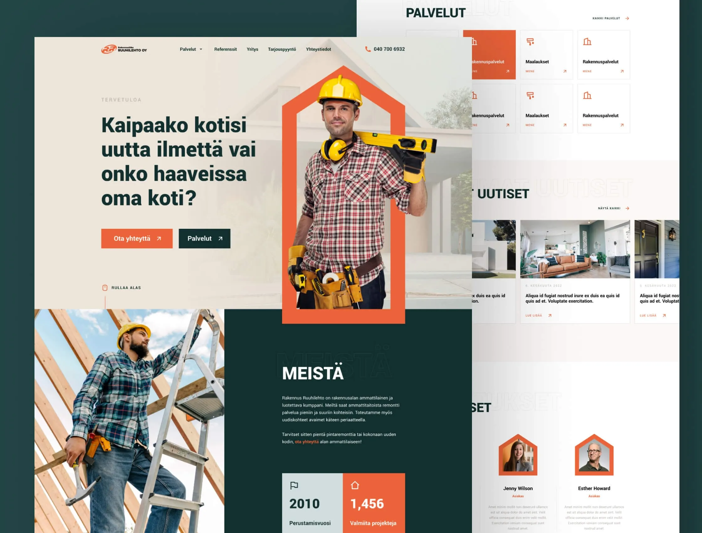
- Home page
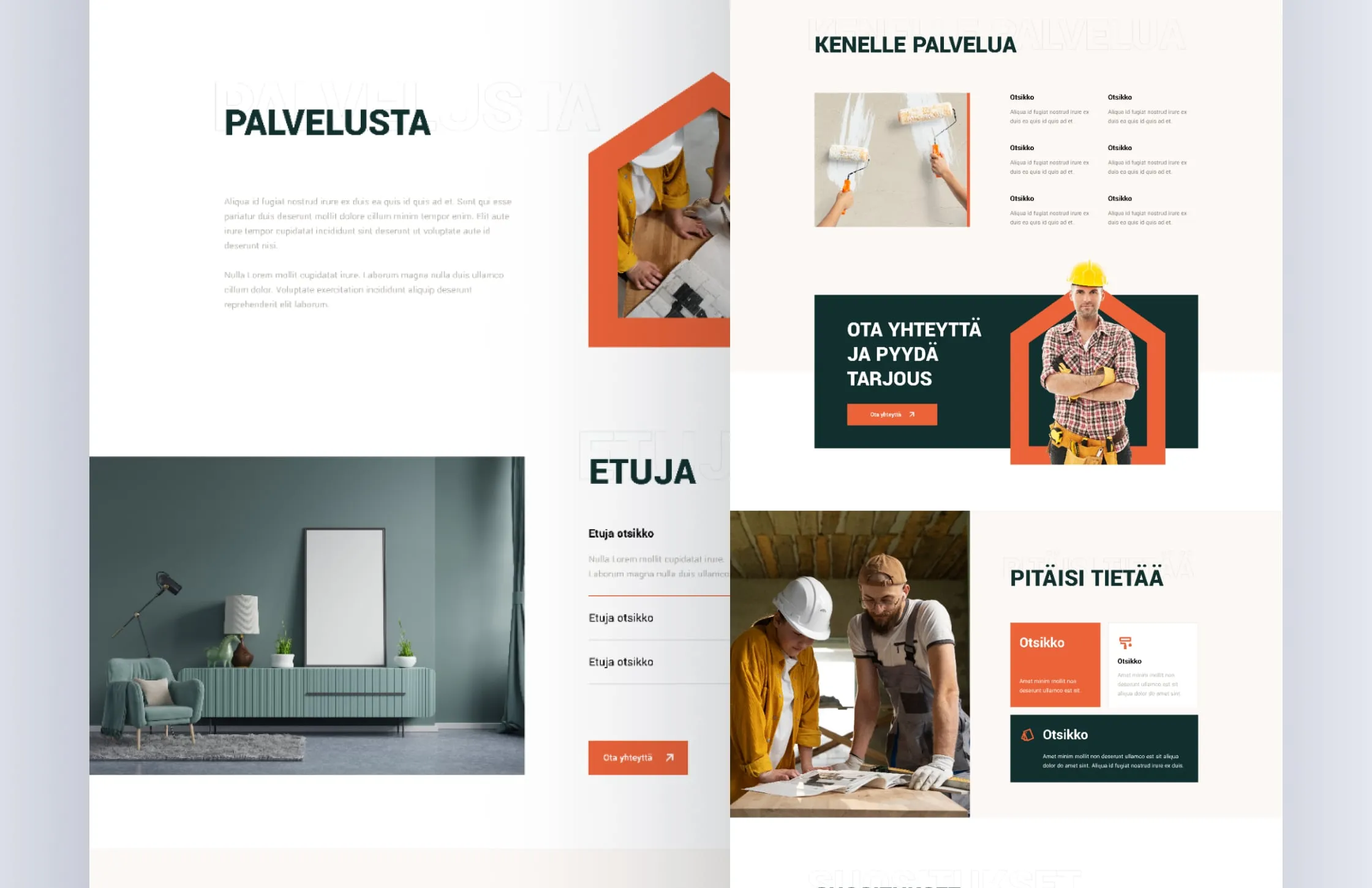
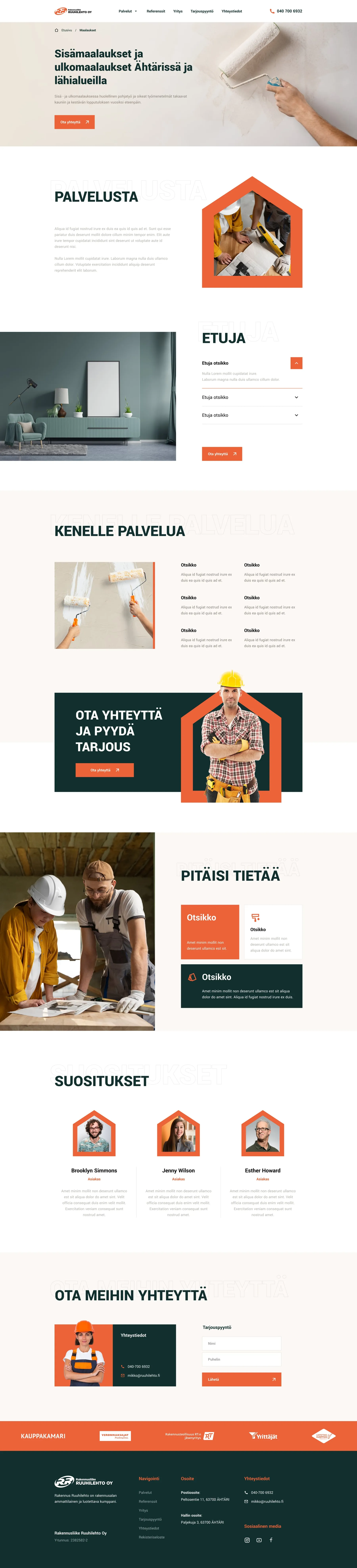
- Services and single service pages
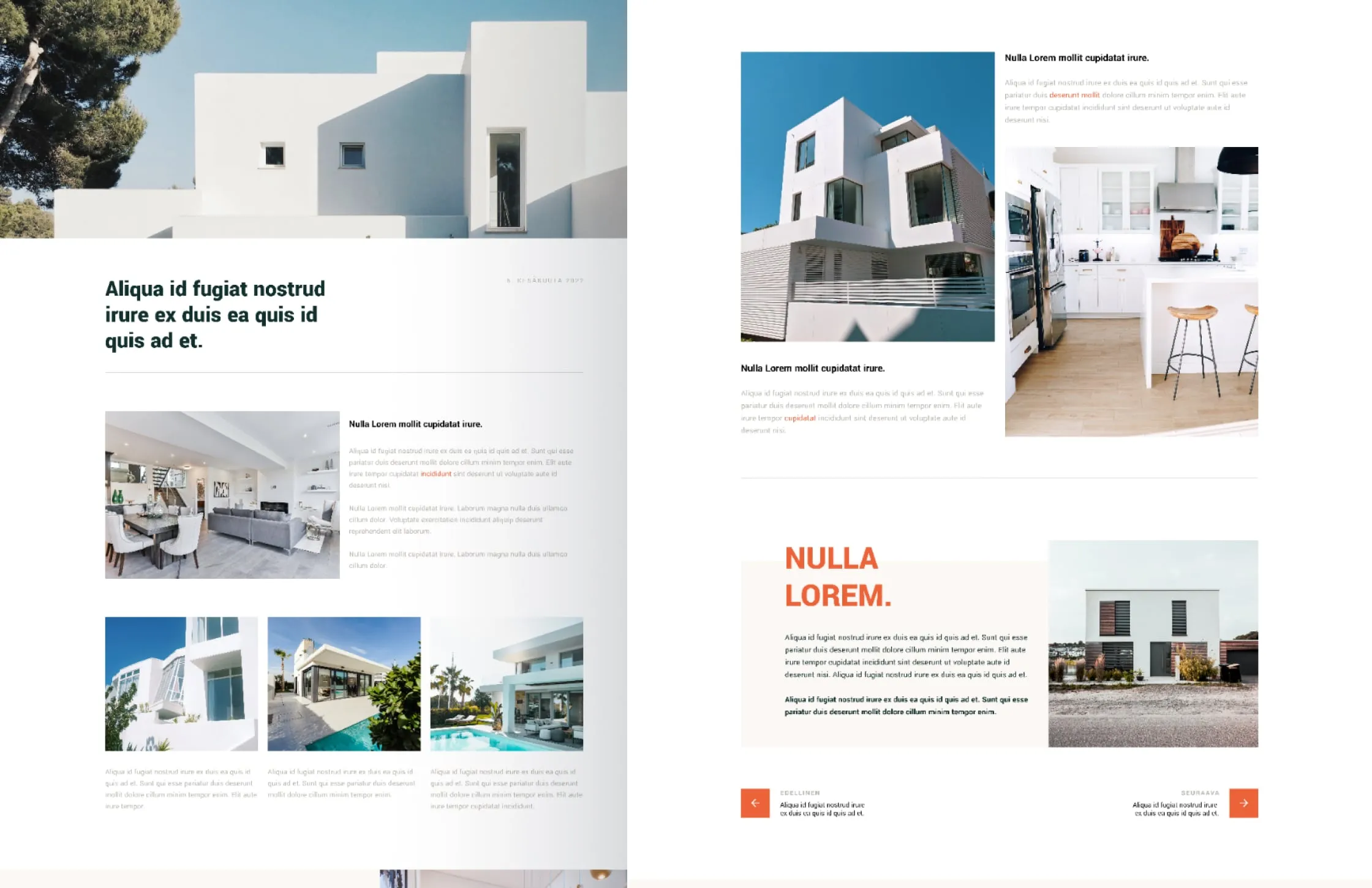
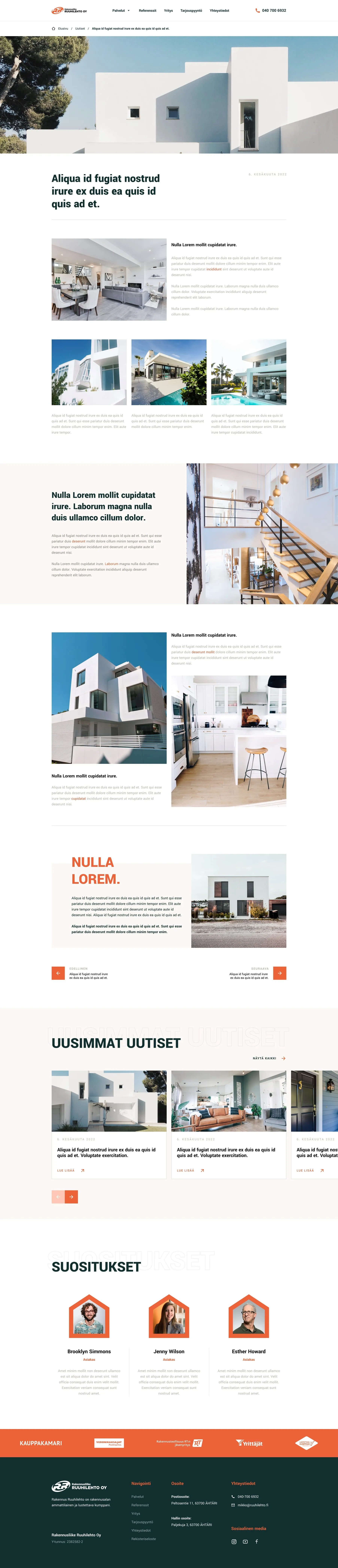
- News and blog post templates
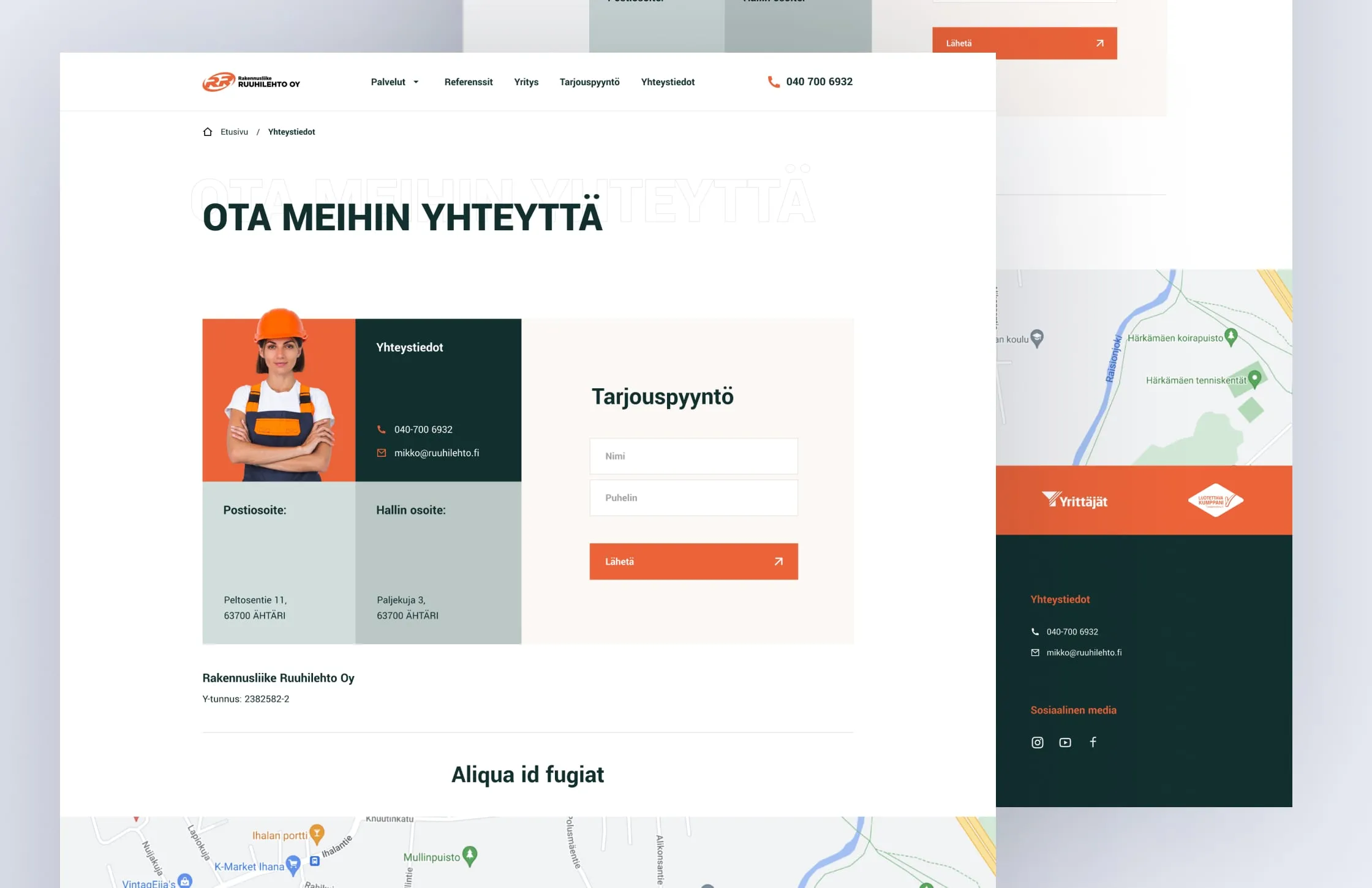
- Contact and quote request page
- Mobile layouts
Small construction companies win work on trust. Visitors want to see who will come to their house, what the company does, and how to ask for a price. The old site mixed services, badges and forms on heavy textures, so none of them stood out. We needed a calmer page, one strong recurring shape, clear entry points for each service and a quote request that is always close.
- 01 — Trust
People invite a builder into their home and want to see faces first.
- 02 — Service clarity
Painting, renovation and building work needed separate, scannable entry points.
- 03 — Price requests
Asking for a quote had to be easy from any page.
Keep the question, lose the noise
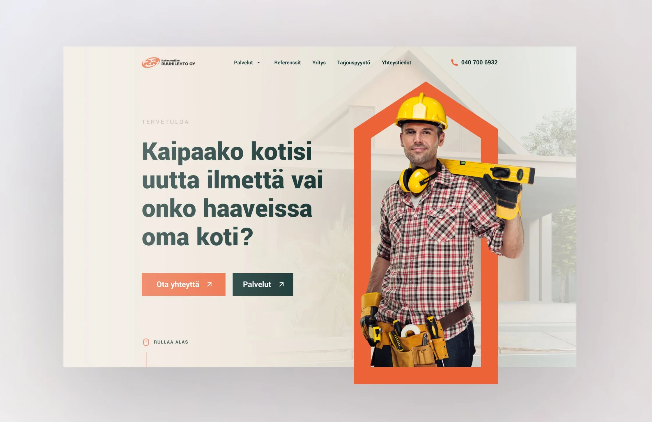
We kept the headline the client already used, because it is a good one, and gave it room. The new hero sets it in large type next to a builder framed by an orange house outline, with two clear actions: contact us, or see services. Dark wood and yellow gave way to warm off-white, deep green and orange. The message stayed. The noise went.
One shape, used everywhere
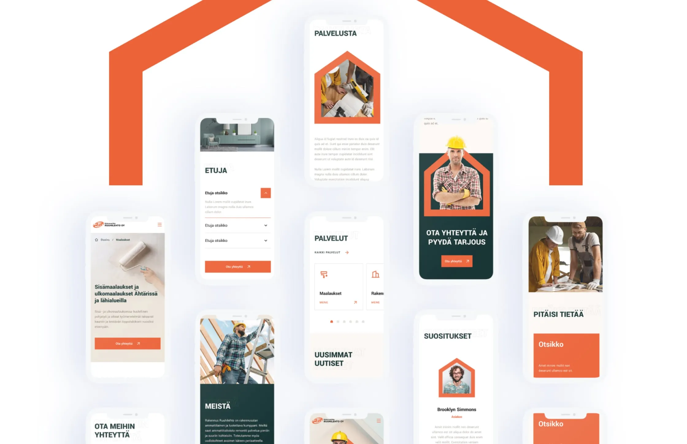
The house outline became the brand's main device. It frames the builder in the hero, the call-to-action banner, service photos and customer portraits in the recommendations block. It reads at any size, so it carries to mobile without changes. One shape repeated with discipline does more for recognition than a set of decorations, and it says what the company does before a word is read.
Templates the team can grow
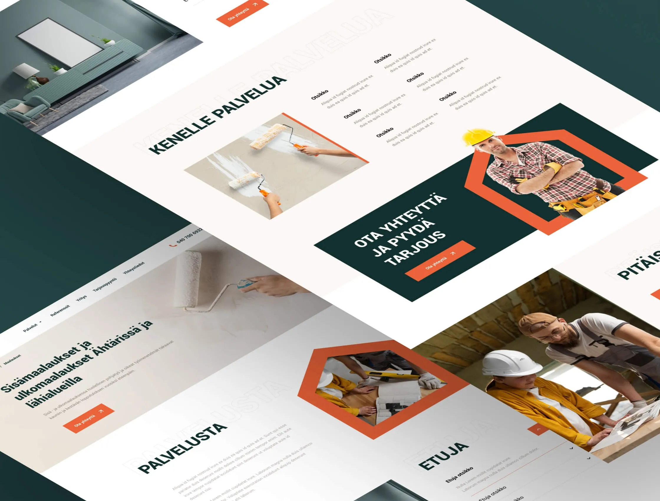
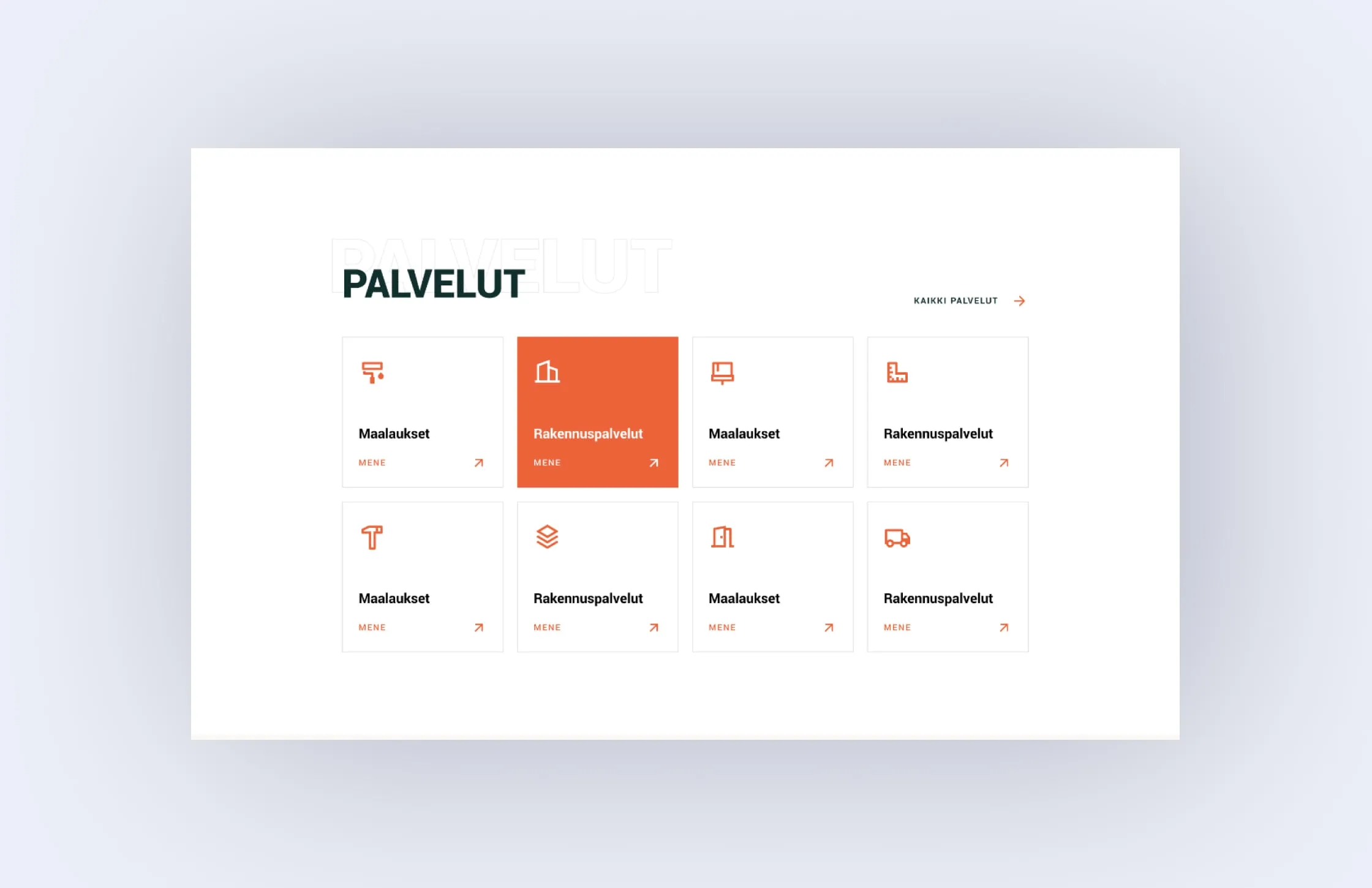
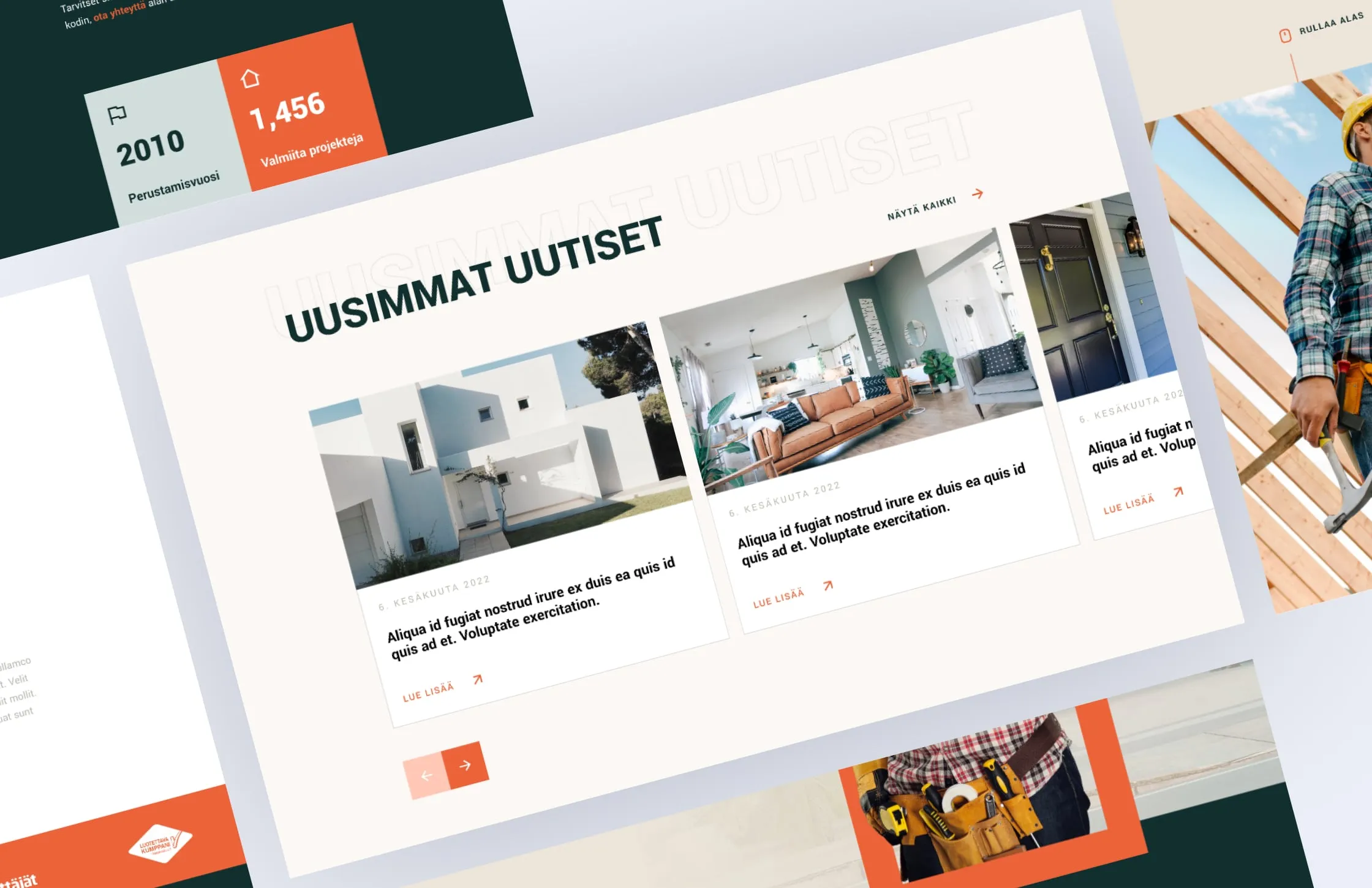
We designed a set of templates instead of one-off pages: a services grid, a single service page with benefits, audience and need-to-know blocks, a news listing and a blog post layout. Each page ends with the same quote request and a strip of trust badges, including Kauppakamari, Yrittäjät and Luotettava Kumppani. A new service or article slots into an existing pattern, with no new design needed.
A person on the contact page
The contact page leads with a person: a team member's photo, phone and email, then postal and office addresses, and a short quote request form alongside. A map sits below. The same contact block closes every service page, so a visitor reading about painting never has to hunt for the form. The footer repeats phone, email and both addresses.
Rakennus Ruuhilehto now has a redesigned website in Finnish that shows the people, the services and the way to ask for a price on every page. The house outline gives a small local builder a recognisable identity. The template set lets the team add services and articles without new design work, and the site works the same on a phone.
- Redesigned home page
- Services grid and single service template
- News listing and blog post template
- Contact page with quote request and map
- House-outline visual system
- Mobile layouts
“They listened to our needs and delivered a website that not only looks great but also drives results. We have received countless compliments from customers since launching our new site!”